Supervised Classification: an Exploration with R and tidymodels
The aim of this file is to visualize the predictions of many classical models on a simple dataset:the twoClass dataset from Applied Predictive Modeling, the book of M. Kuhn and K. Johnson. At the same time, it provides an example of how to use the tidymodels ecosystem to obtain those predictions as well as good estimates of the quality of the correponding predictors.
We start by loading our main (meta)-libraries:
library("tidyverse")
library("tidymodels")
library("conflicted")
conflict_prefer("select", "dplyr")
conflict_prefer("filter", "dplyr")
conflict_prefer("slice", "dplyr")
They give access to most of the functions required to work with dataframes (or rather tibble), to visualize them and to do machine learning on tabular data.
To accelerate our code, we will rely on parallelization, and, more precisely, on the future implementation:
library("doFuture")
registerDoFuture()
plan(multisession)
options(doFuture.rng.onMisuse="ignore")
The twoClass dataset
We are now ready to read the dataset and use ggplot2 to display it.
library(AppliedPredictiveModeling)
library(RColorBrewer)
data(twoClassData)
twoClass <- tibble(predictors) |> mutate(classes)

twoClassColor <- brewer.pal(3,'Set1')[1:2]
names(twoClassColor) <- c('Class1','Class2')

ggplot(data = twoClass,aes(x = PredictorA, y = PredictorB)) +
  geom_point(aes(color = classes), size = 6, alpha = .5) +
  scale_colour_manual(name = 'classes', values = twoClassColor) +
  scale_x_continuous(expand = c(0,0)) +
  scale_y_continuous(expand = c(0,0)) +
  coord_equal() +
  theme_light()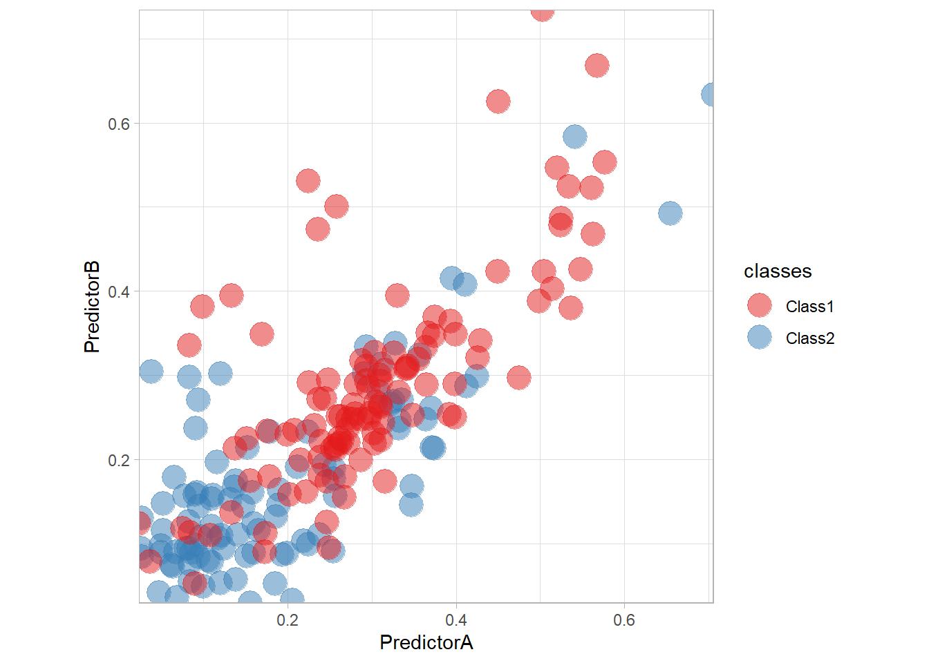
Let’s train a simple logistic regression on the data with tidymodels. We need to specify the preprocessing of the data as well as the model itself. The combination of those two steps is call a workflow and can be defined as follows:
preprocess <- workflow() |>
  add_formula(classes ~ .)

model_ <- logistic_reg()

workflow_ <- preprocess |>
  add_model(model_)
We can then train our model on the data on make some predictions:
fitted_ <- workflow_ |> fit(twoClass)
fitted_ |> predict(twoClass |> slice(1:10))
## # A tibble: 10 × 1
## .pred_class
## <fct>
## 1 Class2
## 2 Class1
## 3 Class1
## 4 Class2
## 5 Class1
## 6 Class1
## 7 Class2
## 8 Class1
## 9 Class2
## 10 Class2To better visualize the predictor, we will plot the predictions on a grid as well a the decision boundary with the following function:
library("patchwork")
nbp <- 250;
PredA <- seq(min(twoClass$PredictorA), max(twoClass$PredictorA), length = nbp)
PredB <- seq(min(twoClass$PredictorB), max(twoClass$PredictorB), length = nbp)
Grid <- as_tibble(expand.grid(PredictorA = PredA, PredictorB = PredB))

plot_grid <- function(fitted, title) {
  pred <- fitted |> predict(Grid)
  surf <- (ggplot(data = twoClass, aes(x = PredictorA, y = PredictorB,
                                      color = classes)) +
          geom_tile(data = Grid |> bind_cols(pred), mapping = aes(fill = .pred_class, color = .pred_class)) +
          scale_fill_manual(name = 'classes', values = twoClassColor) +
          ggtitle("Decision region") + theme(legend.text = element_text(size = 10)) +
  scale_colour_manual(name = 'classes', values = twoClassColor)) +
  scale_x_continuous(expand = c(0,0)) +
  scale_y_continuous(expand = c(0,0)) +
    theme_light()
  pts <- (ggplot(data = twoClass, aes(x = PredictorA, y = PredictorB,
                                    color = classes)) +
          geom_contour(data = Grid |> bind_cols(pred), aes(z = as.numeric(.pred_class), color = .pred_class),
                       color = "red", breaks = c(1.5)) +
          geom_point(size = 4, alpha = .5) +
          ggtitle("Decision boundary") +
          theme(legend.text = element_text(size = 10)) +
          scale_colour_manual(name = 'classes', values = twoClassColor)) +
    scale_x_continuous(expand = c(0,0)) +
    scale_y_continuous(expand = c(0,0)) +
    coord_equal() + theme_light()

  surf + pts +
    plot_annotation(title = title)
}
plot_grid(fitted_, "Logistic")
We will also use tidymodels to assess the quality of our predictors through a cross-validation scheme. We need to define a set of resamples of the original dataset, a collection of train/validate sets that will be used respectively to fit the workflow and to compute some metrics. We will rely on a classical repeated cross-validation strategy, but we will also compute an optimistic training error computed by testing a model on the very same data it has been trained on. As this a bad idea, we need to hack a little the ecosystem…
set.seed(seed = 42)
folds <- vfold_cv(twoClass, v = 10, repeats = 4, strata = classes)

no_fold <- manual_rset(list(make_splits(x = twoClass, assessment = twoClass)), 'None')
all_folds <- folds|>
  mutate(id = paste(id, id2)) |>
  bind_rows(no_fold)
all_folds <- manual_rset(all_folds[["splits"]], all_folds[["id"]])
We are now ready to compute some metric values for all resamples (folds):
resamples_ <- workflow_ |>
  fit_resamples(resamples = all_folds)

metrics_ <- resamples_ |>
  collect_metrics(summarize = FALSE) |>
  mutate(.model = "logistic", .before ="id")

metrics_
## # A tibble: 123 × 6
## .model id .metric .estimator .estimate .config
## <chr> <chr> <chr> <chr> <dbl> <chr>
## 1 logistic None accuracy binary 0.75 Preprocessor1_Model1
## 2 logistic None roc_auc binary 0.785 Preprocessor1_Model1
## 3 logistic None brier_class binary 0.189 Preprocessor1_Model1
## 4 logistic Repeat1 Fold01 accuracy binary 0.818 Preprocessor1_Model1
## 5 logistic Repeat1 Fold01 roc_auc binary 0.758 Preprocessor1_Model1
## 6 logistic Repeat1 Fold01 brier_class binary 0.182 Preprocessor1_Model1
## 7 logistic Repeat1 Fold02 accuracy binary 0.762 Preprocessor1_Model1
## 8 logistic Repeat1 Fold02 roc_auc binary 0.782 Preprocessor1_Model1
## 9 logistic Repeat1 Fold02 brier_class binary 0.207 Preprocessor1_Model1
## 10 logistic Repeat1 Fold03 accuracy binary 0.714 Preprocessor1_Model1
## # ℹ 113 more rowsAs we will repeat several time, we provide a function to learn a predictor, computes its metric values on the resamples and visualize the predictor and a function to add those values to some already collected.
learn_and_display <- function (name, workflow, seed=42) {
  set.seed(seed)
  resamples_ <- workflow |> fit_resamples(all_folds)
  metrics_ <- resamples_ |>
    collect_metrics(summarize = FALSE) |>
    mutate(.model = name, .before ="id")
  fitted_ <- workflow |>
    fit(twoClass)
  print(plot_grid(fitted_, name))
  metrics_
}

learn_display_and_add <- function(metrics, name, workflow, seed=42) {
  metrics_ <- learn_and_display(name, workflow, seed)
  bind_rows(metrics, metrics_)
}

all_metrics <- tibble()
Any model available in tidymodels can be used! We will explore here the most classical ones. We will start by models that are explicitely based on the estimation of the conditional density (the probabilistic approach) and continue with models more related to the optimization approach, in which one try to enforce a small training error by minimizing a surrogate criterion.
Statistical point of view
Parametric conditional estimation
The most classical model is probably the logistic model, that we have seen before. It is indeed the canonical example of a parametric conditional regression estimate.
workflow_ <- preprocess |>
  add_model(logistic_reg())

all_metrics <- all_metrics |>
  learn_display_and_add("Logistic", workflow_)
We are not restricted to the use of two features but may use any transformation of them. For instance, we may use all the possible monomials up to degree \(2\). We only need to change the preprocessing step:
quadratic_preprocess <- workflow() |>
  add_formula(classes ~ PredictorA + PredictorB + I(PredictorA^2) + I(PredictorB^2) + I(PredictorA*PredictorB))

workflow_ <- quadratic_preprocess |>
  add_model(logistic_reg())

all_metrics <- all_metrics |>
  learn_display_and_add("Quadratic Logistic", workflow_)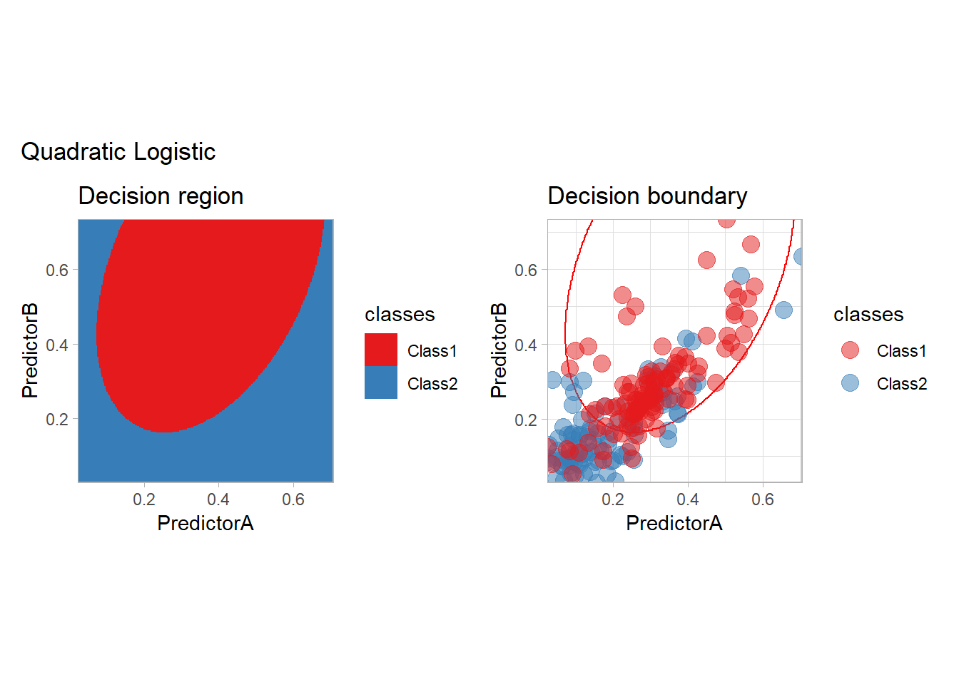
Non parametric conditional density estimation
The most classical approaches are kernel methods, and among them simplest one is the nearest neighbor one. We only need to supply a parameter: \(k\) the number of neighbors used to define the kernel. We will compare visually the solution obtained with a few \(k\) values.
knn_metrics <- data.frame()
k_knn <- c(seq(1, 33, by = 4),seq(37,85, by = 8), seq(101, 200, by = 8))
for (k_ in k_knn) {
  workflow_ <- preprocess |>
    add_model(nearest_neighbor(mode = "classification", neighbors = {{ k_ }},
                               weight_func = "rectangular"))
  knn_metrics <- knn_metrics |>
    learn_display_and_add(paste("k-NN with k=", k_), workflow_)
}
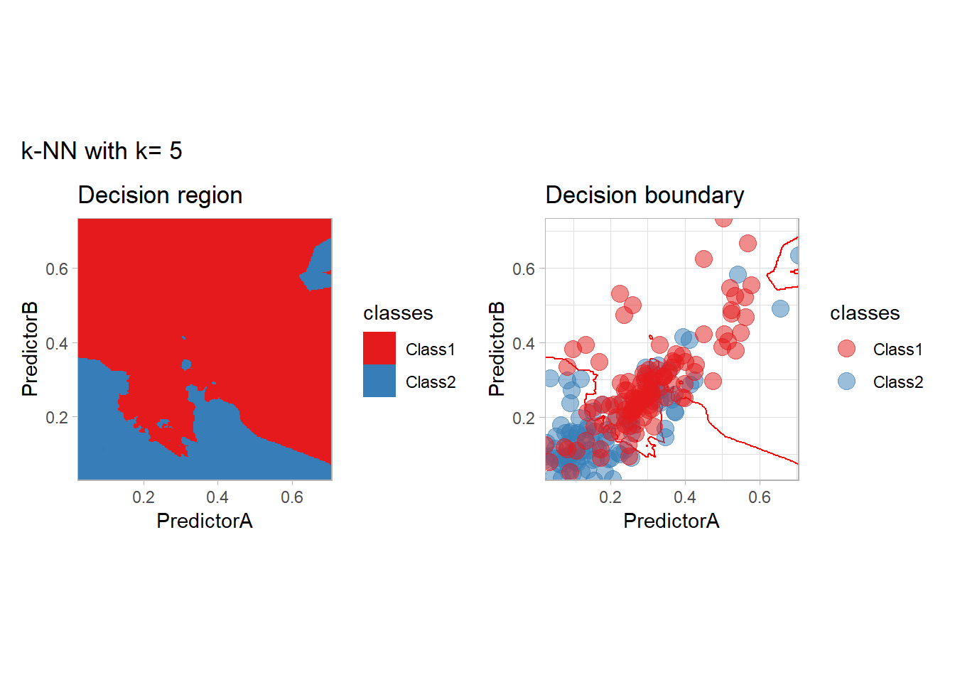
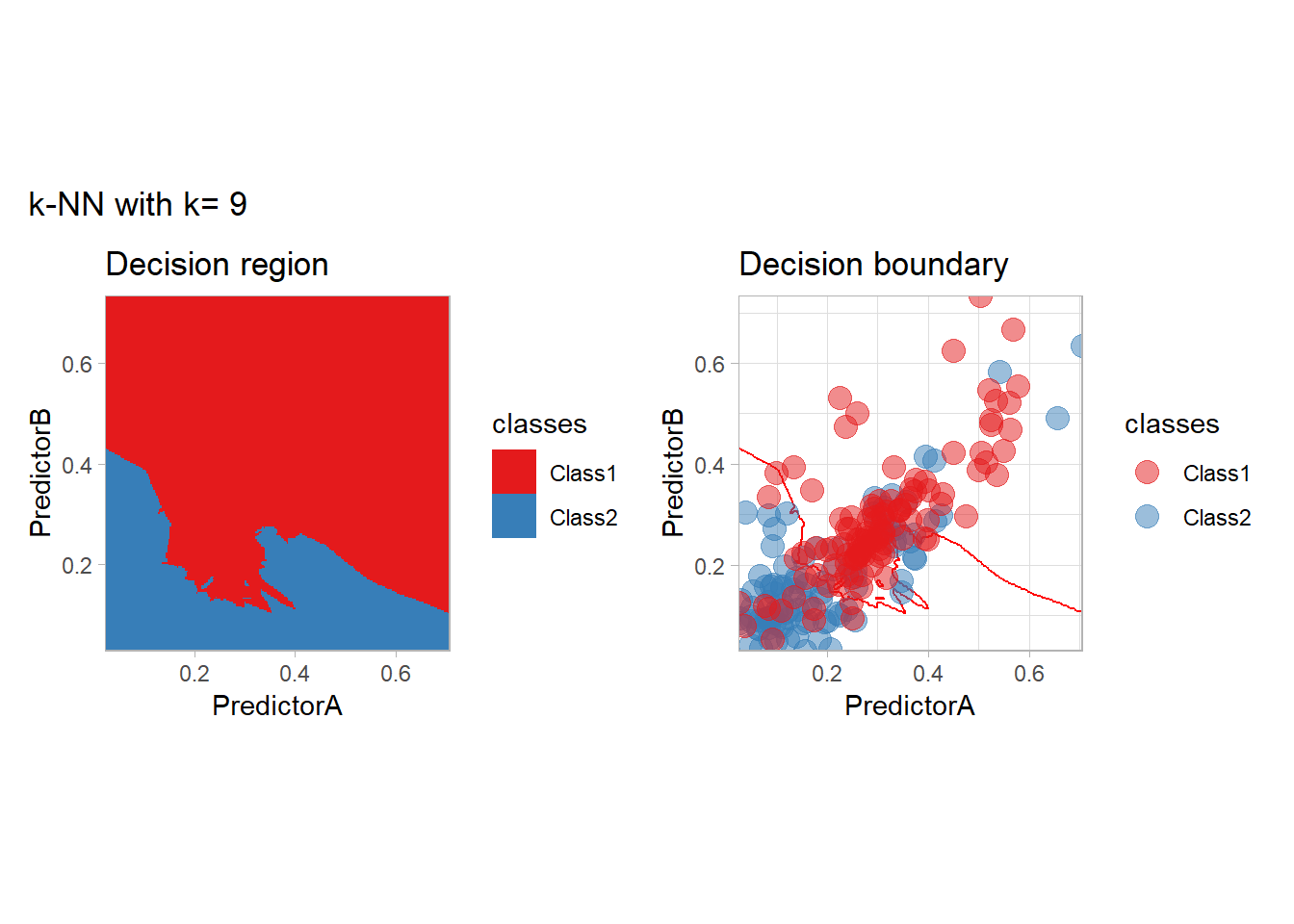


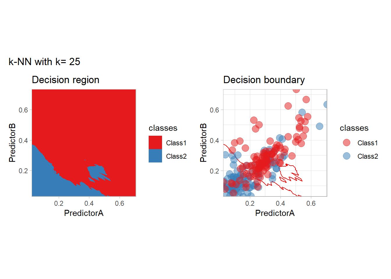


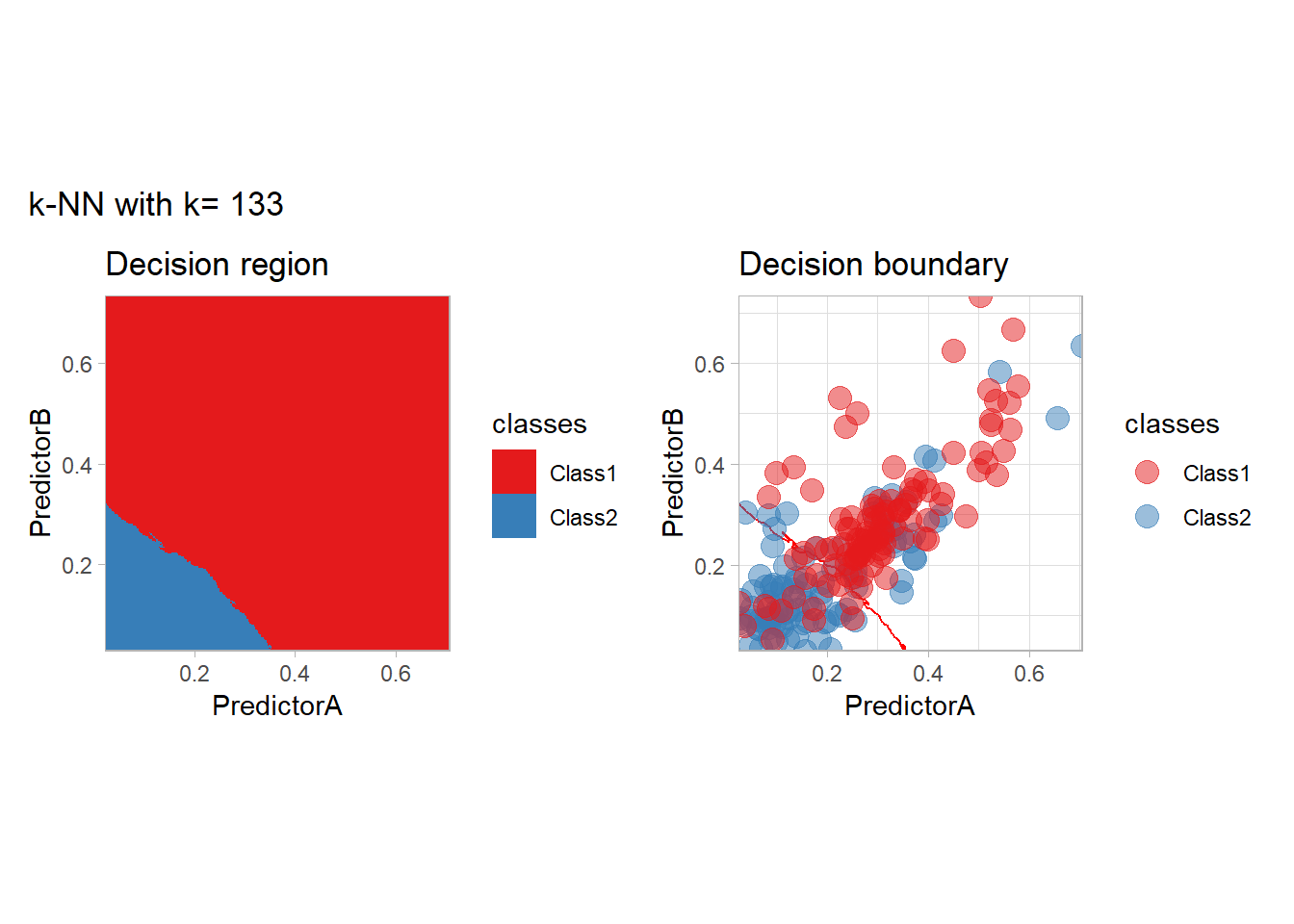


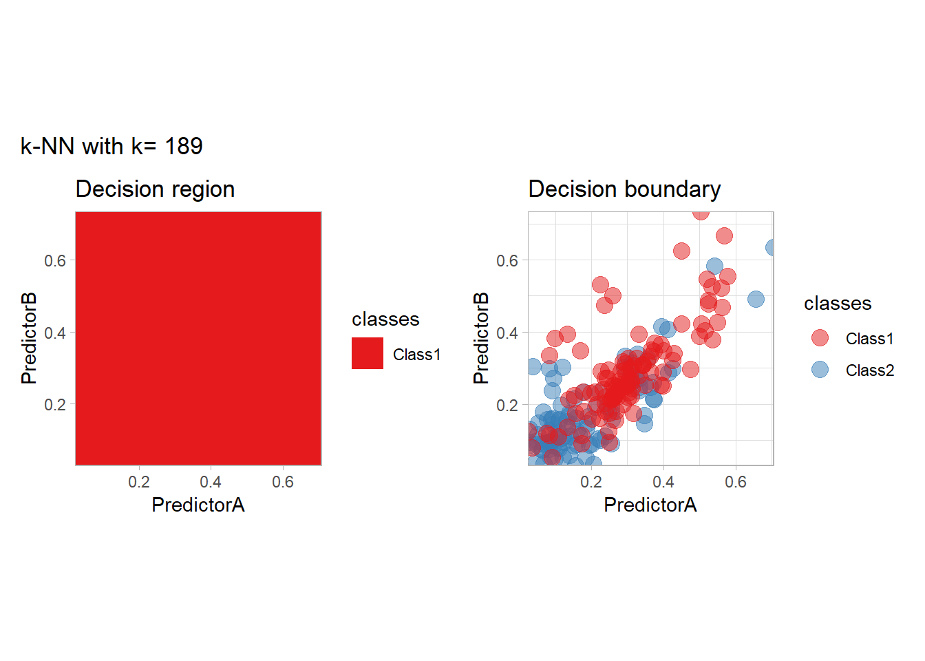

all_metrics <- all_metrics |> bind_rows(knn_metrics)Note that the default nearest neighbor algorithm in tidymodel is a weighted one, so that we had to specify weight_func = "rectangular" to use the classical algorithm.
As a teaser of what we are going to see, we could use those metrics to find the best parameters. This can be done in an efficient way:
workflow_ <- preprocess |>
  add_model(nearest_neighbor(mode = "classification", neighbors = tune(), weight_fun = "rectangular"))

param_grid <- expand_grid(neighbors = k_knn)

resamples_ <- workflow_ |>
  tune_grid(resamples = folds, grid = param_grid)

best_params_ <- resamples_ |>
  select_best(metric = "accuracy")

workflow_ <- workflow_ |>
  finalize_workflow(best_params_)

all_metrics <- all_metrics |>
  learn_display_and_add("k-NN with CV choice", workflow_)
We will look more closely at this choice at the end of this document.
Generative Modeling
In the generative modeling approach, one propose to estimate the joint law of the covariates and the label and to derive the conditional law using the Bayes formula. The generative models differ by the choice of the density estimator (often specified by an intra class model). We consider here the LDA and QDA methods, in which a Gaussian model is used, and two variants of the Naive Bayes method, in which all the features are assumed to be independent. For Naive Bayes, we will use a Gaussian model and a density based one.
library(discrim)
workflow_ <- preprocess |>
  add_model(discrim_linear())
all_metrics <- all_metrics |>
  learn_display_and_add("Linear Discrimant Analysis", workflow_)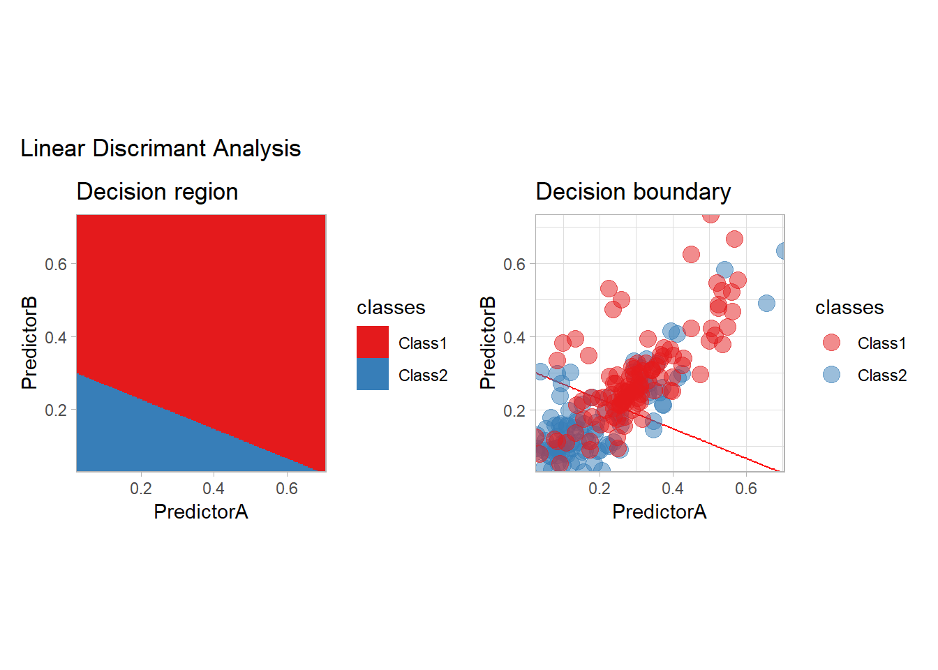
workflow_ <- preprocess |>
  add_model(discrim_quad())
all_metrics <- all_metrics |>
  learn_display_and_add("Quadratic Discriminant Analysis", workflow_)
workflow_ <- preprocess |>
  add_model(naive_Bayes() |>
              set_engine("klaR", usekernel = c(FALSE)))

all_metrics <- all_metrics |>
  learn_display_and_add("Naive Bayes with Gaussian model", workflow_)
workflow_ <- preprocess |>
  add_model(naive_Bayes() |>
              set_engine("klaR"))

all_metrics <- all_metrics |>
  learn_display_and_add("Naive Bayes with kernel density estimates", workflow_)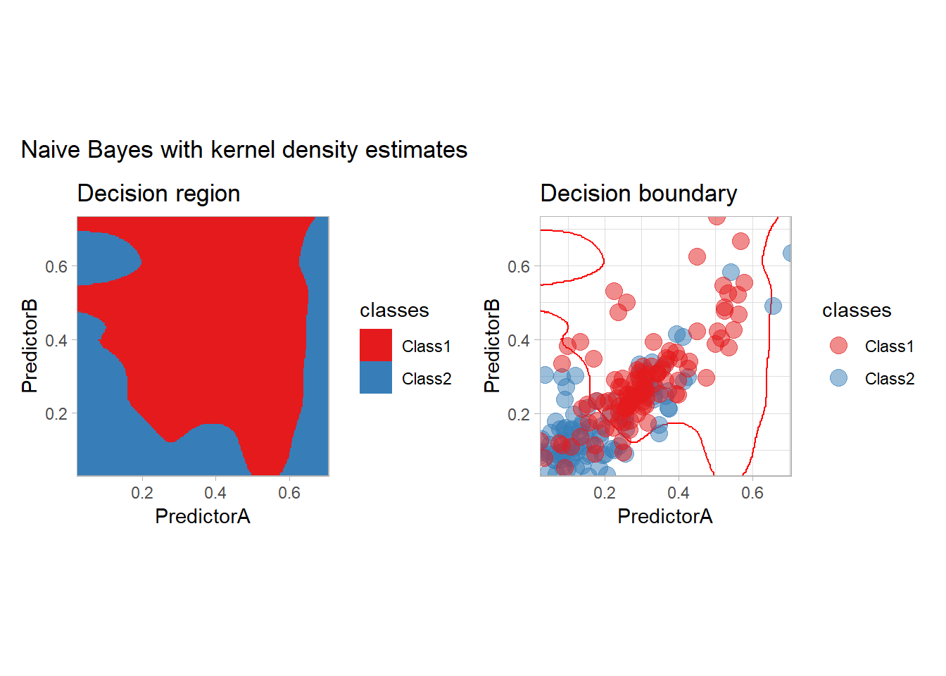
Optimization point of view
Neural Networks
Some simple neural networks can be used with tidymodels:
workflow_ <- preprocess |>
  add_model(mlp(mode = "classification"))

all_metrics <- all_metrics |>
  learn_display_and_add("Neural Network", workflow_)
but moving to a dedicated package such as keras3 is probably a better decision…
Penalization
Penalized models are available in tidymodels:
workflow_ <- quadratic_preprocess |>
  add_model(logistic_reg(mode = "classification", penalty = 1))

all_metrics <- all_metrics |>
  learn_display_and_add("Logistic with L2 penalization", workflow_)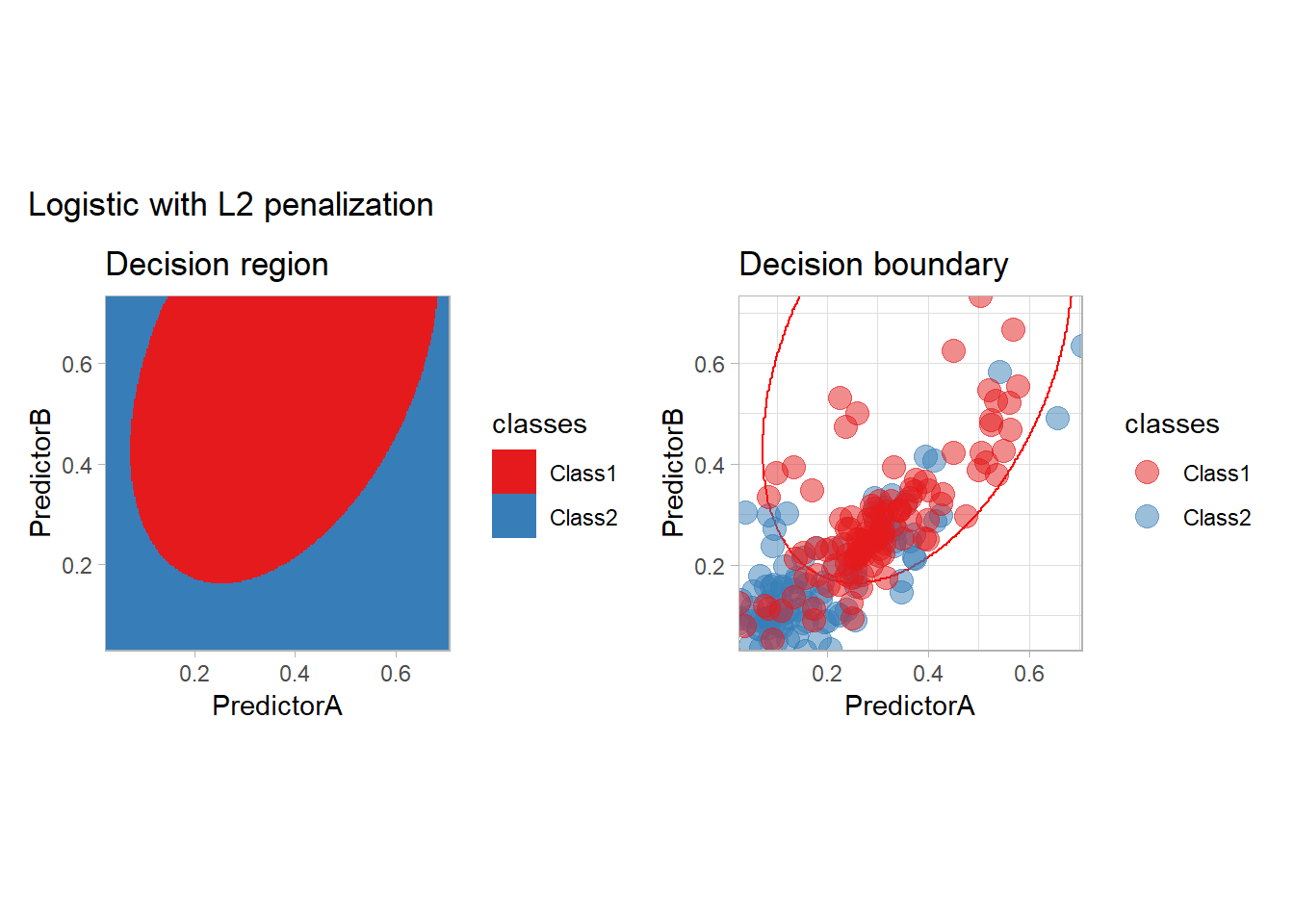
In practice, we should probably optimize the choice of the penalty (or use another model as we only have two features).
Support Vector Machine
The SVM may be seen as the original optimization method, and it can be used with tidymodels: - with a vanilla kernel
workflow_ <- preprocess |>
  add_model(svm_linear(mode = "classification") |>
              set_engine("kernlab"))

all_metrics <- all_metrics |>
  learn_display_and_add("Support Vector Machine", workflow_)
## Setting default kernel parameters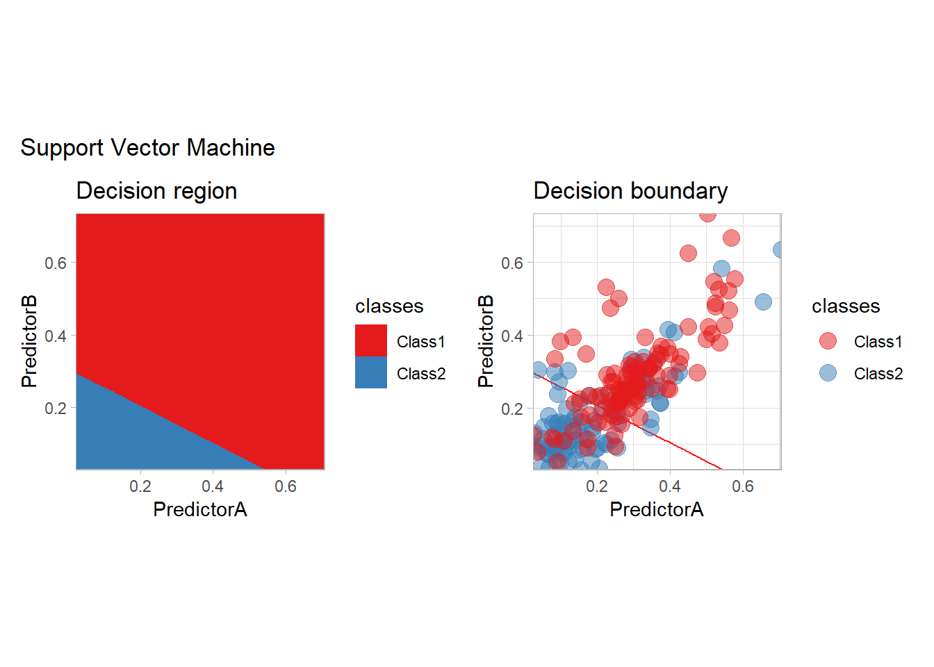
- a polynomial one
workflow_ <- preprocess |>
  add_model(svm_poly(mode = "classification", degree = 3) |>
              set_engine("kernlab"))

all_metrics <- all_metrics |>
  learn_display_and_add("Support Vector Machine with polynomial kernel", workflow_)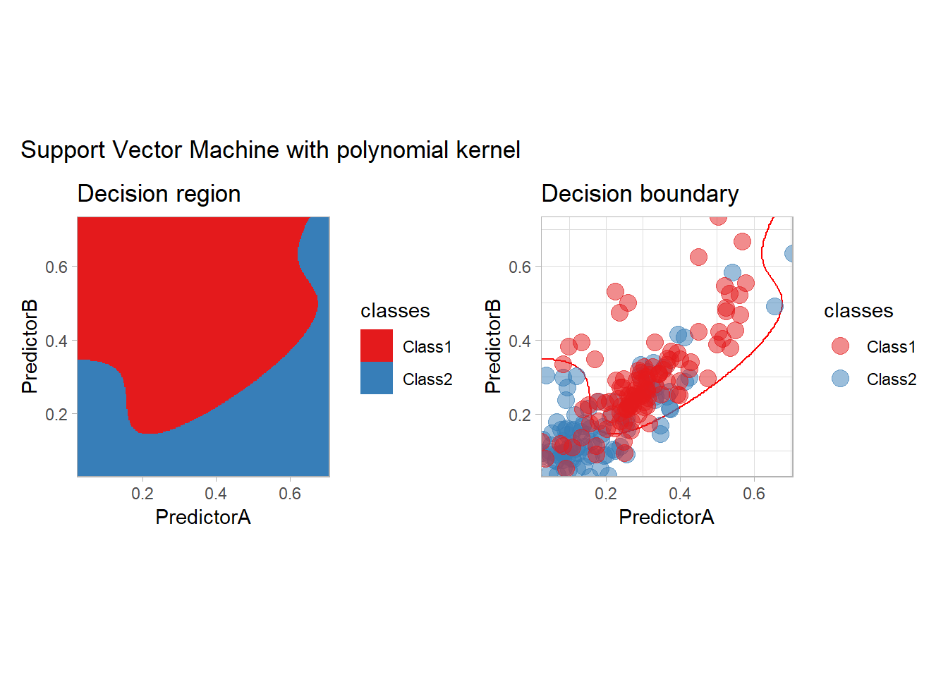
- or a Gaussian kernel for example
workflow_ <- preprocess |>
  add_model(svm_rbf(mode = "classification") |>
              set_engine("kernlab"))

all_metrics <- all_metrics |>
  learn_display_and_add("Support Vector Machine with Gaussian kernel", workflow_)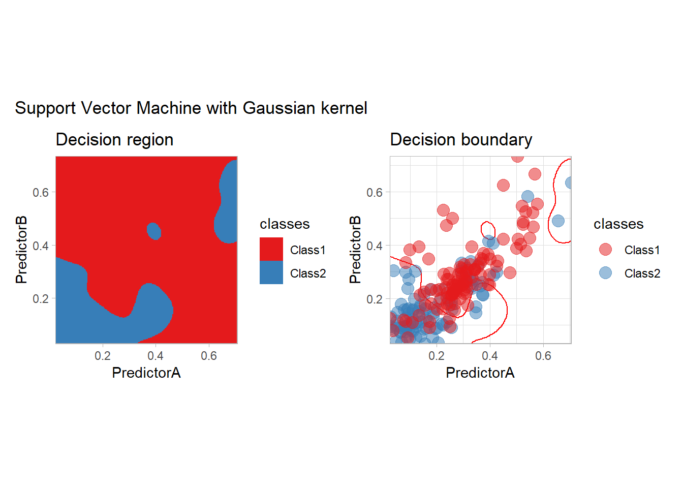
Trees and Boosting
We conclude this model exploration by some tree base methods: plain tree (CART), bagging, random forest, boosting with C5.0 and XGBoost…
workflow_ <- preprocess |>
  add_model(decision_tree(mode = "classification",
                          min_n = 5, cost_complexity = 0.02))

all_metrics <- all_metrics |>
  learn_display_and_add("CART", workflow_)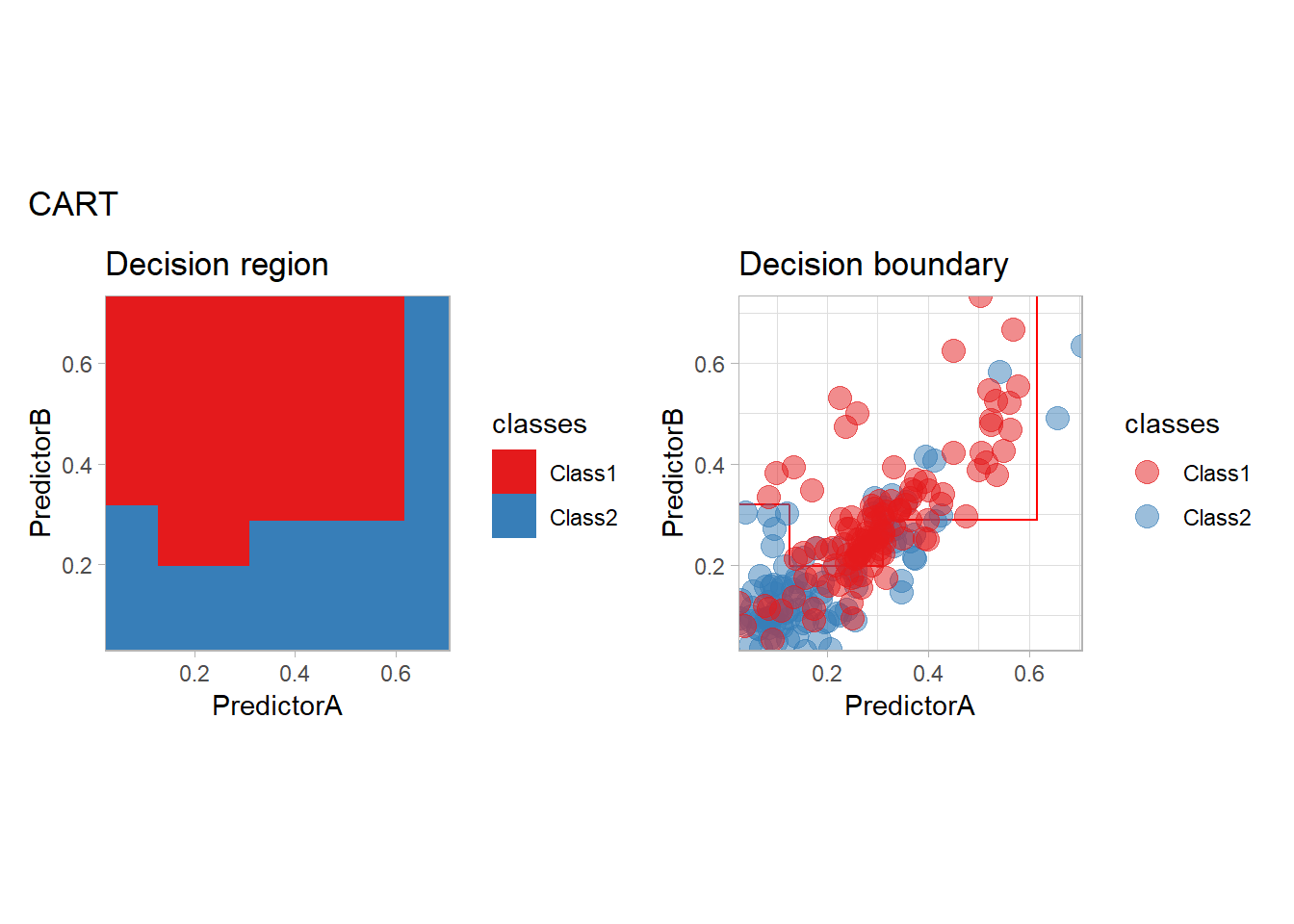
library(rpart.plot)
fit_ <- workflow_ |> fit(twoClass)
model_ <- fit_ |> extract_fit_parsnip()
rpart.plot(model_$fit, roundint = FALSE)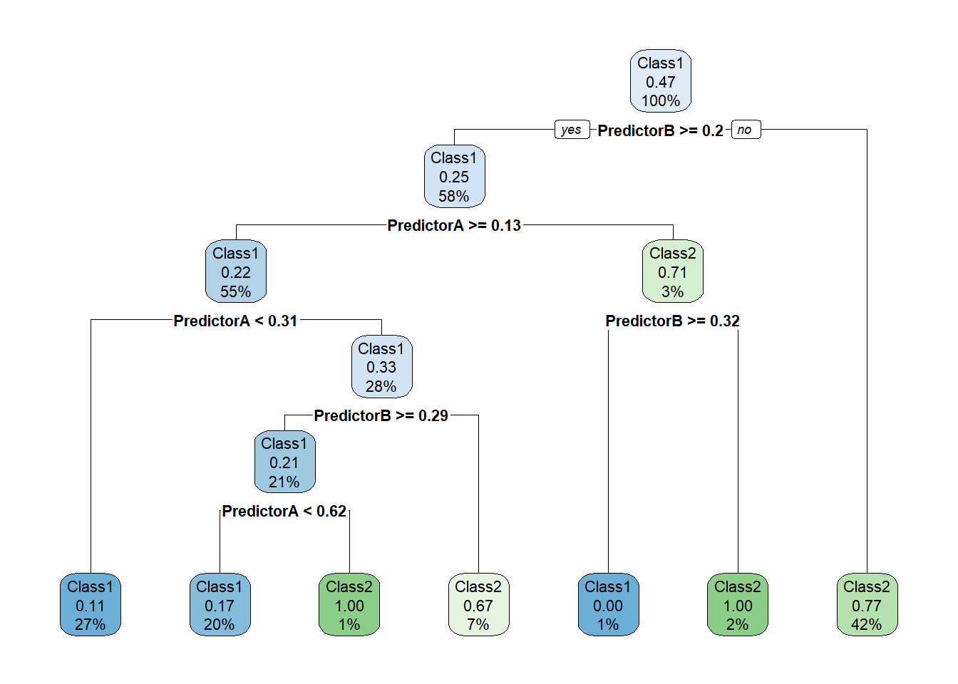
prp(model_$fit, type = 2, extra = 106, nn = TRUE, fallen.leaves = TRUE,
    box.col = twoClassColor[model_$fit$frame$yval], roundint=FALSE)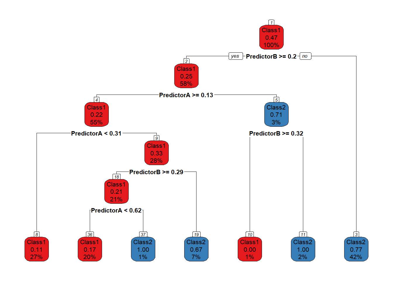
library(baguette)
workflow_ <- preprocess |>
  add_model(bag_tree(mode = "classification",
                     tree_depth = 5) |>
              set_engine("rpart", times = 20))

all_metrics <- all_metrics |>
  learn_display_and_add("Bagging", workflow_)
workflow_ <- preprocess |>
  add_model(rand_forest(mode = "classification",
                          trees = 500, mtry = 2))

all_metrics <- all_metrics |>
  learn_display_and_add("Random Forest", workflow_)
workflow_ <- preprocess |>
  add_model(boost_tree(mode = "classification") |>
              set_engine("C5.0"))

all_metrics <- all_metrics |>
  learn_display_and_add("C5.0", workflow_)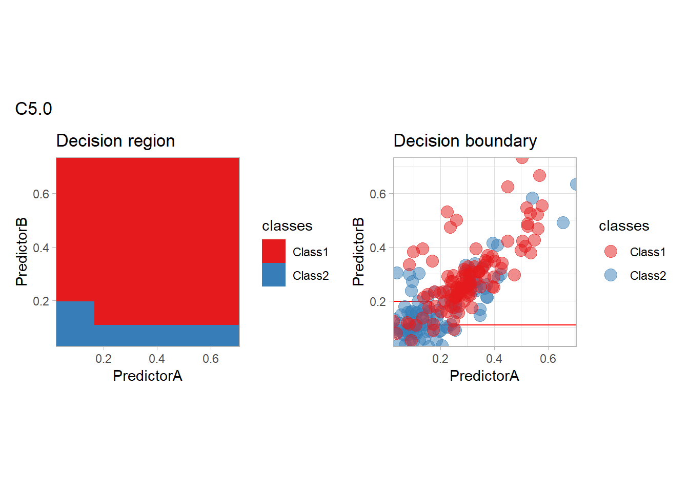
workflow_ <- preprocess |>
  add_model(boost_tree(mode = "classification"))

all_metrics <- all_metrics |>
  learn_display_and_add("XGBoost Tree", workflow_)
Model comparison
We will now compare our model according to 4 criterion:
- Empirical: the naive empirical accuracy computed on the same dataset than the one used to learn the classifier,
- CV: the mean of the accuracies obtained by the resampling scheme,
- Pessimistic CV: a lower bound on the mean accuracy obtained by substracting to the average accuracy two times the standard deviation divided by the square root of the number of resamples.
- PAC CV: a highly probably bound on the accuracy obtained by substracting to the average accuracy the standard deviation.
Global comparison
We can display those values for all our methods:
compute_metrics_summary_long <- function(metrics) {
  metrics <- metrics |> mutate(.model = forcats::fct_inorder(.model))

  metrics_summary <- metrics |>
    group_by(.model, .metric, .type = if_else(id == "None", "Empirical", "CV")) |>
    summarize(.mean = mean(.estimate), .sd = sd(.estimate), .n = n(),
            .groups = "drop") |>
    mutate(.mean_conf = .mean - 2 * .sd / sqrt(.n),
         .mean_pac = .mean - .sd)

  metrics_summary_wide <- metrics_summary |>
    select(- .n, - .sd) |>
    pivot_wider(names_from = .type, values_from = c(.mean, .mean_conf, .mean_pac))

  metrics_summary_long <- metrics_summary_wide |>
    pivot_longer(cols = c(- .model, -.metric), names_to = c(".type"), values_to = ".value") |>
    filter(!is.na(.value))

  metrics_summary_long
}

all_metrics_summary_long <- compute_metrics_summary_long(all_metrics)

simplify_type_names <- function(type)
{
  type_simpler_names = c(".mean_Empirical" = "Empirical",
                  ".mean_CV" = "CV",
                  ".mean_conf_CV" = "Pessimistic CV",
                  ".mean_pac_CV" = "PAC CV")
  type_simpler_names[type] |>
    factor(level = type_simpler_names)
}

  c(".mean_Empirical" = "Empirical",
                         ".mean_CV" = "CV",
                         ".mean_conf_CV" = "Pessimistic CV",
                         ".mean_pac_CV" = "PAC CV")
## .mean_Empirical .mean_CV .mean_conf_CV .mean_pac_CV
## "Empirical" "CV" "Pessimistic CV" "PAC CV"type_colors = c("Empirical" = "red", "CV" = "blue", "Pessimistic CV" = "green", "PAC CV" = "purple")
plot_accuracy <- function(all_metrics_summary_long, simple = FALSE)
{
df_ <- all_metrics_summary_long |>
filter(.metric == "accuracy") |>
mutate(.type = simplify_type_names(.type))
if (simple) {
df_ <- df_ |>
filter(.type %in% c("Empirical", "CV"))
}
df_ |>
ggplot(aes(x = .model, y = .value, color = .type)) +
geom_point(size = 5) +
scale_color_manual(values = type_colors, name = NULL) +
scale_y_continuous(name = "Accuracy", limits = c(0, 1), expand = expansion()) +
scale_x_discrete(name = "Method") +
theme_light() +
theme(axis.text.x = element_text(angle = 45, hjust = 1),
plot.margin = grid::unit(c(1, 1, .5, 1.5), "lines"))
}
plot_accuracy(all_metrics_summary_long)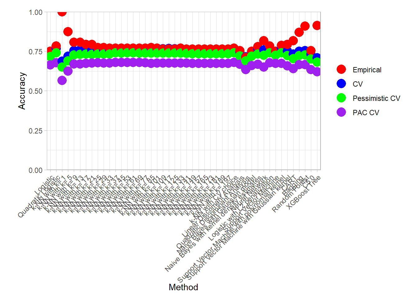
plot_accuracy(all_metrics_summary_long, simple = TRUE)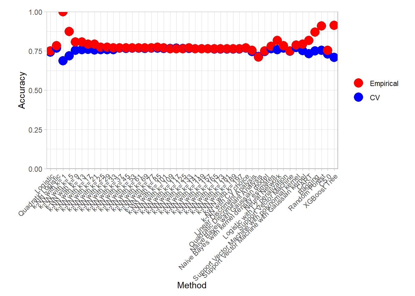
We can also display the best models for all those criterion:
find_best <- function(all_metrics_summary_long) {
  all_metrics_summary_long |>
    group_by(.metric, .type) |>
    slice_max(.value, n = 1) |>
    mutate(.type = simplify_type_names(.type)) |>
    arrange(.metric, .type)
}

find_best(all_metrics_summary_long)
## # A tibble: 14 × 4
## # Groups: .metric, .type [12]
## .model .metric .type .value
## <fct> <chr> <fct> <dbl>
## 1 k-NN with k= 1 accuracy Empirical 1
## 2 Support Vector Machine with polynomial kernel accuracy CV 0.771
## 3 Support Vector Machine with polynomial kernel accuracy Pessimistic… 0.740
## 4 k-NN with k= 37 accuracy PAC CV 0.680
## 5 k-NN with k= 53 accuracy PAC CV 0.680
## 6 k-NN with CV choice accuracy PAC CV 0.680
## 7 k-NN with k= 197 brier_class Empirical 0.197
## 8 k-NN with k= 1 brier_class CV 0.312
## 9 k-NN with k= 1 brier_class Pessimistic… 0.273
## 10 k-NN with k= 1 brier_class PAC CV 0.190
## 11 k-NN with k= 1 roc_auc Empirical 1
## 12 k-NN with k= 53 roc_auc CV 0.815
## 13 Naive Bayes with kernel density estimates roc_auc Pessimistic… 0.783
## 14 Naive Bayes with kernel density estimates roc_auc PAC CV 0.717find_best(all_metrics_summary_long) |> filter(.metric == "accuracy")## # A tibble: 6 × 4
## # Groups: .metric, .type [4]
## .model .metric .type .value
## <fct> <chr> <fct> <dbl>
## 1 k-NN with k= 1 accuracy Empirical 1
## 2 Support Vector Machine with polynomial kernel accuracy CV 0.771
## 3 Support Vector Machine with polynomial kernel accuracy Pessimistic CV 0.740
## 4 k-NN with k= 37 accuracy PAC CV 0.680
## 5 k-NN with k= 53 accuracy PAC CV 0.680
## 6 k-NN with CV choice accuracy PAC CV 0.680An interesting plot to assess the variability of the Cross Validation result is the following parallel plot in which an error is computed for each resample in addition to the mean.
df_ <- all_metrics |>
  mutate(.model = forcats::fct_inorder(.model)) |>
  filter(.metric == "accuracy") |>
  filter(id != "None" )
df_ |>
  ggplot(aes(x = .model, y = .estimate)) +
  geom_line(aes(color = id, group = id)) +
  scale_color_grey(guide = FALSE) +
  scale_x_discrete(name = "Method") +
  scale_y_continuous(name = "Accuracy", limits = c(0, 1), expand = expansion()) +
  geom_line(data = df_ |>
              summarize(.estimate = mean(.estimate), .by = .model),
            group = 1,
            linewidth = 1.5) +
  theme_light() +
  theme(axis.text.x = element_text(angle = 45, hjust = 1),
        plot.margin = grid::unit(c(1, 1, .5, 1.5), "lines"))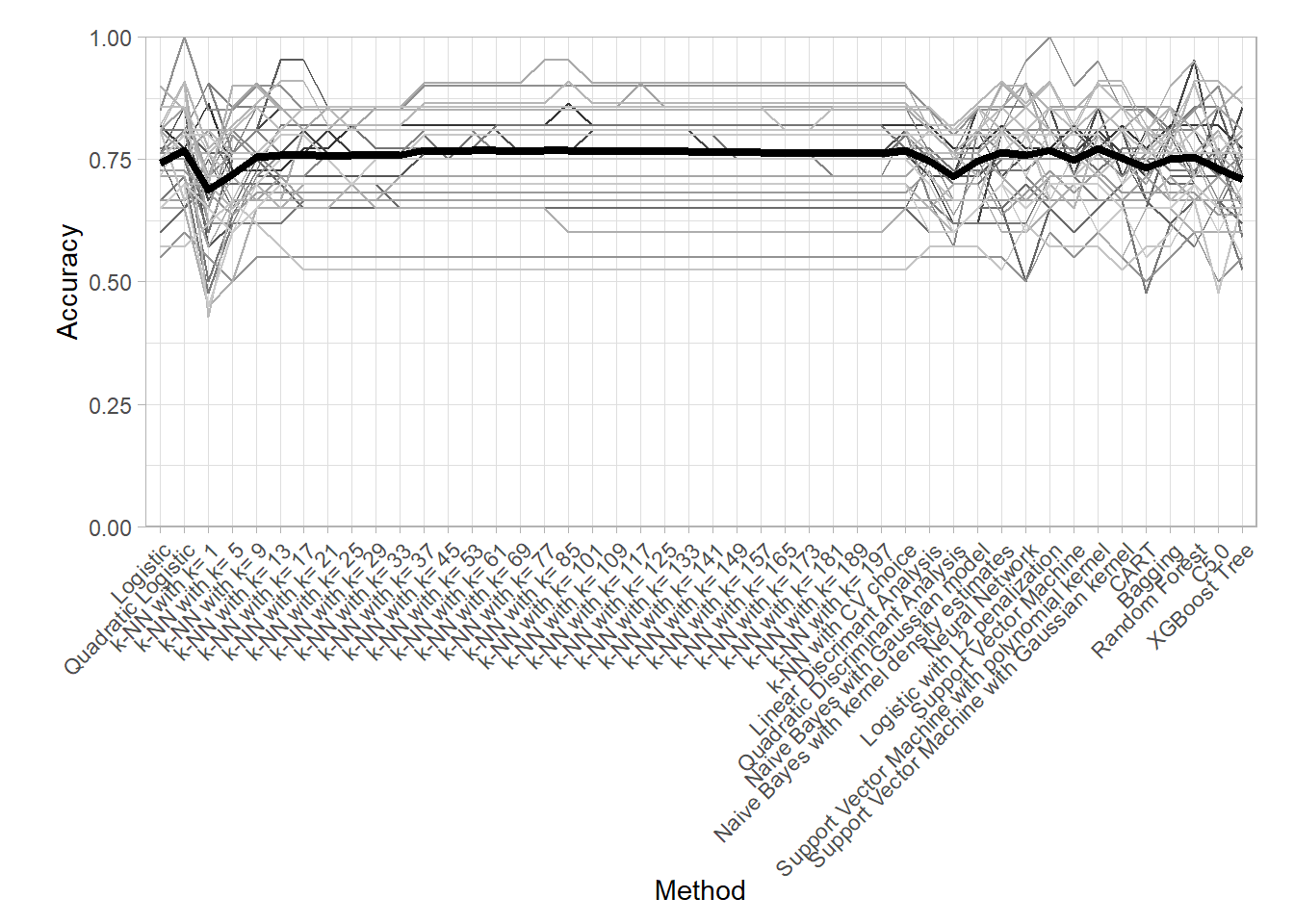
K-NN Comparison
We focus here on the choice of the neighborhood in the \(k\) Nearest Neighbor method.
knn_metrics_summary_long <- all_metrics_summary_long |>
  filter(str_starts(.model, "k-NN")) |>
  filter(!str_detect(.model, "CV"))

knn_metrics_summary_long |>
  plot_accuracy()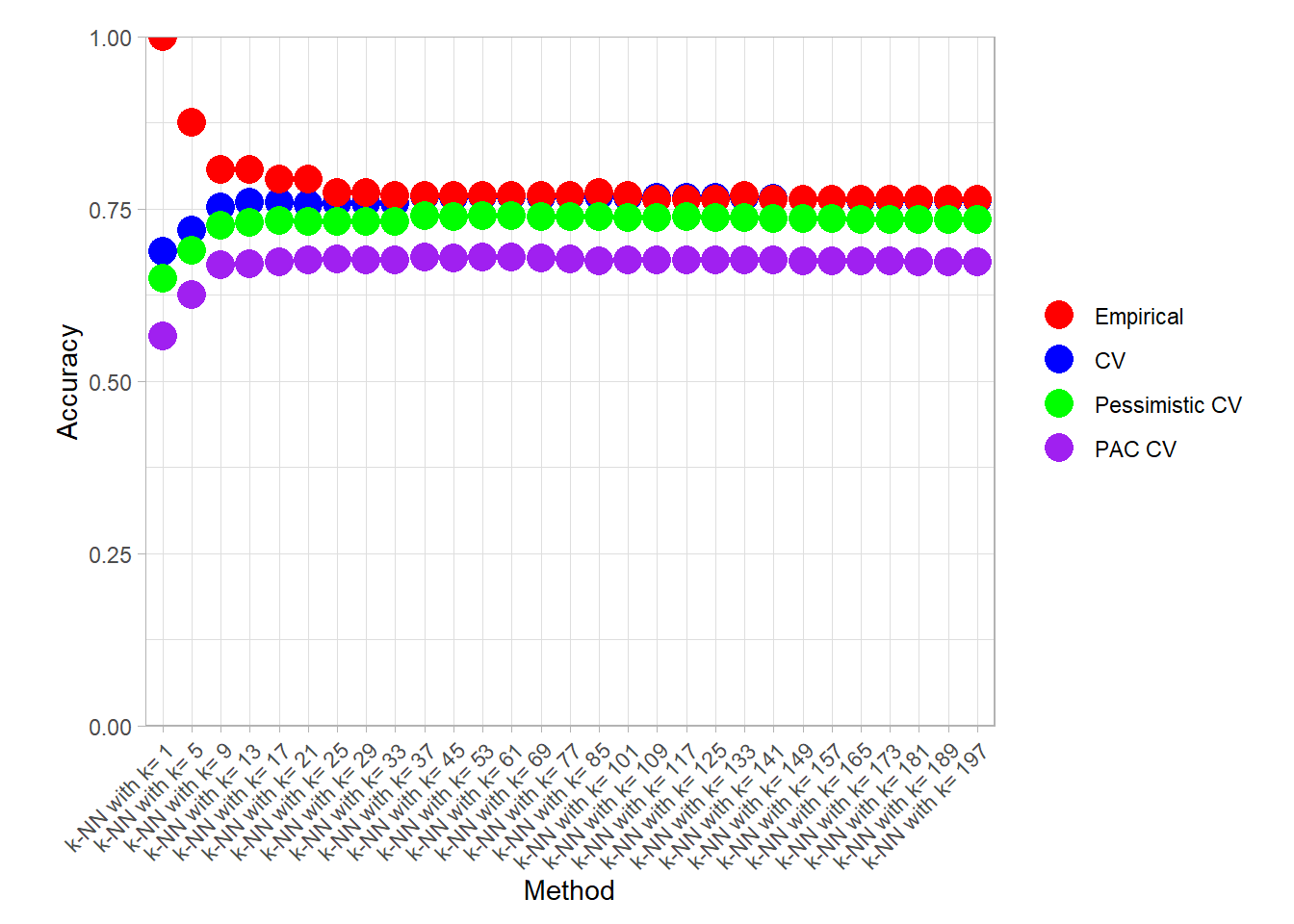
knn_metrics_summary_long |>
  find_best() |> filter(.metric == "accuracy")
## # A tibble: 6 × 4
## # Groups: .metric, .type [4]
## .model .metric .type .value
## <fct> <chr> <fct> <dbl>
## 1 k-NN with k= 1 accuracy Empirical 1
## 2 k-NN with k= 85 accuracy CV 0.768
## 3 k-NN with k= 37 accuracy Pessimistic CV 0.740
## 4 k-NN with k= 53 accuracy Pessimistic CV 0.740
## 5 k-NN with k= 37 accuracy PAC CV 0.680
## 6 k-NN with k= 53 accuracy PAC CV 0.680knn_metrics_summary_long |>
plot_accuracy(simple = TRUE)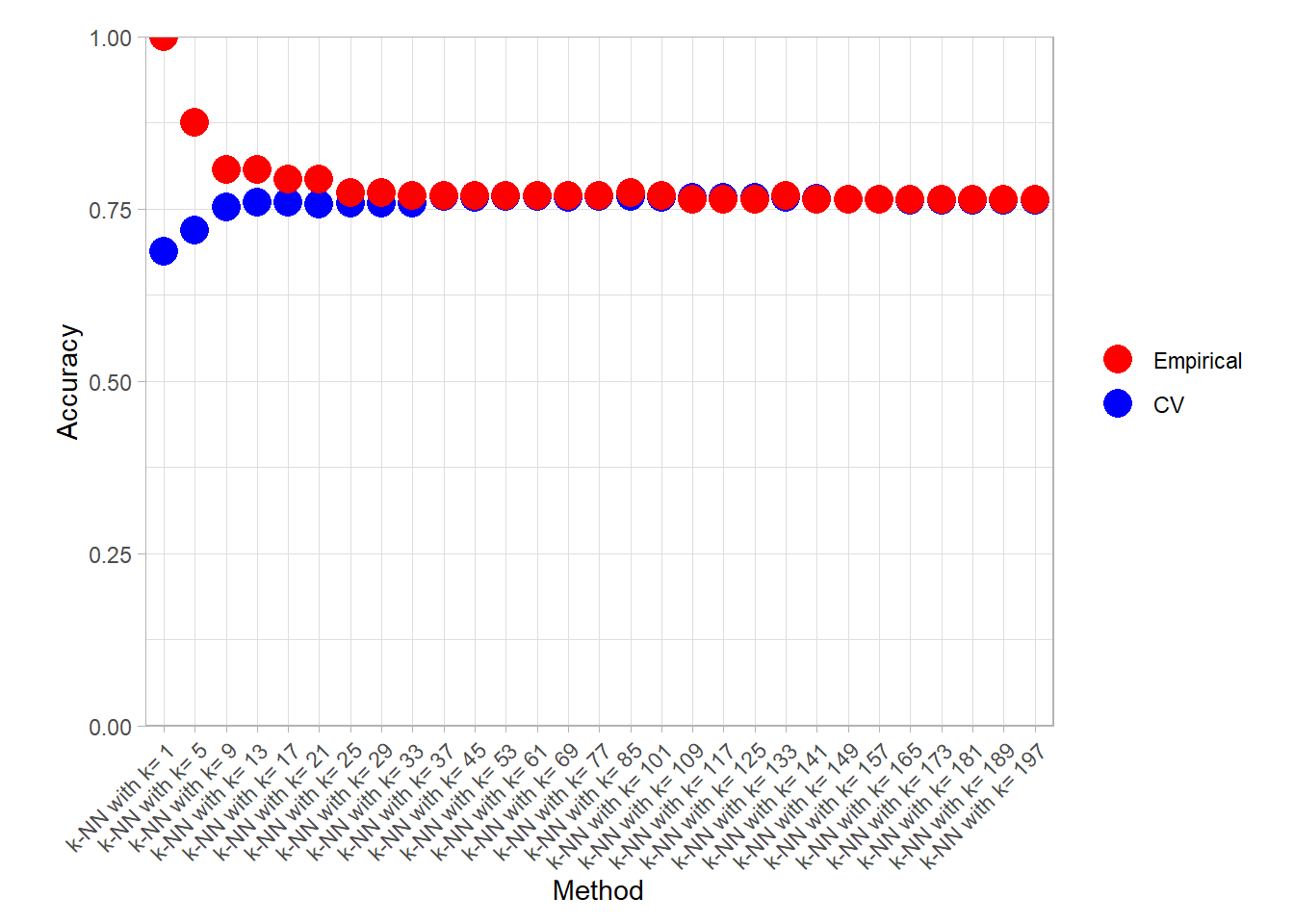
knn_metrics_summary_long |>
  find_best() |> filter(.type %in% c("Empirical", "CV"))
## # A tibble: 6 × 4
## # Groups: .metric, .type [6]
## .model .metric .type .value
## <fct> <chr> <fct> <dbl>
## 1 k-NN with k= 1 accuracy Empirical 1
## 2 k-NN with k= 85 accuracy CV 0.768
## 3 k-NN with k= 197 brier_class Empirical 0.197
## 4 k-NN with k= 1 brier_class CV 0.312
## 5 k-NN with k= 1 roc_auc Empirical 1
## 6 k-NN with k= 53 roc_auc CV 0.815Bonus: CART variability
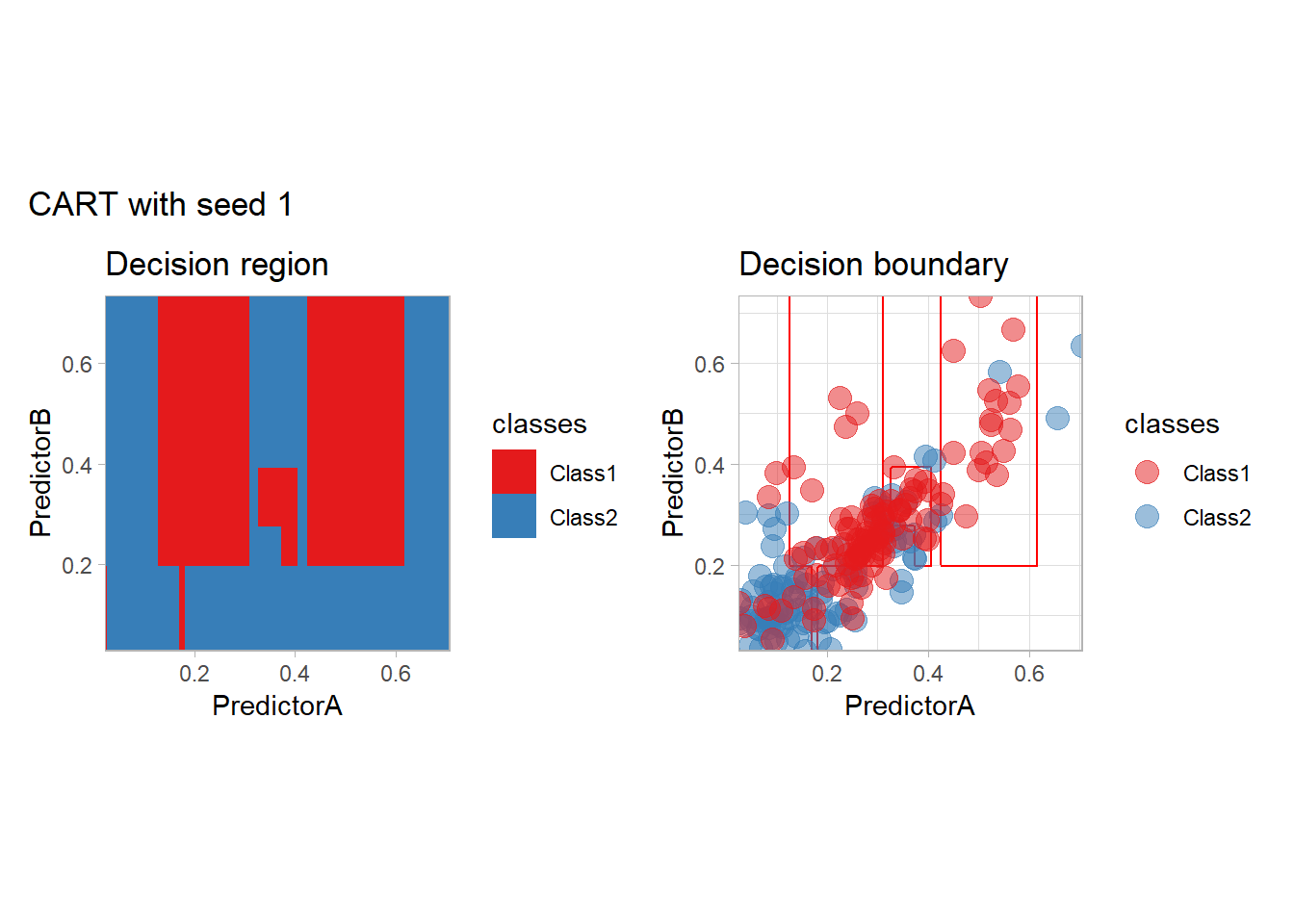
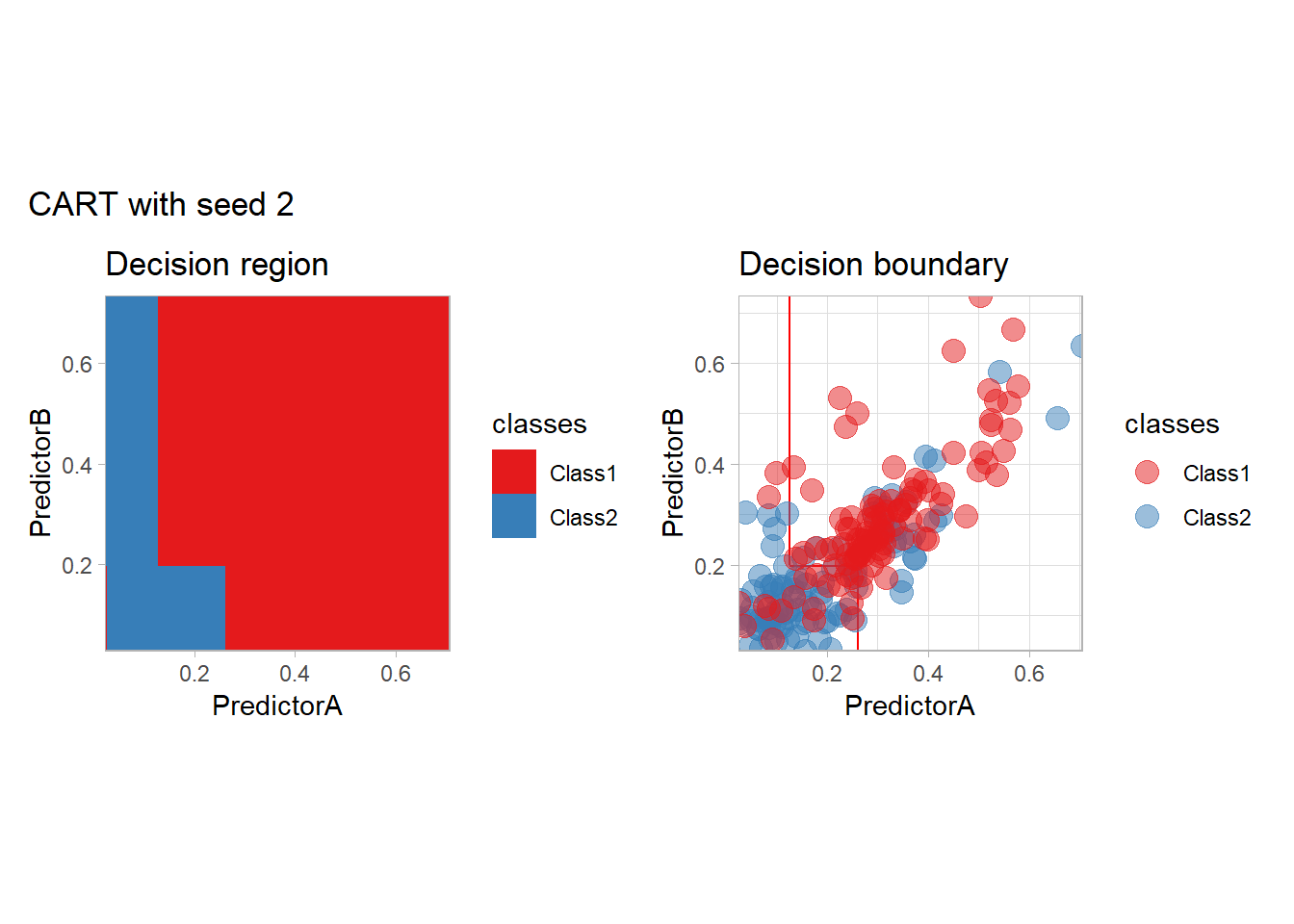
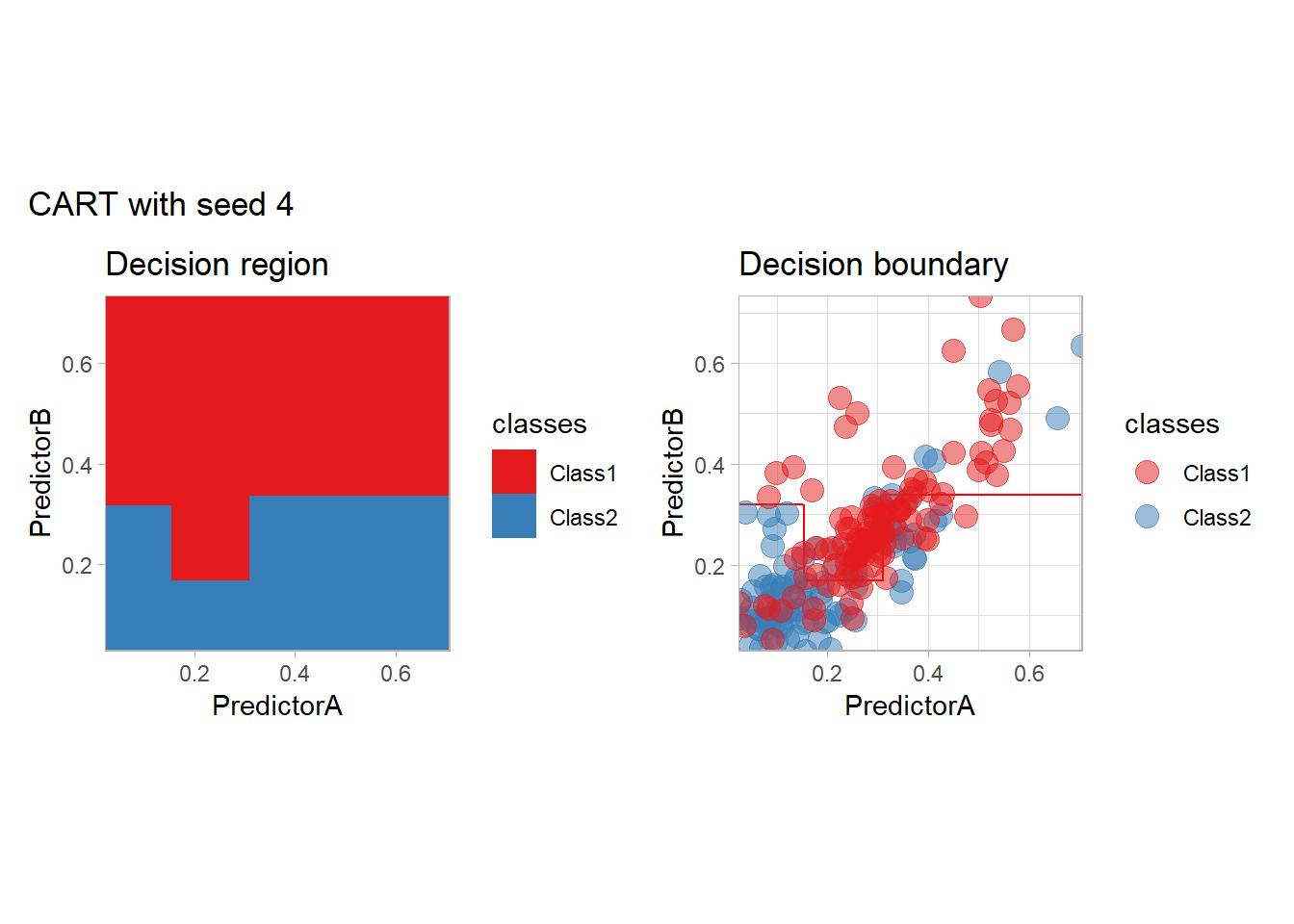
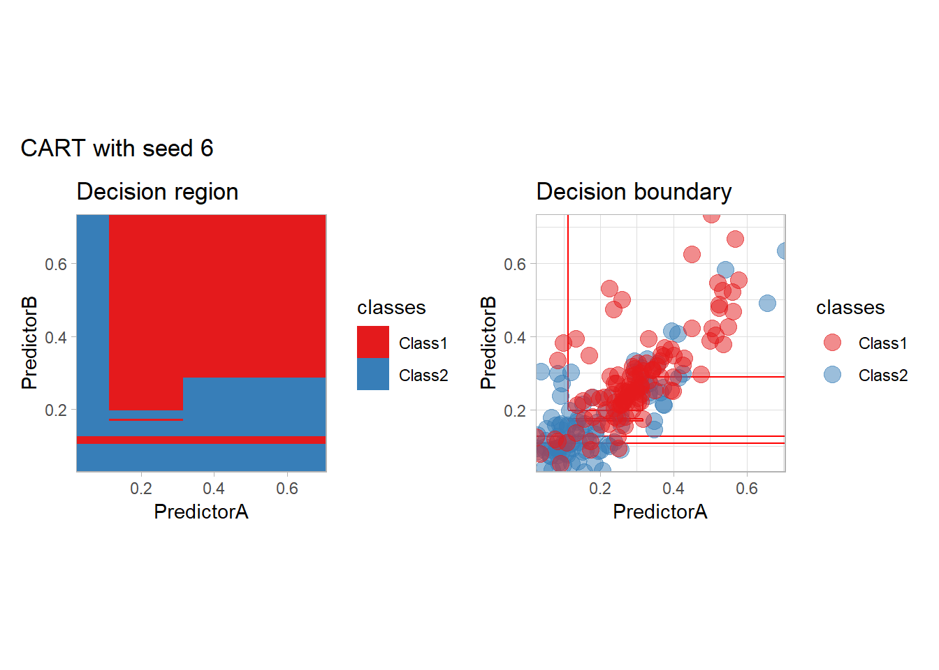
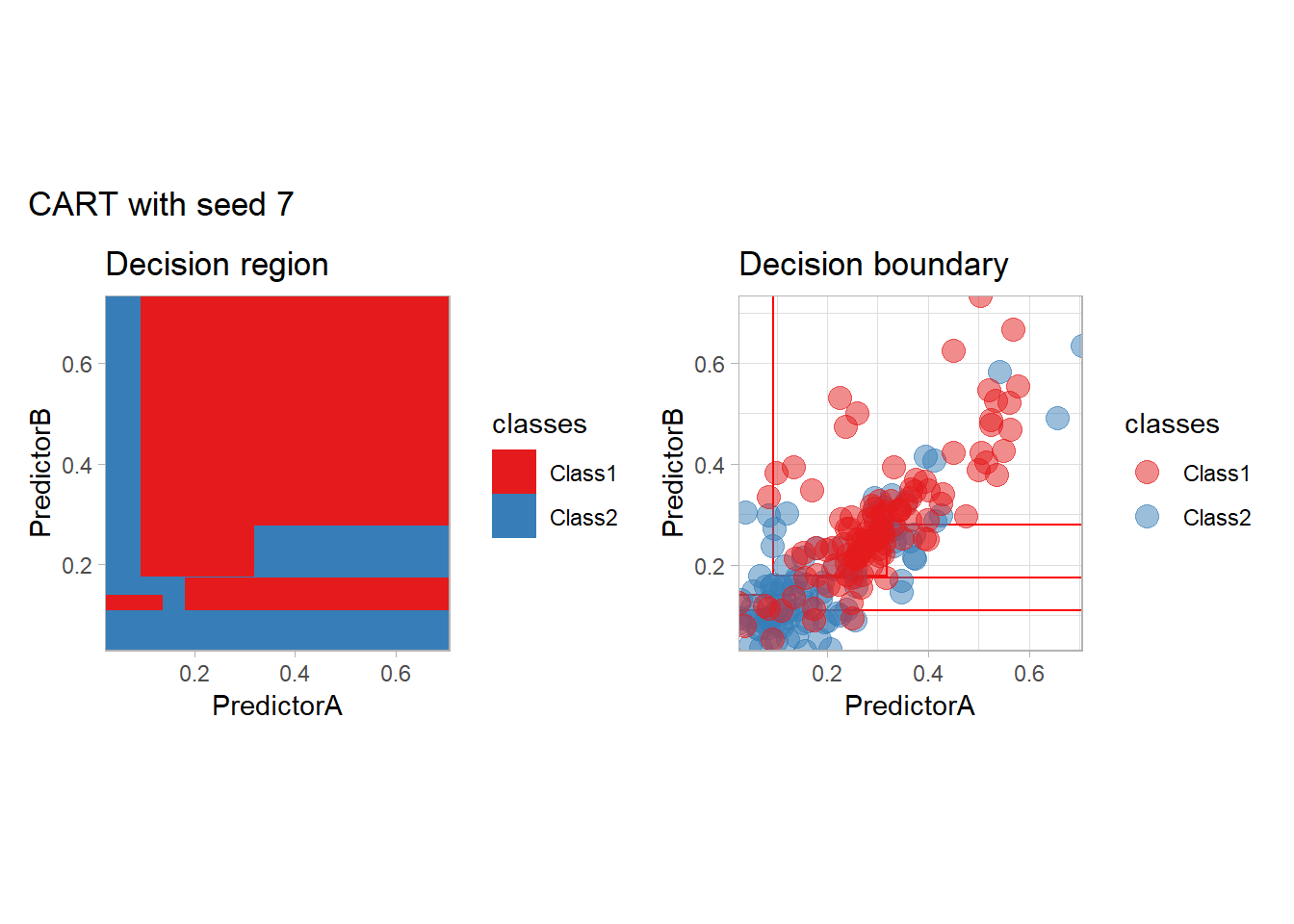
One of the issue of the CART method as that the predictor is quite unstable : it can change a lot when the data is slightly changed. Here we train the CART with bootstrapped versions of the original dataset:
workflow_ <- preprocess |>
  add_model(decision_tree(mode = "classification",
                          min_n = 5, cost_complexity = 0.02))

for (i in 1:9){
  set.seed(i*42)
  twoClass_boot <- twoClass |> slice_sample(prop = 1, replace = TRUE)
  print(plot_grid(workflow_ |> fit(twoClass_boot),
                  paste("CART with seed", i)))
}


Bonus : CV variability
We illustrate here the variability of the accuracy estimated by V-folds cross-validation. Each boxplot corresponds to a repetition of a 10-folds cross-validation for the same (SVM with a polynomial kernel) method.
set.seed(42)
more_folds <- vfold_cv(twoClass, v = 10, repeats = 10, strata = classes)
workflow_ <- preprocess |>
  add_model(svm_poly(mode = "classification", degree = 3) |>
  set_engine("kernlab"))

resamples_ <- workflow_ |> fit_resamples(more_folds)
metrics_ <- resamples_ |>
  collect_metrics(summarize = FALSE)

metrics_ |>
  filter(.metric == "accuracy") |>
  ggplot(aes(x = id, y = .estimate)) +
  geom_boxplot() +
  geom_point() +
  scale_y_continuous(name = "accuracy", limits = c(0,1), expand = expansion()) +
  scale_x_discrete(name = NULL) +
  theme_light()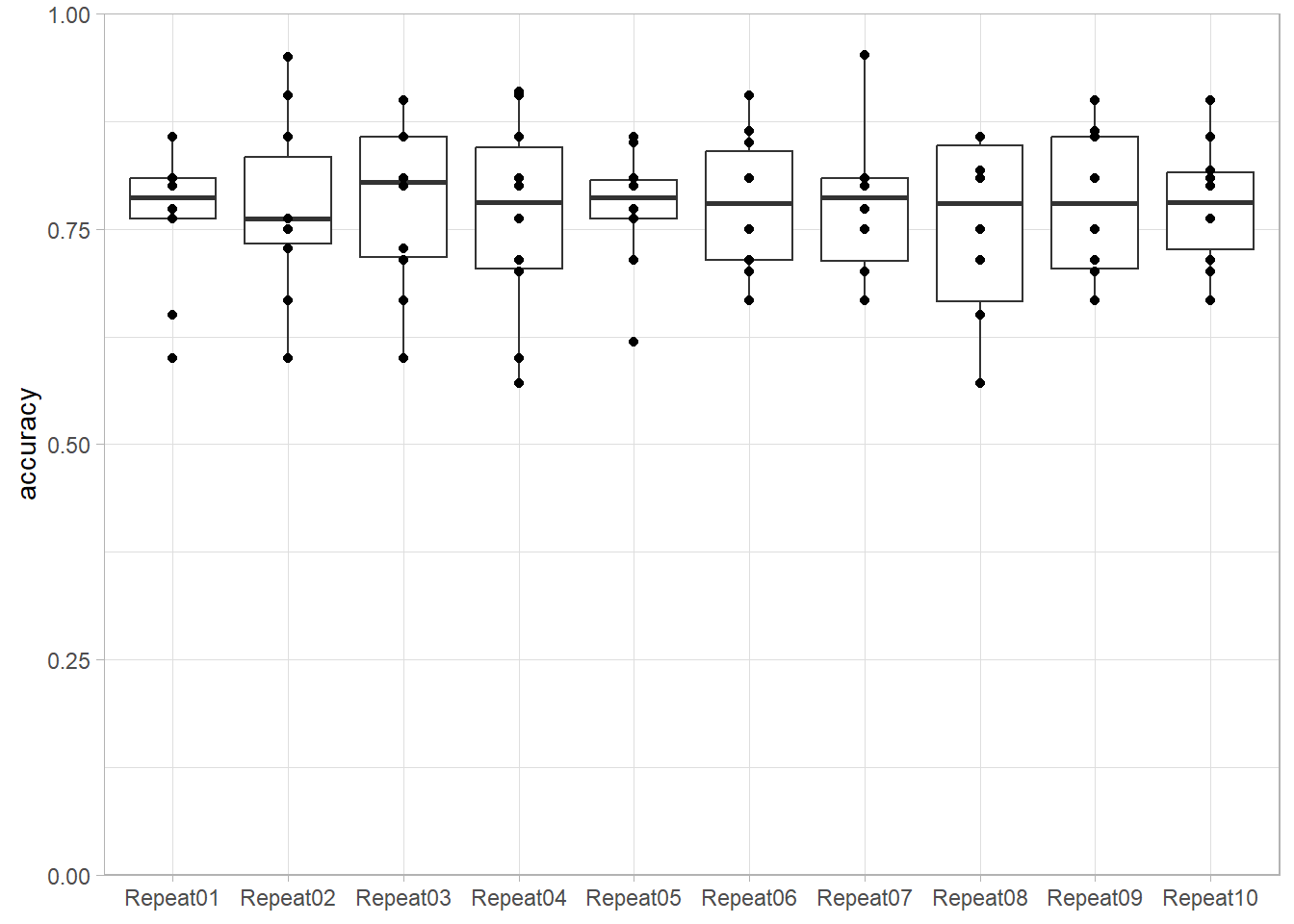
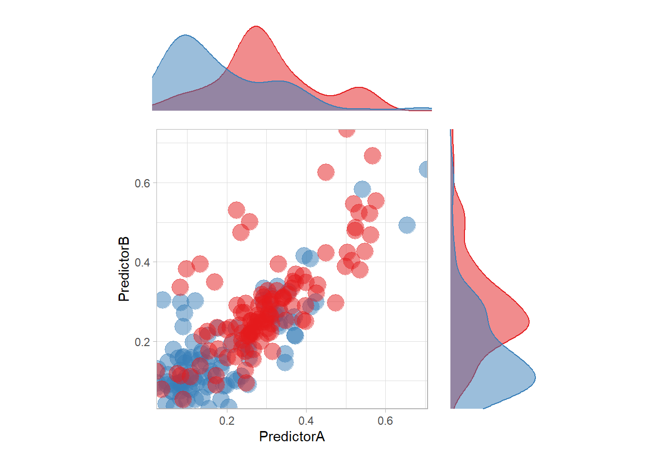
Bonus: Naive Bayes with kernel density estimates
The most surprising predictor is probably this one. In particular, there is a strange blue zone in the top left… that can be explained by the density of each feature:
p <- ggplot(data = twoClass,aes(x = PredictorA, y = PredictorB)) +
  geom_point(aes(color = classes), size = 6, alpha = .5) +
  scale_colour_manual(name = 'classes', values = twoClassColor) +
  scale_x_continuous(expand = c(0,0)) +
  scale_y_continuous(expand = c(0,0)) +
  coord_equal() +
  theme_light() +
  guides(color = "none")

ptop <- ggplot(data = twoClass,aes(x = PredictorA)) +
  geom_density(aes(color = classes, fill = classes), alpha = .5) +
  guides(color = "none", fill = "none") +
  scale_colour_manual(name = 'classes', values = twoClassColor) +
  scale_fill_manual(name = 'classes', values = twoClassColor) +
  theme_void() +
  scale_x_continuous(expand = c(0,0))

pright <- ggplot(data = twoClass,aes(y = PredictorB)) +
  geom_density(aes(color = classes, fill = classes), alpha = .5) +
  guides(color = "none", fill = "none") +
  scale_color_manual(name = 'classes', values = twoClassColor) +
  scale_fill_manual(name = 'classes', values = twoClassColor) +
  theme_void() +
  scale_y_continuous(expand = c(0,0))

(ptop +
    patchwork::plot_spacer()+ p + pright) +
  plot_layout(guides = "collect",
              ncol = 2,
              heights = unit(c(.2, .6), "snpc"),
              widths = unit(c(.6, .2), "snpc"))