Visualization Examples
library("tidyverse")Visualization issues
Anscombe quartet
anscombeL <- anscombe  |>
  pivot_longer(everything(),
    names_to = c(".value", "example"),
    names_pattern = "(.)(.)"
  )
ggplot() +
annotation_custom(gridExtra::tableGrob(anscombe |>
select(
x1, y1, x2, y2,
x3, y3, x4, y4
))) +
theme_minimal() +
labs(title = "Anscombe Quartet")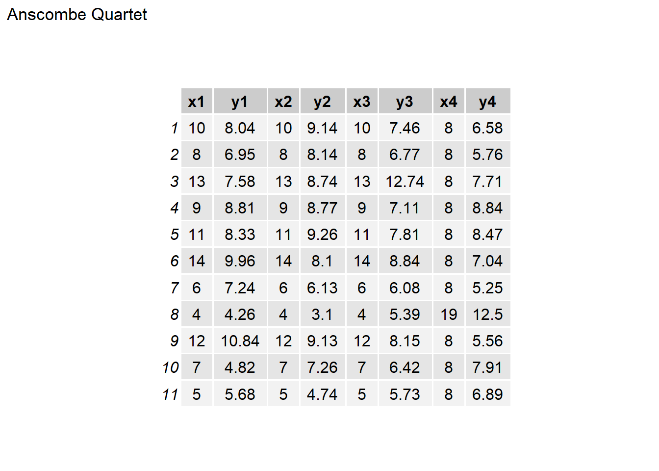
ggplot(data = anscombeL, aes(x = x, y = y)) +
  geom_smooth(method = "lm", fullrange = TRUE) +
  facet_wrap(~example, ncol = 2) +
  labs(
    title = "Anscombe Quartet",
    subtitle = "Linear regression with confidence bar and points"
  ) +
  theme_minimal()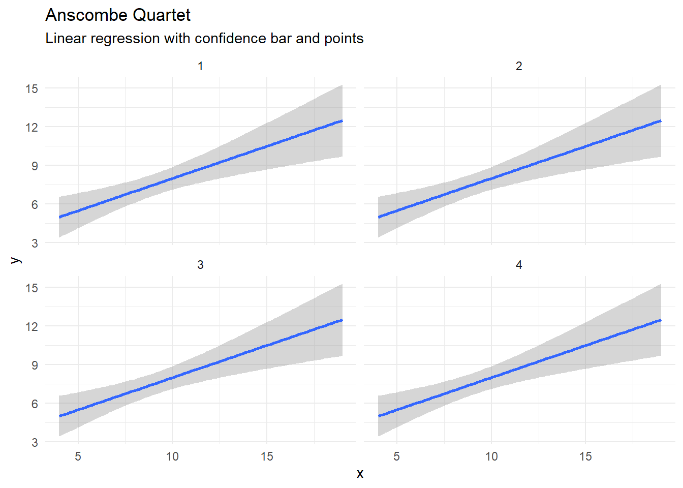
ggplot(data = anscombeL, aes(x = x, y = y)) +
  geom_point() +
  geom_smooth(method = "lm", fullrange = TRUE) +
  facet_wrap(~example, ncol = 2) +
  labs(
    title = "Anscombe Quartet",
    subtitle = "Linear regression with confidence bar"
  ) +
  theme_minimal()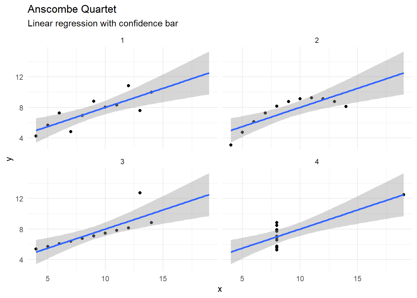
Bad pie

pie_stats <- function(df, x0, y0, r0, r1, amount, explode, label_perc) {
df |>
mutate(
x0 = {{ x0 }},
y0 = {{ y0 }},
r0 = {{ r0 }},
r1 = {{ r1 }},
`explode` = {{ explode }}
) |>
group_by(x0, y0) |>
mutate(end = cumsum({{ amount }}) / sum({{ amount }}) * 2 * pi) |>
mutate(start = lag(end, default = 0)) |>
ungroup() |>
mutate(
x_lab = (x0) +
((r0) + label_perc * ((r1) - (r0)) + (explode)) *
sin((end + start) / 2),
y_lab = (y0) +
((r0) + label_perc * ((r1) - (r0)) + (explode)) *
cos((end + start) / 2)
)
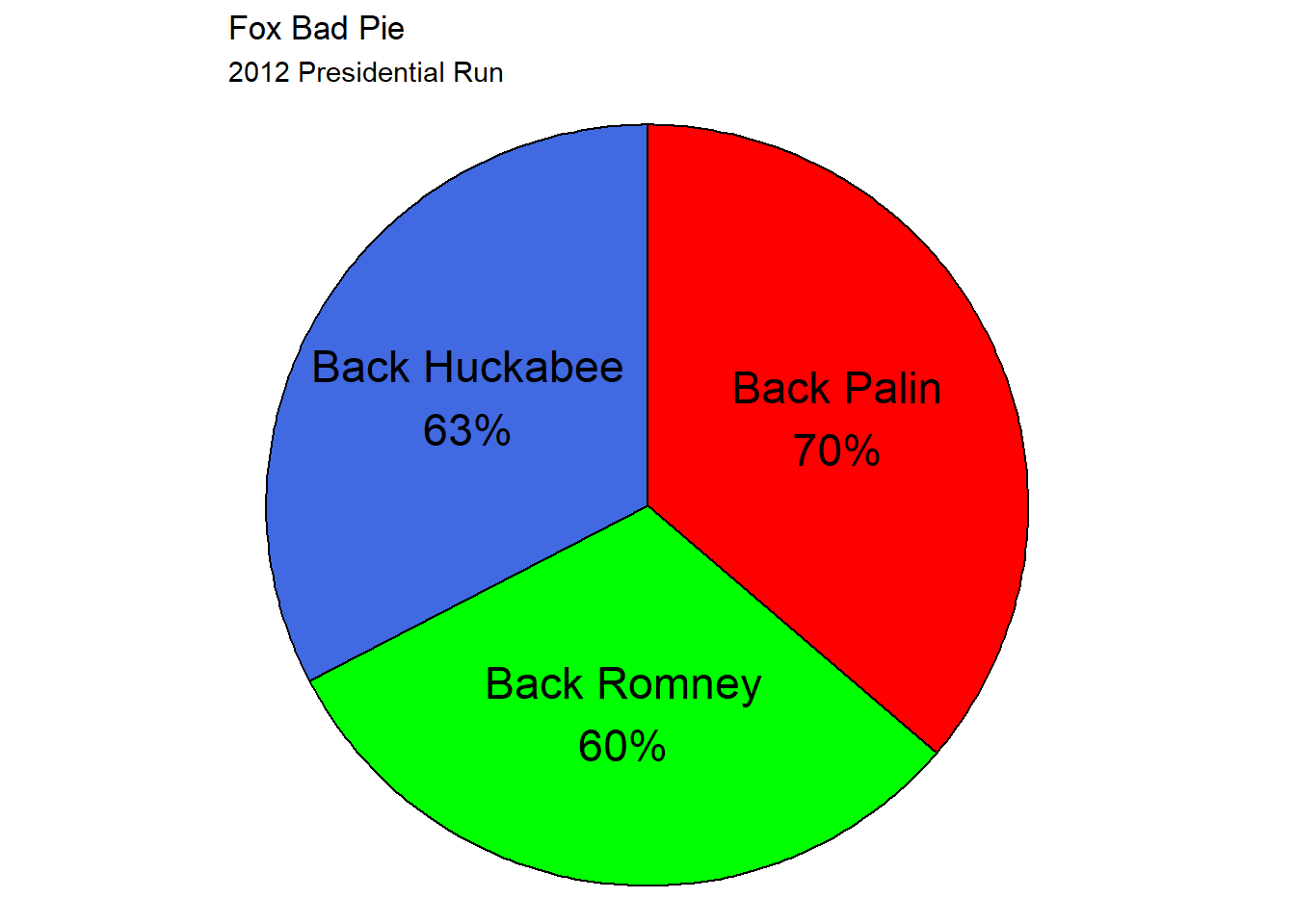
}data_pie_fox <- tribble(
~candidate, ~percent,
"Palin", 70,
"Romney", 60,
"Huckabee", 63
)
data_pie_fox_pie <- data_pie_fox |>
pie_stats(0, 0, 0, 1, percent, FALSE, .55)ggplot(data_pie_fox_pie) +
ggforce::geom_arc_bar(aes(
x0 = x0, y0 = y0,
r0 = r0, r = r1,
start = start, end = end,
fill = candidate
)) +
geom_text(
aes(
x = x_lab, y = y_lab,
label = glue::glue("Back {candidate}\n{scales::percent(percent/100)}")
),
size = 6
) +
guides(fill = "none") +
scale_fill_manual(values = c(
"Huckabee" = "royalblue",
"Palin" = "red",
"Romney" = "green"
)) +
theme_void() + coord_equal() +
labs(
title = "Fox Bad Pie",
subtitle = "2012 Presidential Run"
)
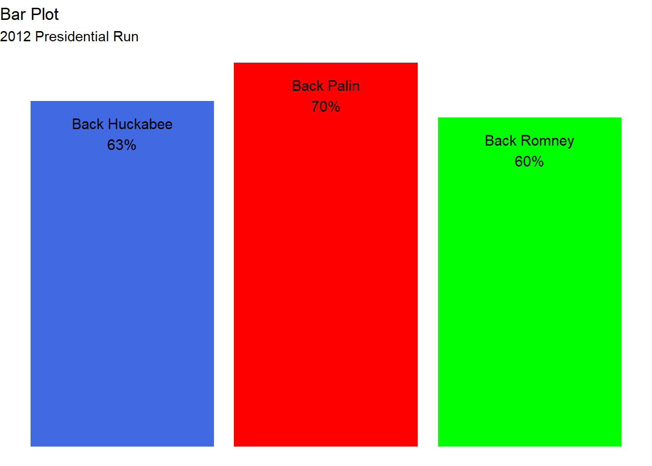
ggplot(data = data_pie_fox) +
  geom_col(aes(
    x = candidate, y = percent,
    fill = candidate
  )) +
  geom_text(
    aes(
      x = candidate, y = percent,
      label = glue::glue("Back {candidate}\n{scales::percent(percent/100)}")
    ),
    size = 4,
    vjust = 1.5
  ) +
  scale_fill_manual(values = c(
    "Huckabee" = "royalblue",
    "Palin" = "red",
    "Romney" = "green"
  )) +
  guides(fill = "none") +
  theme_void() +
  labs(
    title = "Bar Plot",
    subtitle = "2012 Presidential Run"
  )
Scale issue

fox_gas <- tribble(
  ~date, ~price, ~in_fox,
  "08/02/2012", 3.57, TRUE,
  "01/02/2012", 3.51, TRUE,
  "01/02/2011", 3.17, TRUE,
  "01/01/2012", 3.34, FALSE,
  "01/12/2011", 3.30, FALSE,
  "01/11/2011", 3.36, FALSE,
  "01/10/2011", 3.43, FALSE,
  "01/09/2011", 3.56, FALSE,
  "01/08/2011", 3.57, FALSE,
  "01/07/2011", 3.58, FALSE,
  "01/06/2011", 3.60, FALSE,
  "01/05/2011", 3.92, FALSE,
  "01/04/2011", 3.78, FALSE,
  "01/03/2011", 3.54, FALSE
) |>
  mutate(date = lubridate::dmy(date))
ggplot(fox_gas |> filter(in_fox)) +
geom_line(aes(
x = as.factor(date),
y = price,
group = 1
)) +
scale_x_discrete(labels = c(
"Last Year", "Last Week",
"Current"
)) +
labs(
x = NULL,
y = "Price",
title = "Cost of Gas",
subtitle = "Fox"
) +
theme_minimal()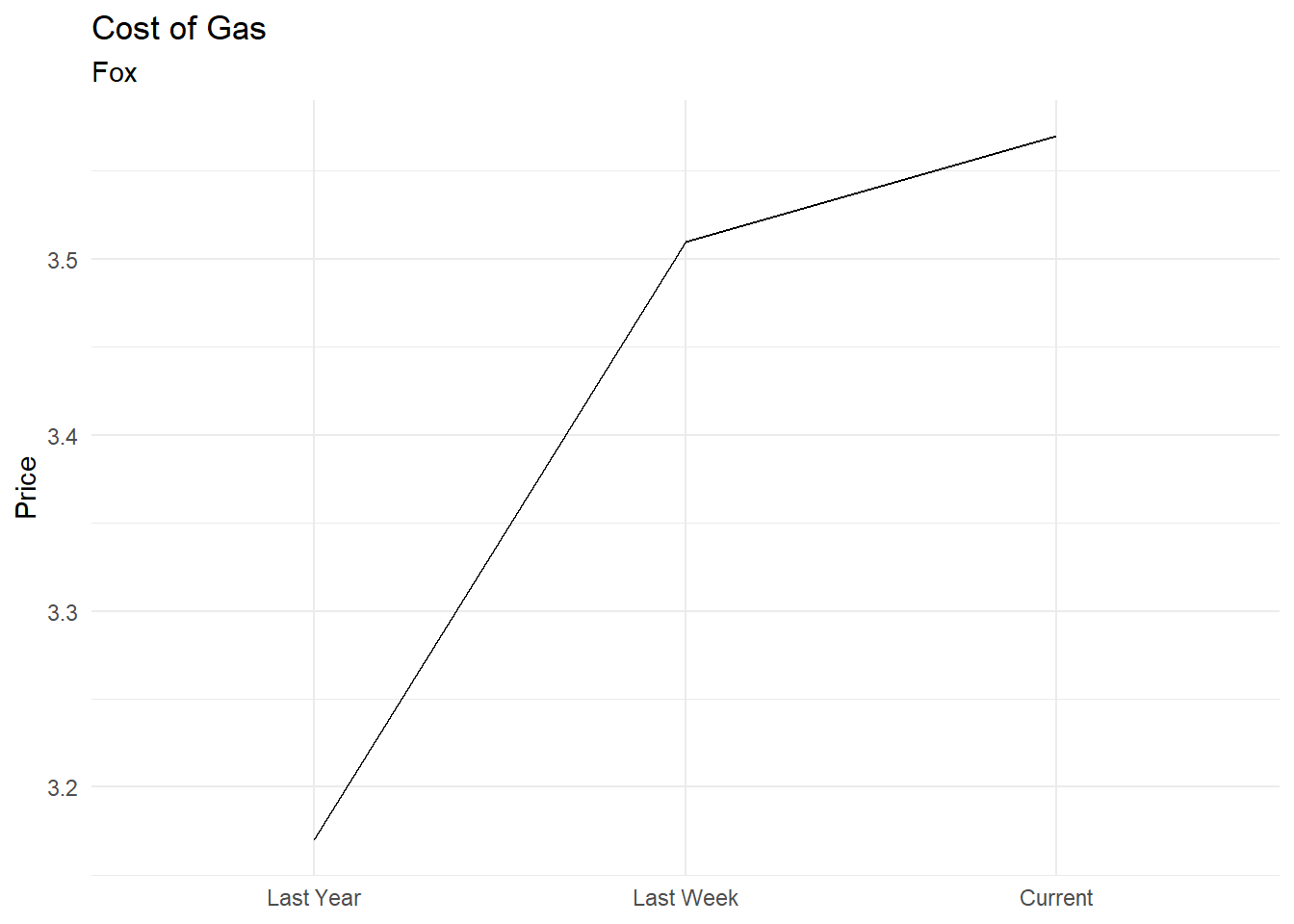
ggplot(fox_gas |> filter(in_fox)) +
  geom_line(aes(
    x = date,
    y = price
  )) +
  scale_x_date(
    breaks = sort({
      fox_gas |>
        filter(in_fox) |>
        pull(date)
    }),
    labels = c(
      "Last Year", "Last Week",
      "Current"
    )
  ) +
  scale_y_continuous(limits = c(0, NA)) +
  theme(axis.text.x = element_text(
    angle = 45,
    hjust = 1
  )) +
  labs(
    x = NULL,
    y = "Price",
    title = "Cost of Gas",
    subtitle = "Scale corrected"
  ) +
  theme_minimal()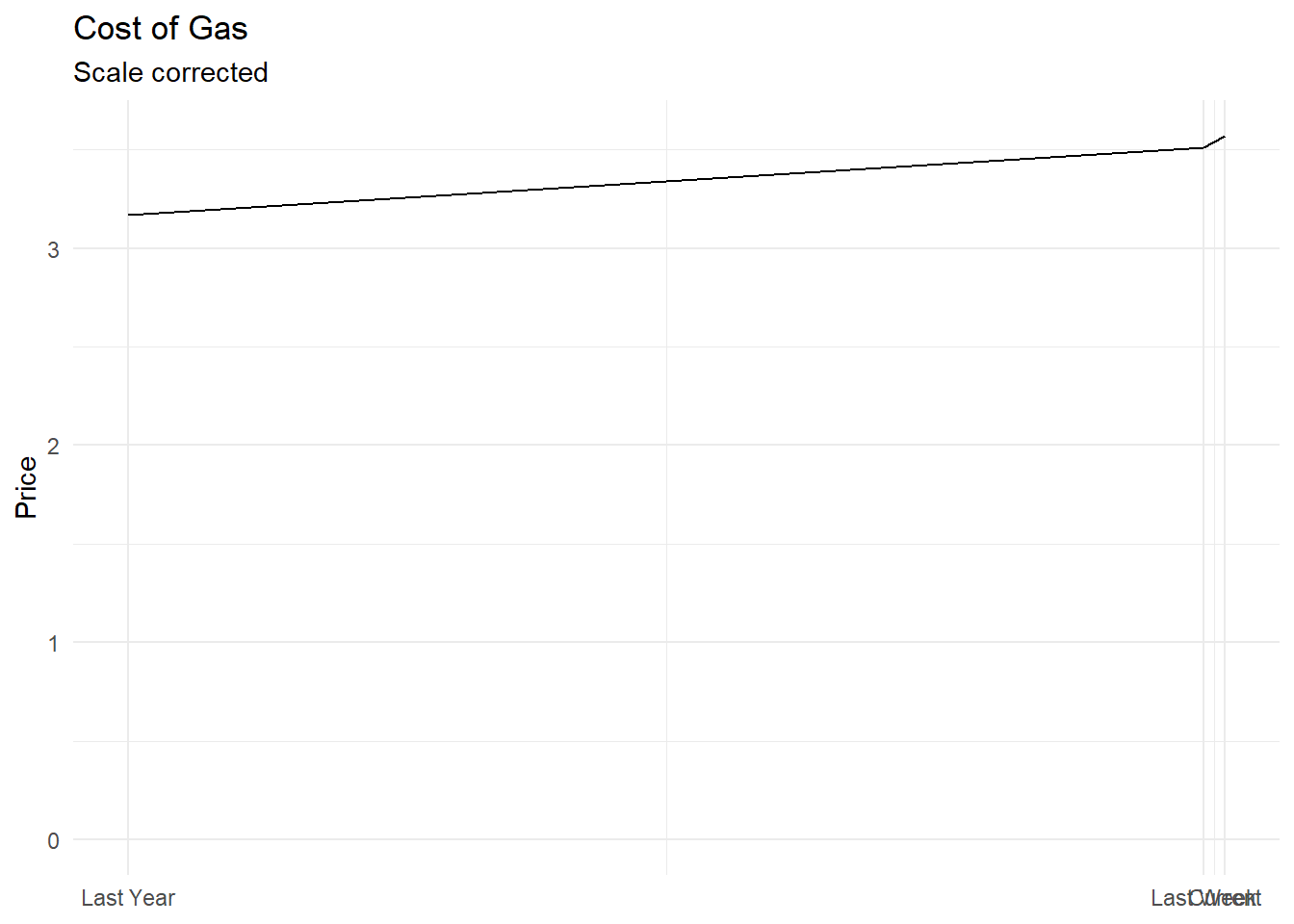
ggplot(fox_gas) +
  geom_line(aes(
    x = date,
    y = price
  )) +
  scale_x_date(
    breaks = sort({
      fox_gas |>
        filter(in_fox) |>
        pull(date)
    }),
    labels = c(
      "Last Year", "Last Week",
      "Current"
    )
  ) +
  scale_y_continuous(limits = c(0, NA)) +
  theme(axis.text.x = element_text(
    angle = 45,
    hjust = 1
  )) +
  labs(
    x = NULL,
    y = "Price",
    title = "Cost of Gas",
    subtitle = "Scale and missing data corrected"
  ) +
  theme_minimal()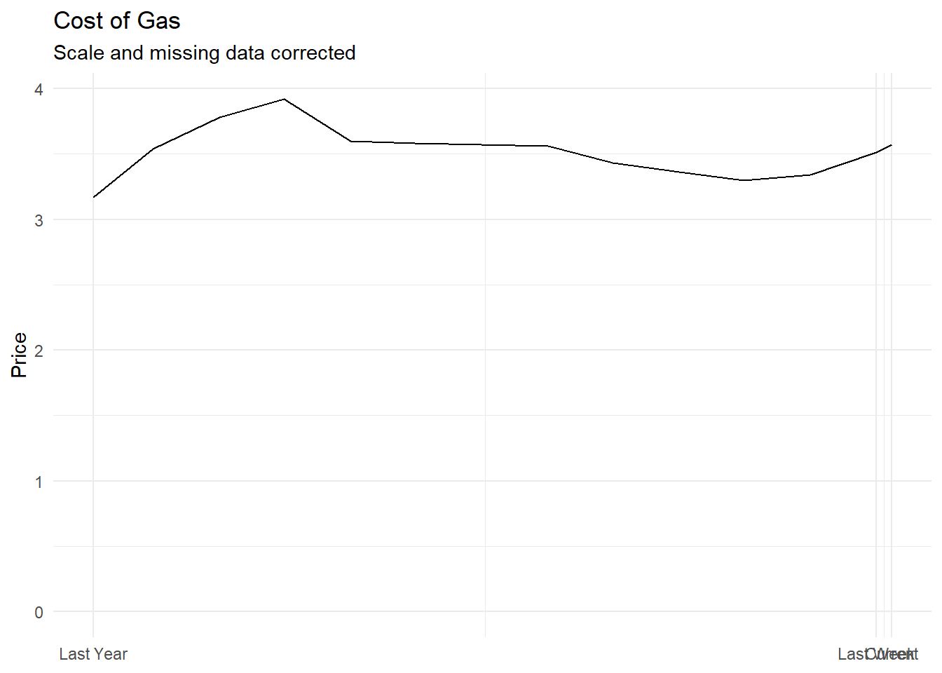
Truncated axis

election_venezuela <- tribble(
  ~candidate, ~percent,
  "Nicolas Maduro Moros", 50.66,
  "Henrique Capriles Radonski", 49.07
) |>
  mutate(candidate = as_factor(candidate))
ggplot(data = election_venezuela) +
geom_col(aes(
x = candidate, y = percent,
fill = candidate
)) +
geom_text(
aes(
x = candidate, y = percent,
label = scales::percent(percent / 100)
),
vjust = -.45
) +
scale_y_continuous(breaks = NULL) +
scale_fill_manual(values = c("red", "darkblue")) +
coord_cartesian(ylim = c(49.05, 51)) +
guides(fill = "none") +
labs(
x = NULL, y = NULL,
title = "2013 Venezuelian presidential election",
subtitle = "Venezolana Television"
) +
theme_minimal() +
theme(panel.grid.major.x = element_blank())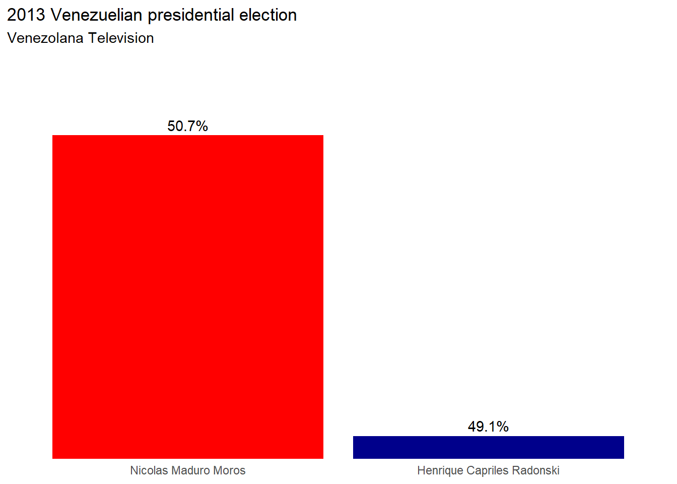
ggplot(data = election_venezuela) +
  geom_col(aes(
    x = candidate, y = percent,
    fill = candidate
  )) +
  geom_text(
    aes(
      x = candidate, y = percent,
      label = scales::percent(percent / 100)
    ),
    vjust = -.45
  ) +
  scale_y_continuous(breaks = NULL) +
  scale_fill_manual(values = c("red", "darkblue")) +
  guides(fill = "none") +
  labs(
    x = NULL, y = NULL,
    title = "2013 Venezuelian presidential election",
    subtitle = "Truncated axis corrected"
  ) +
  theme_minimal() +
  theme(panel.grid.major.x = element_blank())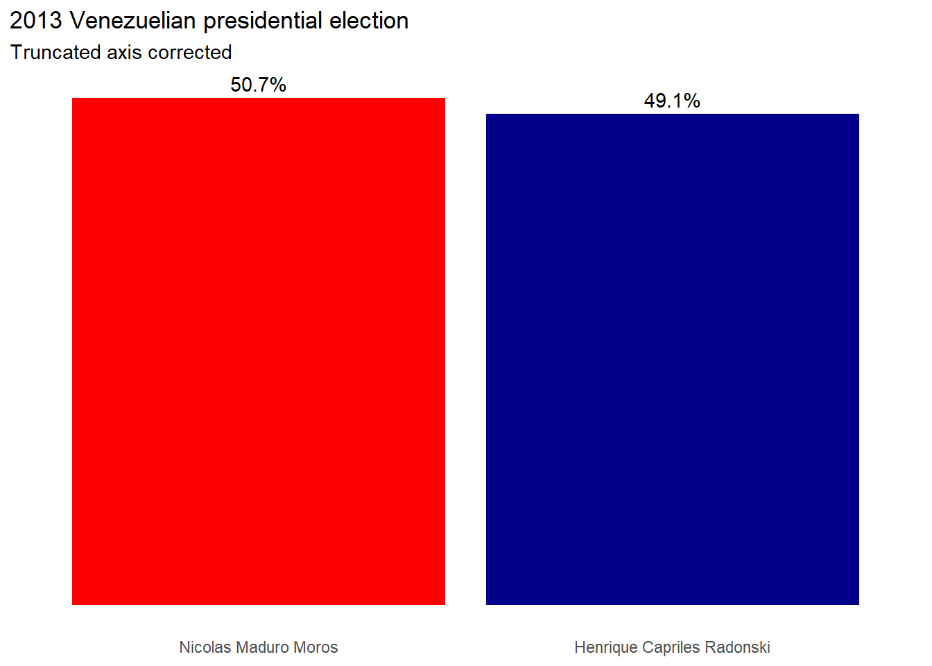
Scale and selection issue

temperature <- read_csv(
  "data_Examples/Temperature-1895-2024.csv",
  skip = 4,
  col_types = cols(Date = col_character())
) |>
  mutate(Date = str_sub(Date, end = -3L))

year_selected <- c("1921", "1999", "1934", "2006", "1998", "2012")

temperature <- temperature |>
  mutate(is_selected = Date %in% year_selected)
ggplot(data = temperature |>
filter(is_selected) |>
mutate(Date = fct_reorder(
Date,
Value
))) +
geom_col(aes(x = Date, y = Value)) +
geom_text(aes(x = Date, y = Value, label = Value),
vjust = -0.1
) +
coord_cartesian(ylim = c(53, 55.5)) +
labs(
x = "Year",
y = "Average temperature",
title = "Warmest year in the USA",
subtitle = "6 warmest years before 2012"
) +
theme_minimal() +
theme(panel.grid.major.x = element_blank())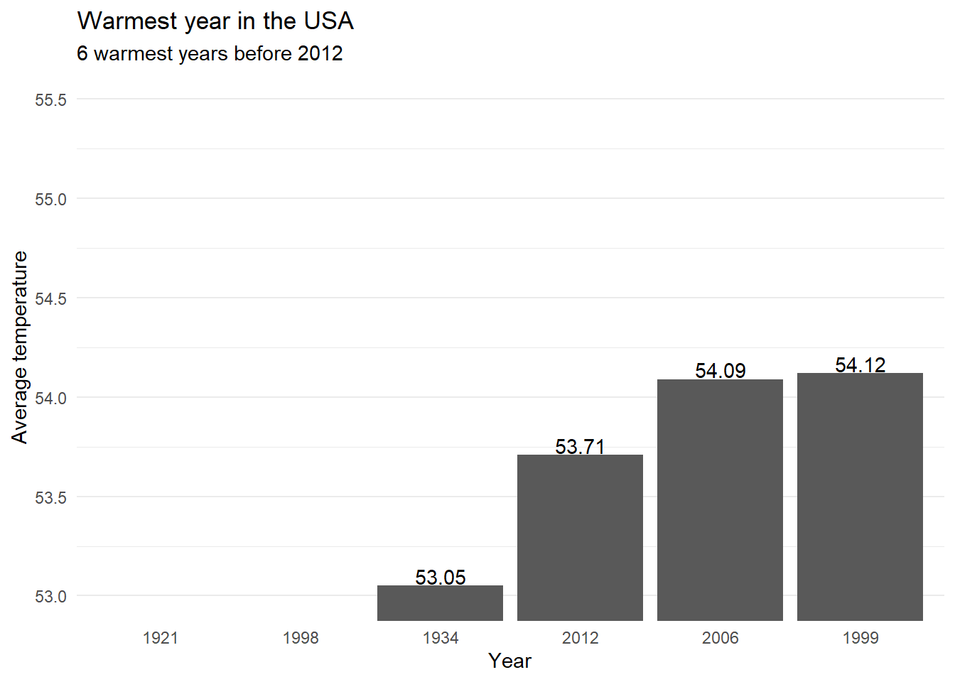
ggplot(
  data = temperature |>
    filter(as.integer(Date) <= 2012),
  aes(
    x = as.integer(Date),
    y = Value
  )
) +
  geom_line() +
  geom_point(
    data = temperature |> filter(is_selected),
    color = "red",
    size = 2
  ) +
  labs(
    x = "Year",
    y = "Average temperature",
    title = "Warmest year in the USA",
    subtitle = "6 warmest years before 2012 in context"
  ) +
  theme_minimal()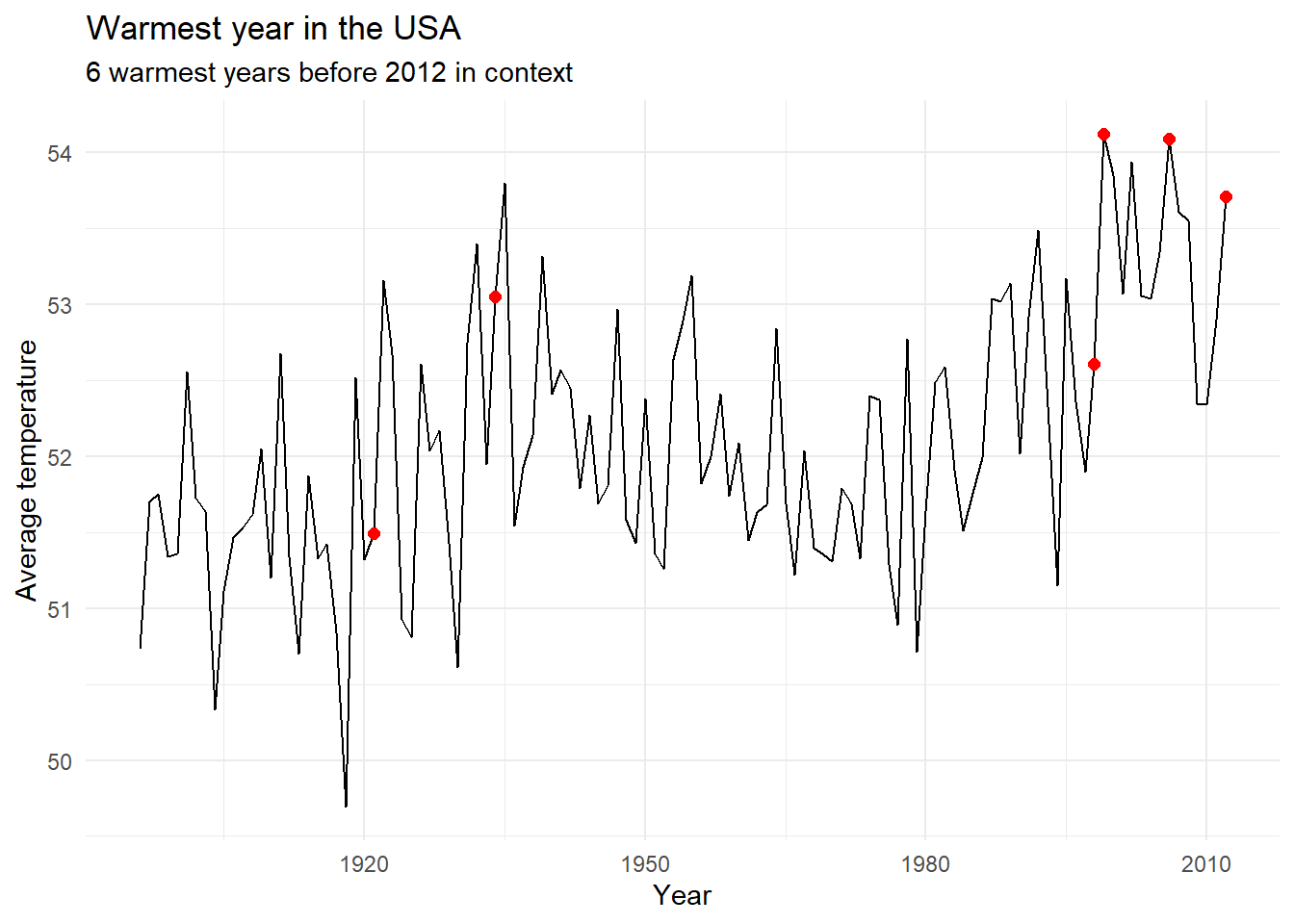
ggplot(
  data = temperature |>
    filter(as.integer(Date) <= 2024),
  aes(
    x = as.integer(Date),
    y = Value
  )
) +
  geom_line() +
  geom_point(
    data = temperature |> filter(rank(desc(Value)) <= 6),
    color = "red",
    size = 2
  ) +
  labs(
    x = "Year",
    y = "Average temperature",
    title = "Warmest year in the USA",
    subtitle = "6 warmest years before 2024 in context"
  ) +
  theme_minimal()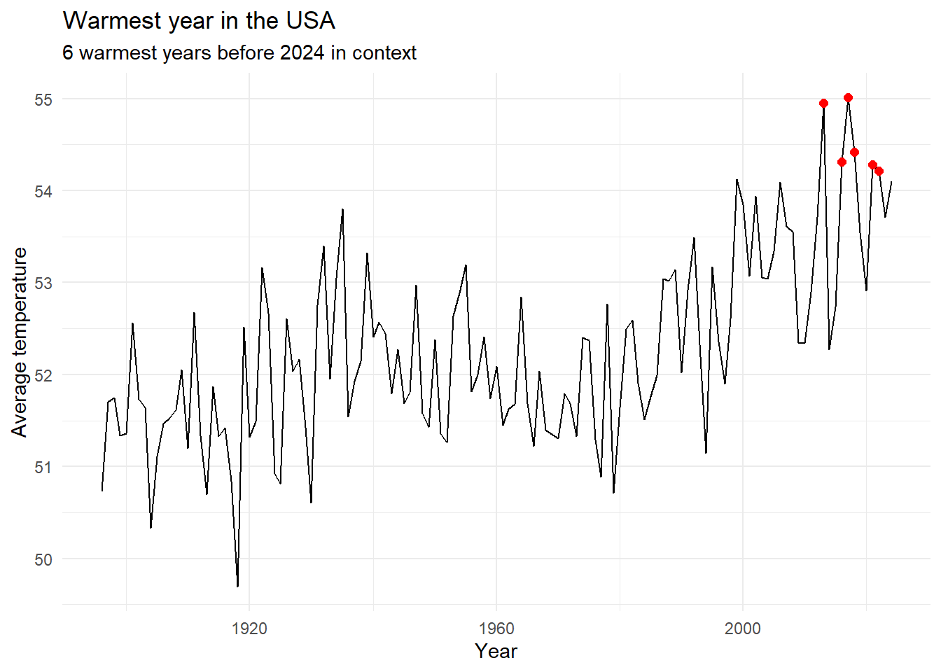
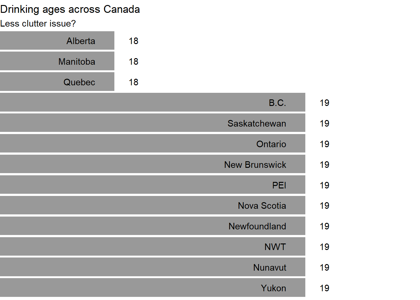
Clutter issue

canada <- tribble(
~state, ~age,
"B.C.", 19,
"Alberta", 18,
"Saskatchewan", 19,
"Manitoba", 18,
"Ontario", 19,
"Quebec", 18,
"New Brunswick", 19,
"PEI", 19,
"Nova Scotia", 19,
"Newfoundland", 19,
"NWT", 19,
"Nunavut", 19,
"Yukon", 19
) |>
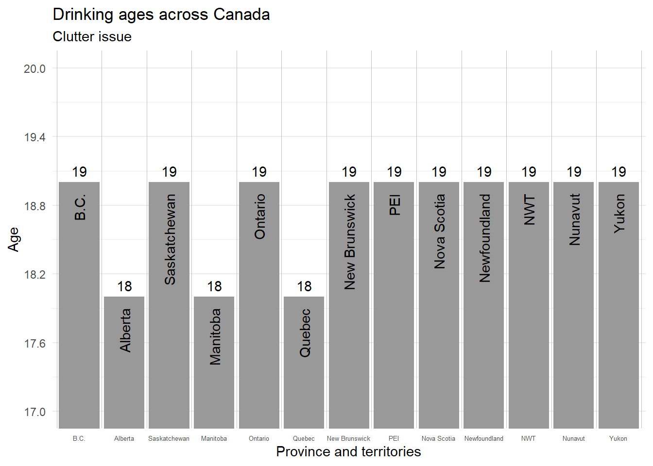
mutate(state = as_factor(state))ggplot(
data = canada,
aes(x = state, y = age)
) +
geom_col(fill = "grey60") +
coord_cartesian(ylim = c(17, 20)) +
geom_text(
aes(label = state),
angle = 90,
hjust = 1, nudge_y = -.1
) +
geom_text(aes(label = age), nudge_y = .1) +
labs(
x = "Province and territories",
y = "Age",
title = "Drinking ages across Canada",
subtitle = "Clutter issue"
) +
geom_vline(
xintercept = seq(.5, 20, by = 1),
size = .1,
color = "grey"
) +
scale_y_continuous(breaks = seq(17, 20, by = .6)) +
theme_minimal() +
theme(
panel.grid.major.x = element_blank(),
axis.text.x = element_text(size = 5)
)
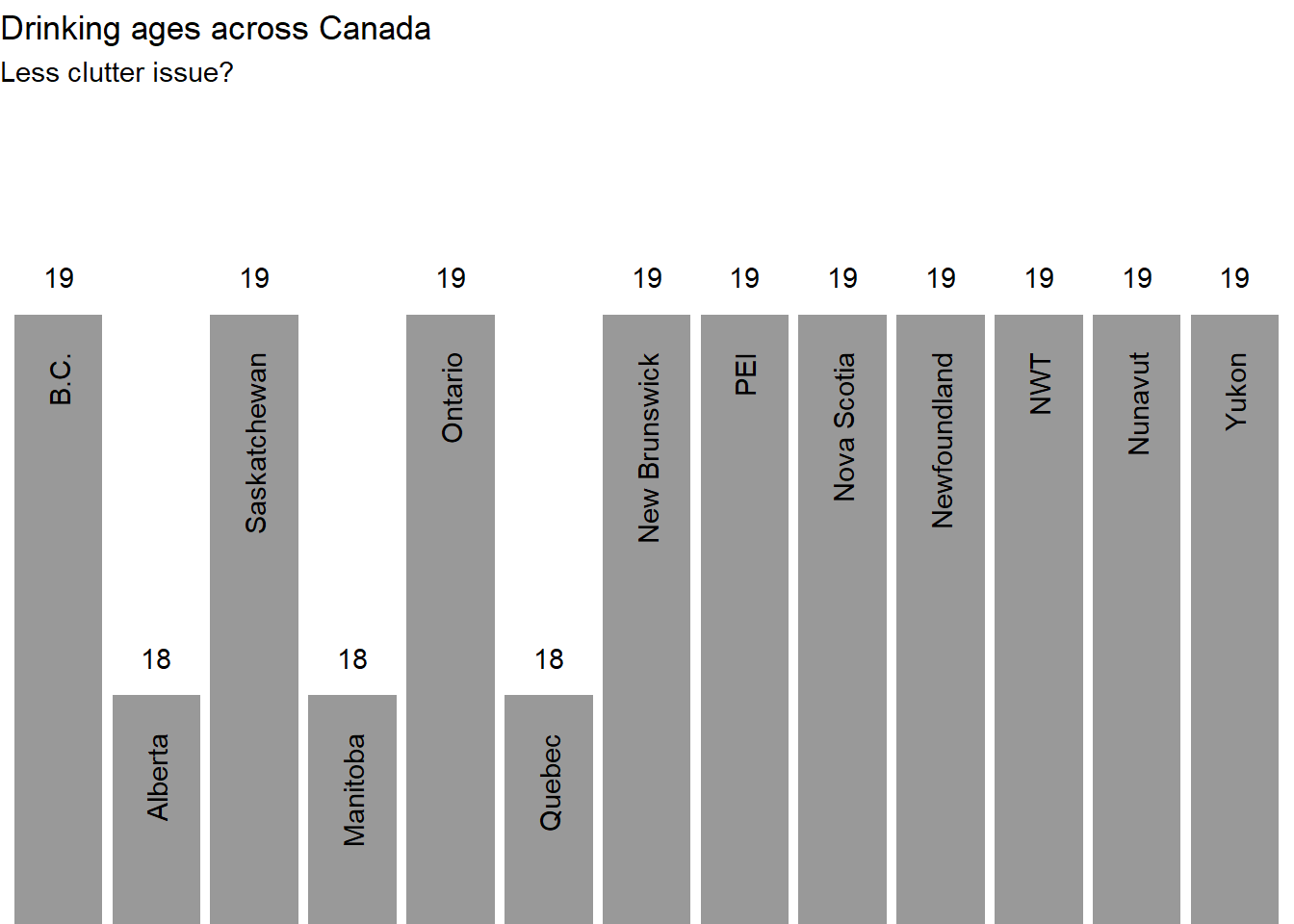
ggplot(
  data = canada,
  aes(x = state, y = age)
) +
  geom_col(fill = "grey60") +
  coord_cartesian(ylim = c(17.5, 19.5)) +
  geom_text(
    aes(label = state),
    angle = 90,
    hjust = 1, nudge_y = -.1
  ) +
  geom_text(aes(label = age), nudge_y = .1) +
  labs(
    x = "Province and territories",
    y = "Age",
    title = "Drinking ages across Canada",
    subtitle = "Less clutter issue?"
  ) +
  theme_void() +
  theme(
    panel.grid.major.x = element_blank(),
    axis.text.x = element_blank()
  )
ggplot(
  data = canada,
  aes(
    x = fct_rev(fct_reorder(state, age)),
    y = age
  )
) +
  geom_col(fill = "grey60") +
  geom_text(
    aes(label = state),
    angle = 0,
    hjust = 1, nudge_y = -.1
  ) +
  geom_text(aes(label = age), nudge_y = .1) +
  coord_flip(ylim = c(17.5, 19.5)) +
  theme_void() +
  labs(
    x = "Province and territories",
    y = "Age",
    title = "Drinking ages across Canada",
    subtitle = "Less clutter issue?"
  )
Radius vs area issue

energy <- tribble(
  ~energy_source, ~amount,
  "Carbon capture and storage", 2.3,
  "Renewable energy", 12.2,
  "Corn ethanol", 16.8,
  "Fossil oils", 70.2
) |>
  mutate(energy_source = as_factor(energy_source))
ggplot(data = energy, aes(x = energy_source, y = "")) +
geom_point(aes(size = amount)) +
geom_text(
aes(label = amount),
nudge_y = c(.075, .1, .1, .2)
) +
geom_text(aes(label = energy_source),
nudge_y = -.25
) +
scale_radius(
range = c(0, 30),
limits = c(0, NA)
) +
guides(size = "none") +
scale_x_discrete(breaks = NULL) +
scale_y_discrete(breaks = NULL) +
labs(
x = NULL,
y = NULL,
size = "Amount spent in million of $",
title = "Subsidize this",
subtitle = "Scale issue"
) +
theme_minimal() +
theme(panel.grid.major.x = element_blank())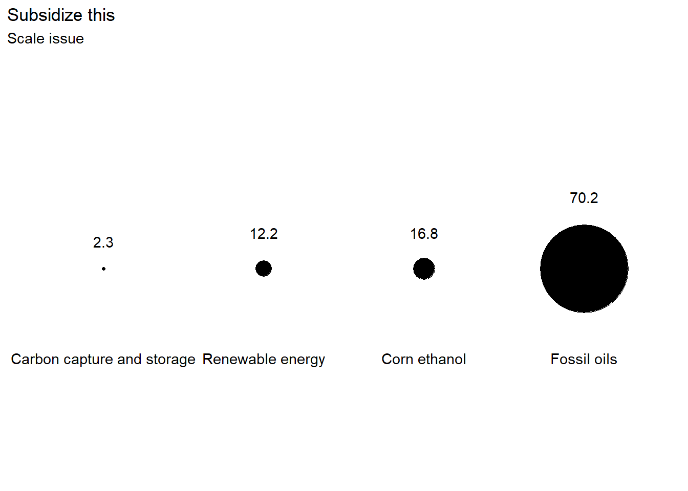

ggplot(data = energy, aes(x = energy_source, y = "")) +
  geom_point(aes(size = amount)) +
  geom_text(
    aes(label = amount),
    nudge_y = c(.075, .1, .1, .17)
  ) +
  geom_text(aes(label = energy_source),
    nudge_y = -.25
  ) +
  scale_size_area(max_size = 30) +
  guides(size = "none") +
  scale_x_discrete(breaks = NULL) +
  scale_y_discrete(breaks = NULL) +
  labs(
    x = NULL,
    y = NULL,
    size = "Amount spent in million of $",
    title = "Subsidize this",
    subtitle = "Scale issue corrected"
  ) +
  theme_minimal() +
  theme(panel.grid.major.x = element_blank())

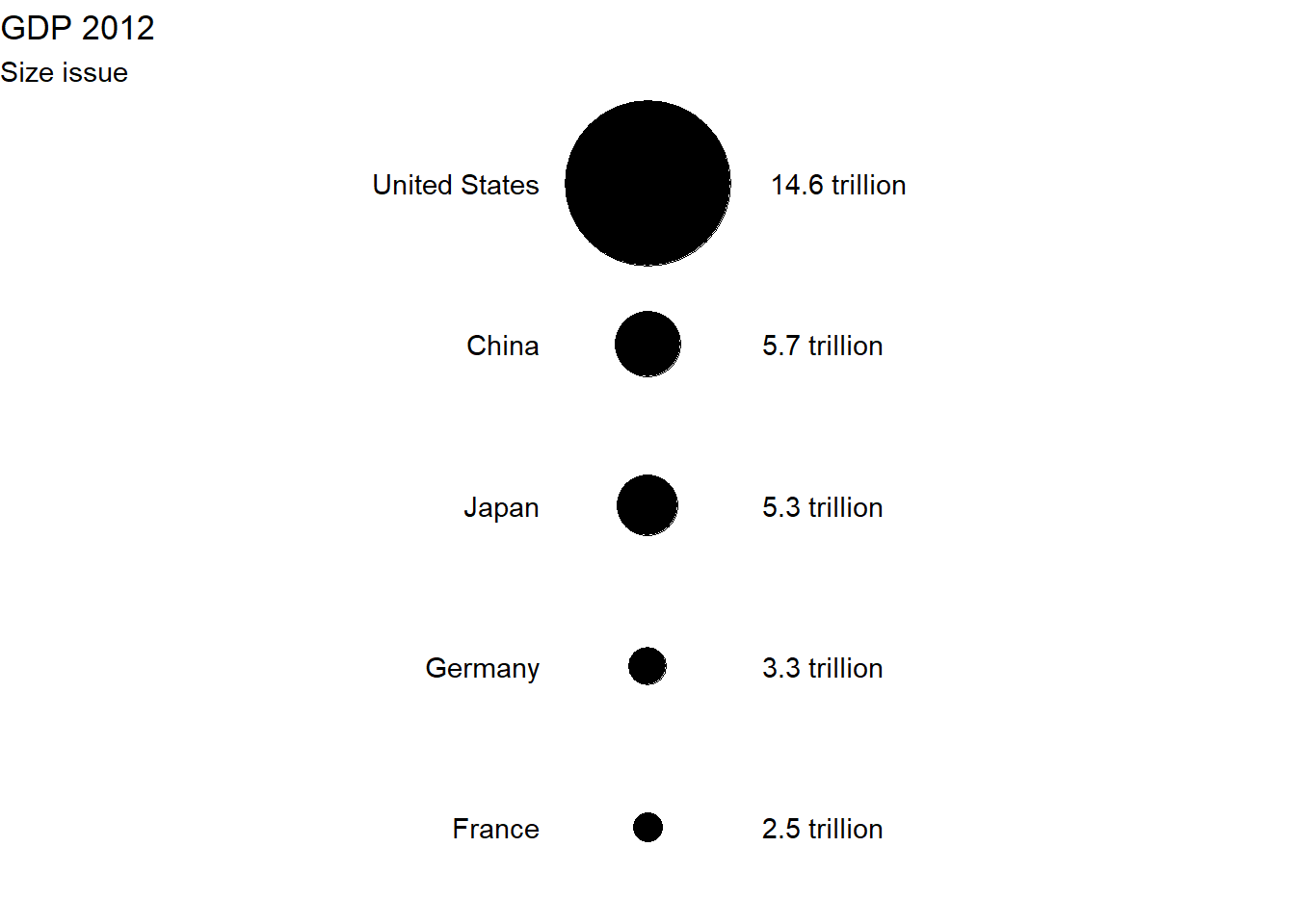
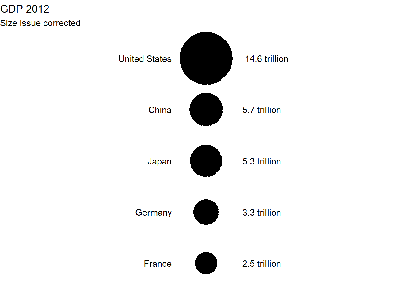
GDP <- tribble(
  ~country, ~GDP,
  "United States", 14.6,
  "China", 5.7,
  "Japan", 5.3,
  "Germany", 3.3,
  "France", 2.5
) |>
  mutate(country = as_factor(country))
ggplot(GDP, aes(x = "", y = fct_rev(country))) +
geom_point(aes(size = GDP)) +
geom_text(
aes(label = country),
nudge_x = -.1,
hjust = 1
) +
geom_text(
aes(label = glue::glue("{GDP} trillion")),
nudge_x = .05,
hjust = -.5
) +
scale_radius(
range = c(0, 30),
limits = c(0, NA)
) +
guides(size = "none") +
theme_void() +
labs(
title = "GDP 2012",
subtitle = "Size issue"
)
ggplot(GDP, aes(x = "", y = fct_rev(country))) +
  geom_point(aes(size = GDP)) +
  geom_text(
    aes(label = country),
    nudge_x = -.1,
    hjust = 1
  ) +
  geom_text(
    aes(label = glue::glue("{GDP} trillion")),
    nudge_x = .05,
    hjust = -.5
  ) +
  scale_size_area(max_size = 30) +
  guides(size = "none") +
  theme_void() +
  labs(
    title = "GDP 2012",
    subtitle = "Size issue corrected"
  )
Unconventional axis issue
data(ethanol, package = "SemiPar")ggplot(data = ethanol) +
geom_point(aes(x = NOx, y = E)) +
labs(
x = "NOx concentration",
y = "Equivalence ratio",
title = "A single-cylinder engine study of efficiency and exhaust emissions",
subtitle = "Equivalence ratio at which the engine was run (a measure of the richness of the air/ethanol mix)\n in function of the NOx concentration"
) +
theme_minimal()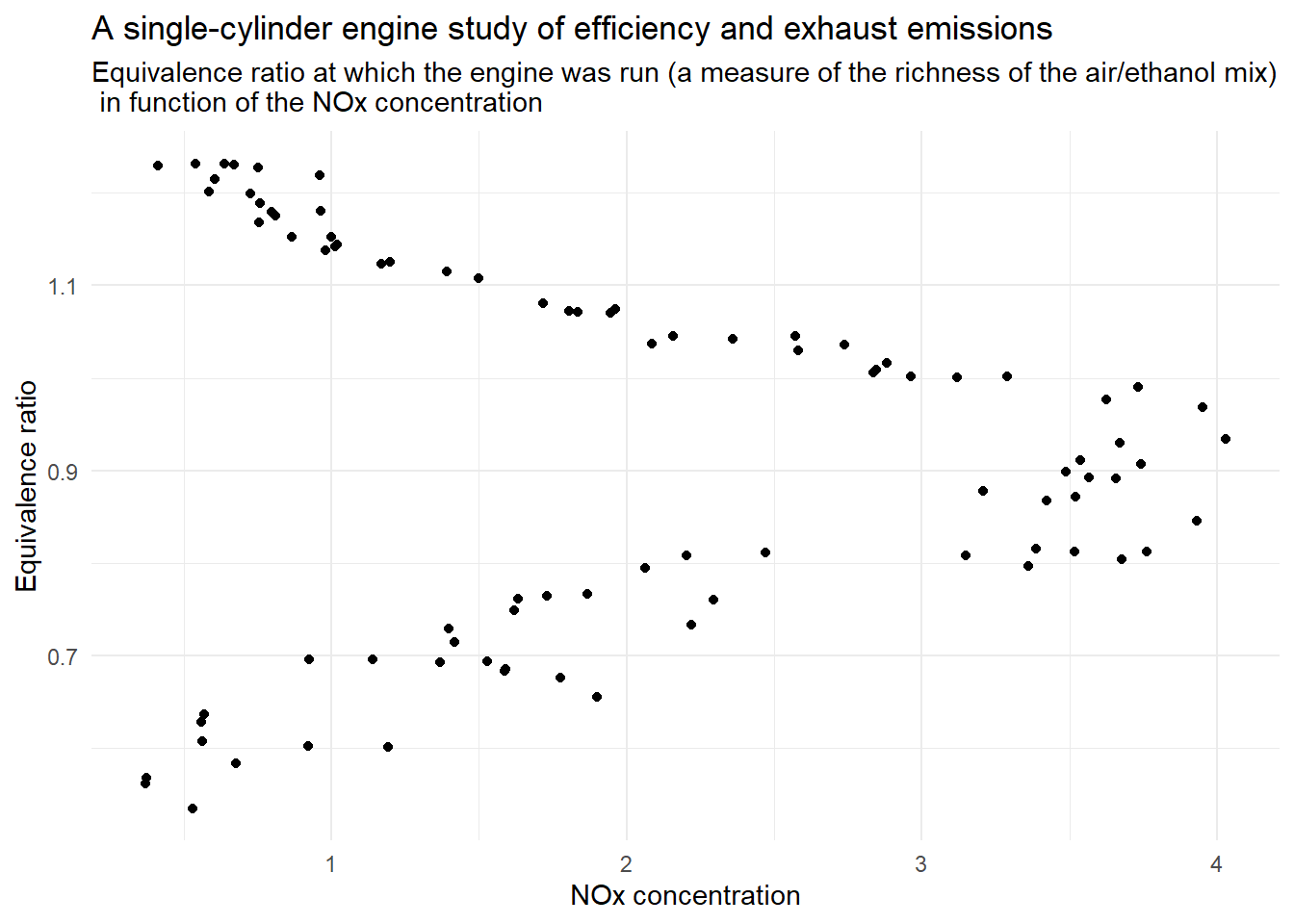
ggplot(data = ethanol) +
  geom_point(aes(x = E, y = NOx)) +
  labs(
    x = "Equivalence ratio",
    y = "NOx concentration",
    title = "A single-cylinder engine study of efficiency and exhaust emissions",
    subtitle = "NOx concentration  in function of the equivalence ratio at which the engine was run (a measure of the richness \n of the air/ethanol mix)"
  ) +
  theme_minimal()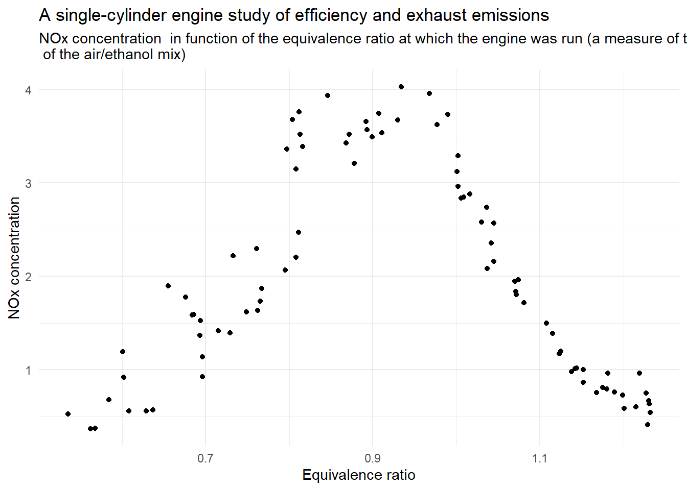
Historical visualizations
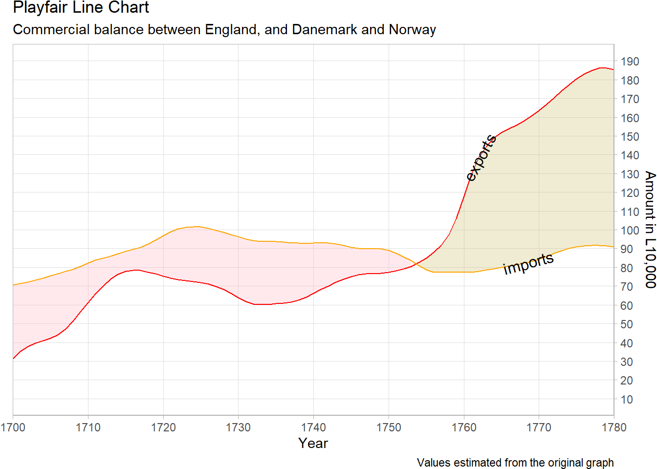
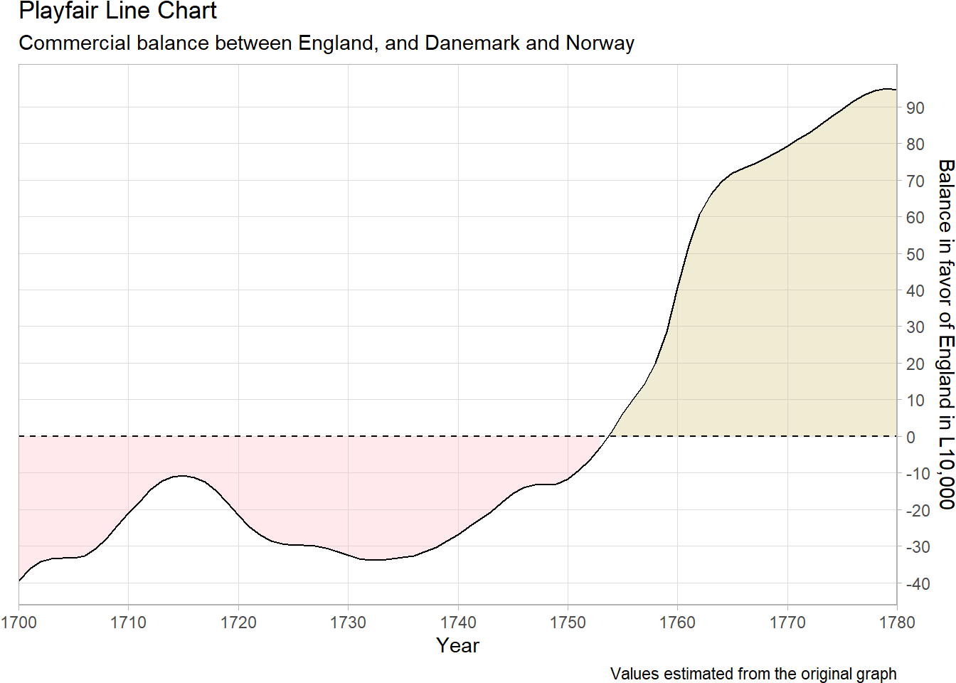
Playfair

playfair_balance <- tibble::tribble(
  ~year, ~exports, ~imports,
  1700L, 31.3, 70.7,
  1701L, 35.2, 71.3,
  1702L, 37.9, 72.1,
  1703L, 39.7, 73.1,
  1704L, 41, 74.2,
  1705L, 42.3, 75.5,
  1706L, 44.1, 76.7,
  1707L, 47.1, 77.8,
  1708L, 51.3, 79,
  1709L, 56.2, 80.5,
  1710L, 61.3, 82.3,
  1711L, 66, 83.8,
  1712L, 70.2, 84.8,
  1713L, 73.7, 85.9,
  1714L, 76.3, 87.3,
  1715L, 77.9, 88.6,
  1716L, 78.4, 89.6,
  1717L, 78.3, 90.7,
  1718L, 77.5, 92.4,
  1719L, 76.5, 94.6,
  1720L, 75.4, 96.9,
  1721L, 74.3, 99,
  1722L, 73.5, 100.5,
  1723L, 72.9, 101.4,
  1724L, 72.3, 101.7,
  1725L, 71.8, 101.5,
  1726L, 71, 100.8,
  1727L, 69.9, 99.8,
  1728L, 68.2, 98.7,
  1729L, 66.1, 97.5,
  1730L, 63.8, 96.3,
  1731L, 61.8, 95.2,
  1732L, 60.5, 94.3,
  1733L, 60.1, 93.9,
  1734L, 60.3, 93.8,
  1735L, 60.6, 93.7,
  1736L, 60.9, 93.5,
  1737L, 61.6, 93.1,
  1738L, 62.6, 92.9,
  1739L, 64.2, 92.8,
  1740L, 66.1, 92.9,
  1741L, 68.2, 92.9,
  1742L, 70.2, 92.9,
  1743L, 72.1, 92.6,
  1744L, 73.8, 91.8,
  1745L, 75.1, 90.7,
  1746L, 76, 90,
  1747L, 76.5, 89.8,
  1748L, 76.7, 90,
  1749L, 76.9, 89.9,
  1750L, 77.4, 89.1,
  1751L, 78.1, 87.5,
  1752L, 79.1, 85.5,
  1753L, 80.6, 83.5,
  1754L, 82.5, 81.1,
  1755L, 85, 78.7,
  1756L, 88, 77.5,
  1757L, 91.8, 77.4,
  1758L, 97.4, 77.4,
  1759L, 105.9, 77.4,
  1760L, 117.9, 77.3,
  1761L, 129.6, 77.5,
  1762L, 138.5, 78,
  1763L, 144.6, 78.6,
  1764L, 148.9, 79.3,
  1765L, 151.8, 80,
  1766L, 153.9, 80.7,
  1767L, 155.8, 81.4,
  1768L, 158.1, 82.2,
  1769L, 160.7, 83.2,
  1770L, 163.6, 84.4,
  1771L, 166.9, 85.8,
  1772L, 170.3, 87.4,
  1773L, 173.9, 88.8,
  1774L, 177.3, 90.1,
  1775L, 180.4, 91,
  1776L, 183, 91.5,
  1777L, 185, 91.8,
  1778L, 186.1, 91.8,
  1779L, 186.3, 91.4,
  1780L, 185.3, 90.8
)
ggplot(
data = playfair_balance |>
pivot_longer(-year,
names_to = "imports/exports",
values_to = "amount"
),
aes(x = year)
) +
geom_ribbon(
data = playfair_balance,
aes(
ymin = imports,
ymax = exports,
fill = exports >= imports
),
alpha = .3
) +
geom_line(aes(y = amount, color = `imports/exports`)) +
directlabels::geom_dl(
aes(
y = amount,
label = `imports/exports`
),
color = "black",
method = list(
box.color = NA,
fill = NA,
"angled.boxes"
)
) +
guides(fill = "none", color = "none") +
labs(
x = "Year", y = "Amount in L10,000",
color = "Imports/Exports",
title = "Playfair Line Chart",
subtitle = "Commercial balance between England, and Danemark and Norway",
caption = "Values estimated from the original graph"
) +
scale_x_continuous(
breaks = seq(1700, 1780, by = 10),
expand = c(0, 0)
) +
scale_y_continuous(
limits = c(10, 190),
breaks = seq(10, 190, by = 10),
position = "right"
) +
scale_fill_manual(values = c(
"TRUE" = "lightgoldenrod3",
"FALSE" = "lightpink"
)) +
scale_color_manual(values = c(
"exports" = "red",
"imports" = "orange"
)) +
theme_light() +
theme(
panel.grid.minor = element_blank(),
plot.margin = margin(l = 10)
)
ggplot(data = playfair_balance, aes(x = year)) +
  geom_ribbon(
    aes(
      ymin = 0,
      ymax = exports - imports,
      fill = exports >= imports
    ),
    alpha = .3
  ) +
  geom_line(aes(y = exports - imports)) +
  geom_hline(yintercept = 0, linetype = "dashed") +
  guides(fill = "none") +
  labs(
    x = "Year", y = "Balance in favor of England in L10,000",
    title = "Playfair Line Chart",
    subtitle = "Commercial balance between England, and Danemark and Norway",
    caption = "Values estimated from the original graph"
  ) +
  scale_x_continuous(
    breaks = seq(1700, 1780, by = 10),
    expand = c(0, 0)
  ) +
  scale_y_continuous(
    breaks = seq(-50, 90, by = 10),
    position = "right"
  ) +
  scale_fill_manual(values = c(
    "TRUE" = "lightgoldenrod3",
    "FALSE" = "lightpink"
  )) +
  theme_light() +
  theme(
    panel.grid.minor = element_blank(),
    plot.margin = margin(l = 10)
  )

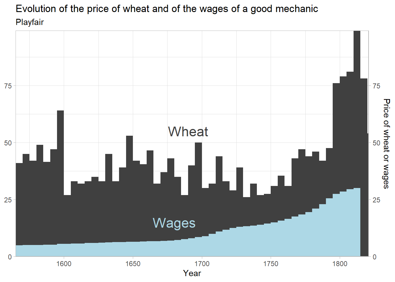
library("HistData")ggplot(
data = Wheat |> pivot_longer(-Year, names_to = "variable", values_to = "value") |>
mutate(variable = fct_relevel(
variable,
"Wheat"
)),
aes(x = Year, y = value)
) +
pammtools::geom_stepribbon(aes(
ymax = value,
ymin = 0,
fill = variable
)) +
labs(
x = "Year",
y = "Price of wheat or wages",
color = NULL,
title = "Evolution of the price of wheat and of the wages of a good mechanic",
subtitle = "Playfair"
) +
scale_y_continuous(
limits = c(0, NA), expand = c(0, 0),
position = "right",
sec.axis = sec_axis("identity")
) +
scale_x_continuous(expand = c(0, 0)) +
scale_fill_manual(values = c(
"Wages" = "lightblue",
"Wheat" = "gray25"
)) +
scale_color_manual(values = c(
"Wages" = "lightblue",
"Wheat" = "gray25"
)) +
theme_light() +
guides(fill = "none", color = "none") +
geom_text(
data =
tibble(
Year = c(1680, 1690),
value = c(15, 55),
variable = c("Wages", "Wheat"),
),
aes(
label = variable,
color = variable
),
size = 6
)
ggplot(data = Wheat, aes(x = Year)) +
  geom_step(aes(y = Wheat / Wages)) +
  scale_y_continuous(limits = c(0, NA)) +
  labs(
    x = "Year",
    y = "Ratio between the price of wheat and the wages",
    title = "Evolution of the price of Wheat and of the wages of a good mechanic",
    subtitle = "Playfair"
  ) +
  theme_minimal()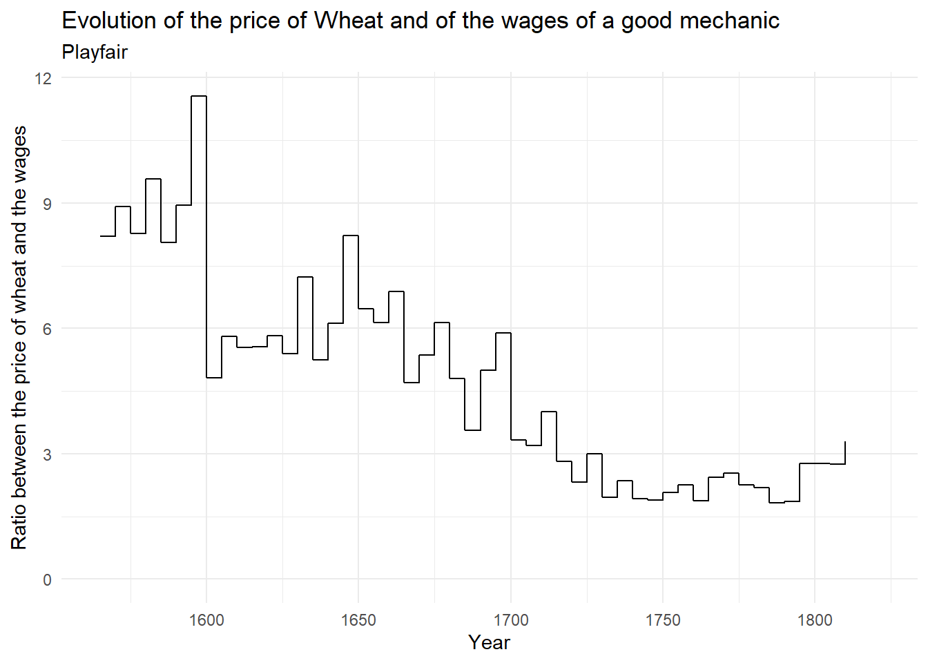
Minard

library(HistData)
Minard.troops <- Minard.troops |>
  group_by(group) |>
  mutate(id = 1:n()) |>
  ungroup() |>
  mutate(group = 4 - group) |>
  arrange(desc(id))

Minard.cities <- Minard.cities |>
  mutate(nudge_lat = case_when(
    city == "Dorogobouge" ~ -.5,
    city == "Wixma" ~ -.4,
    city == "Malo-Jarosewii" ~ -.3,
    city == "Bobr" ~ -.5,
    city == "Studienska" ~ .05,
    city == "Moiodexno" ~ -.25,
    TRUE ~ 0
  ))

Minard.temp <- Minard.temp |>
  mutate(date = str_c(str_sub(Minard.temp$date, end = 3L),
                      " ",
                      str_sub(Minard.temp$date, start = 4L)),
         date = if_else(is.na(date), "", date))
library(ggforce)
p_map <- ggplot(
data = Minard.troops,
aes(x = long, y = lat)
) +
geom_link2(aes(
group = group,
size = survivors,
color = direction
),
lineend = "round") +
geom_link2(
data = Minard.troops |>
filter(id != 1),
aes(
group = group,
size = survivors,
color = direction
),
lineend = "round"
) +
geom_point(
data = Minard.cities,
size = 1
) +
geom_text(
data = Minard.cities, aes(
label = city,
y = lat + nudge_lat
),
size = 3,
color = "grey50",
nudge_y = .15
) +
scale_size(
range = c(0, 8),
limits = c(0, NA),
labels = scales::comma_format(),
trans = "identity"
) +
scale_color_manual(values = c("lightgoldenrod3", "black")) +
labs(
x = "Longitude",
y = "Latitude",
size = "Surivors",
color = "Direction",
title = "Napoleon's march to Russia",
subtitle = "Minard"
) +
scale_x_continuous(limits = c(23.9, 37.6)) +
coord_equal(ratio = 1.75,
xlim = c(23.9, 37.6)) +
guides(
color = "none",
size = "none"
) +
theme_void()
p_temp <- ggplot(data = Minard.temp,
aes(x = long, y = temp)) +
geom_line() +
scale_x_continuous(breaks = Minard.temp$long,
labels = Minard.temp$date,
position = "top",
limits = c(23.9, 37.6)) +
scale_y_continuous(position = "right") +
coord_cartesian(xlim = c(23.2, 38.3)) +
labs(title = NULL,
subtitle = "Temperature in Reaumur Degree",
x = NULL,
y = NULL) +
theme_minimal() +
theme(panel.grid.minor.x = element_blank(),
axis.text.x.top = element_text(size = 4)
)
library(patchwork)
p_map + p_temp +
plot_layout(ncol = 1, heights = c(4,1))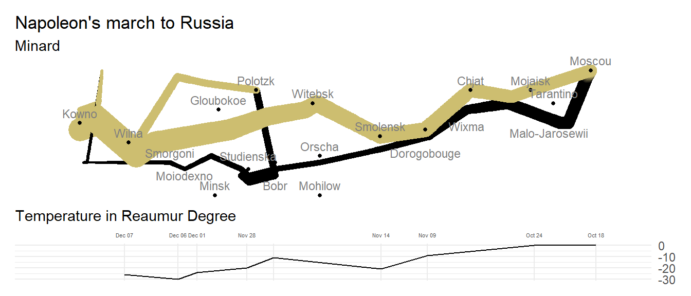

library(sf)

dpt_ori <- sf::read_sf("departements/departements-20140306-100m.shp") |>
  select(code_insee, nom, geometry) |>
  filter(
    code_insee != "2A", code_insee != "2B",
    !str_detect(code_insee, "97.+")
  )

dpt_seine <- tibble(
  code_insee = "78",
  nom = "Seine"
)
st_geometry(dpt_seine) <- dpt_ori |>
  filter(
    code_insee %in% c("78", "91", "92", "93", "94", "95")
  ) |>
  st_union() |>
  st_cast("MULTIPOLYGON")

dpt <- rbind(
  dpt_ori |>
    filter(
      !(code_insee %in% c("78", "91", "92", "93", "94", "95")
      )
    ),
  dpt_seine
)

dpt_centroids <- dpt |>
  st_centroid() |>
  st_coordinates() |>
  as_tibble() |>
  bind_cols(code_insee = dpt[["code_insee"]])

dpt_production <- tribble(
  ~code_insee, ~noir, ~rouge, ~vert,
  "02", 1, 0, 4,
  "03", 10, 0, 0,
  "08", 2, 0, 0,
  "10", 0, 0, 10,
  "14", 120, 0, 0,
  "15", 1, 0, 0,
  "16", 60, 0, 0,
  "17", 44, 0, 2,
  "18", 20, 0, 29,
  "19", 50, 0, 0,
  "21", 10, 0, 5,
  "22", 0, 0, .5,
  "23", 13, 0, 3,
  "24", 47, 0, 5,
  "25", 1, 0, 0,
  "27", 2.5, 20, 1.5,
  "28", 2.5, 30, 2.5,
  "29", 0, 4, 0,
  "31", 3, 0, 0,
  "33", 3, 0, 0,
  "35", 0, 0, .5,
  "36", 26, 0, 25,
  "37", 5, 0, 0,
  "40", 1, 0, 0,
  "41", 3, 0, 0,
  "43", 3, 0, 0,
  "44", 7, 0, 0,
  "45", 2, 18, 22,
  "46", 3, 0, 0,
  "47", 3, 0, 0,
  "49", 100, 0, 20,
  "50", 9, 0, 1,
  "51", 4, 0, 15,
  "52", 5, 0, 0,
  "53", 30, 0, 2,
  "54", 2, 0, 0,
  "55", 2, 0, 0,
  "56", 0, 2, 0,
  "57", 3, 0, 0,
  "58", 50, 0, 2,
  "59", 5, 0, 20,
  "60", 2, 14, 10,
  "61", 60, 0, 0,
  "62", 2, 0, 10,
  "65", 1, 0, 0,
  "71", 4, 0, 0,
  "72", 31, 0, 1,
  "75", 22.5, 0, 2.5,
  "76", 8, 0, 24,
  "77", 7, 20, 10,
  "78", 25, 30, 45,
  "79", 38, 0, 14,
  "80", 2, 0, 10,
  "85", 77, 0, 3,
  "86", 17, 0, 18,
  "87", 50, 0, 10,
  "88", 1, 0, 0,
  "89", 5, 0, 15
) |>
  mutate(prod_tot = noir + rouge + vert)

dpt_join <- dpt_production |>
  pivot_longer(c(-code_insee, -prod_tot), names_to = "prod_type", values_to = "prod") |>
  left_join(dpt_centroids)
plot_pie <- function(df) {
pie_df <- df |>
select(-prod_tot) |>
pivot_longer(everything(), names_to = "prod_type", values_to = "prod") |>
pie_stats(0, 0, 0, 1, prod, FALSE, 0.8)
p <- ggplot(data = pie_df) +
ggforce::geom_arc_bar(
data = pie_df,
aes(
x0 = x0, y0 = y0,
r0 = r0, r = r1,
start = start, end = end,
fill = prod_type
)
) +
guides(fill = "none") +
scale_fill_manual(values = c(
"noir" = "black",
"vert" = "green",
"rouge" = "red"
)) +
theme_void() +
coord_equal()
tibble(plot = list(p), scale = sqrt(df[["prod_tot"]]), prod_tot = df[["prod_tot"]])
}
dpt_production_plot <- dpt_production |>
nest(.by = code_insee) |>
mutate(data = map(data, plot_pie)) |>
unnest(data) |>
left_join(dpt_centroids) |>
mutate(
X = if_else(code_insee == "78", X - .15, X),
Y = if_else(code_insee == "78", Y + .1, Y)
)ggplot(data = dpt |> left_join(dpt_production)) +
geom_sf(aes(fill = !is.na(prod_tot))) +
ggimage::geom_subview(
data = dpt_production_plot |>
mutate(scale = .09 * scale),
aes(
x = X, y = Y,
subview = plot,
width = scale,
height = scale
)
) +
coord_sf(datum = NA) +
guides(fill = "none") +
scale_fill_manual(values = c(
"TRUE" = "lemonchiffon",
"FALSE" = "grey70"
)) +
theme_void() +
labs(
title = "Paris Meat Provenance",
subtitle = "Minard",
caption = "approximate dataset!"
)
Nightingale

Nightingale2 <- Nightingale |>
  select(Date, Disease, Wounds, Other) |>
  pivot_longer(c(Disease, Wounds, Other), names_to = "variable", values_to = "value") |>
  group_by(Date) |>
  arrange(desc(variable)) |>
  mutate(value2 = cumsum(value)) |>
  mutate(value3 = sqrt(value2) - sqrt(lag(value2, default = 0))) |>
  ungroup()
ggplot(
data = filter(
Nightingale2,
Date <= "1855-03-02"
),
aes(x = as.factor(Date))
) +
geom_col(
aes(y = value3, fill = variable),
color = "black", width = 1
) +
geom_text(
data = filter(
Nightingale2,
Date <= "1855-03-02"
) |>
group_by(Date) |>
summarize(value3 = max(sqrt(value2))) |>
mutate(value3 = max(value3)),
aes(y = value3 * (1.1), label = Date),
size = 4
) +
coord_polar(start = -pi / 2, direction = 1) +
scale_y_continuous(breaks = NULL) +
scale_fill_manual(values = c(
"gray70", "gray40",
"lightpink"
)) +
theme(axis.text.x = element_blank()) +
scale_x_discrete(label = NULL) +
labs(
title = "Nightingale Rose Chart",
x = NULL,
y = NULL,
fill = "Reason of death"
) +
geom_vline(
xintercept = seq(.5, 13, by = 1),
size = .1,
color = "grey"
) +
theme_void()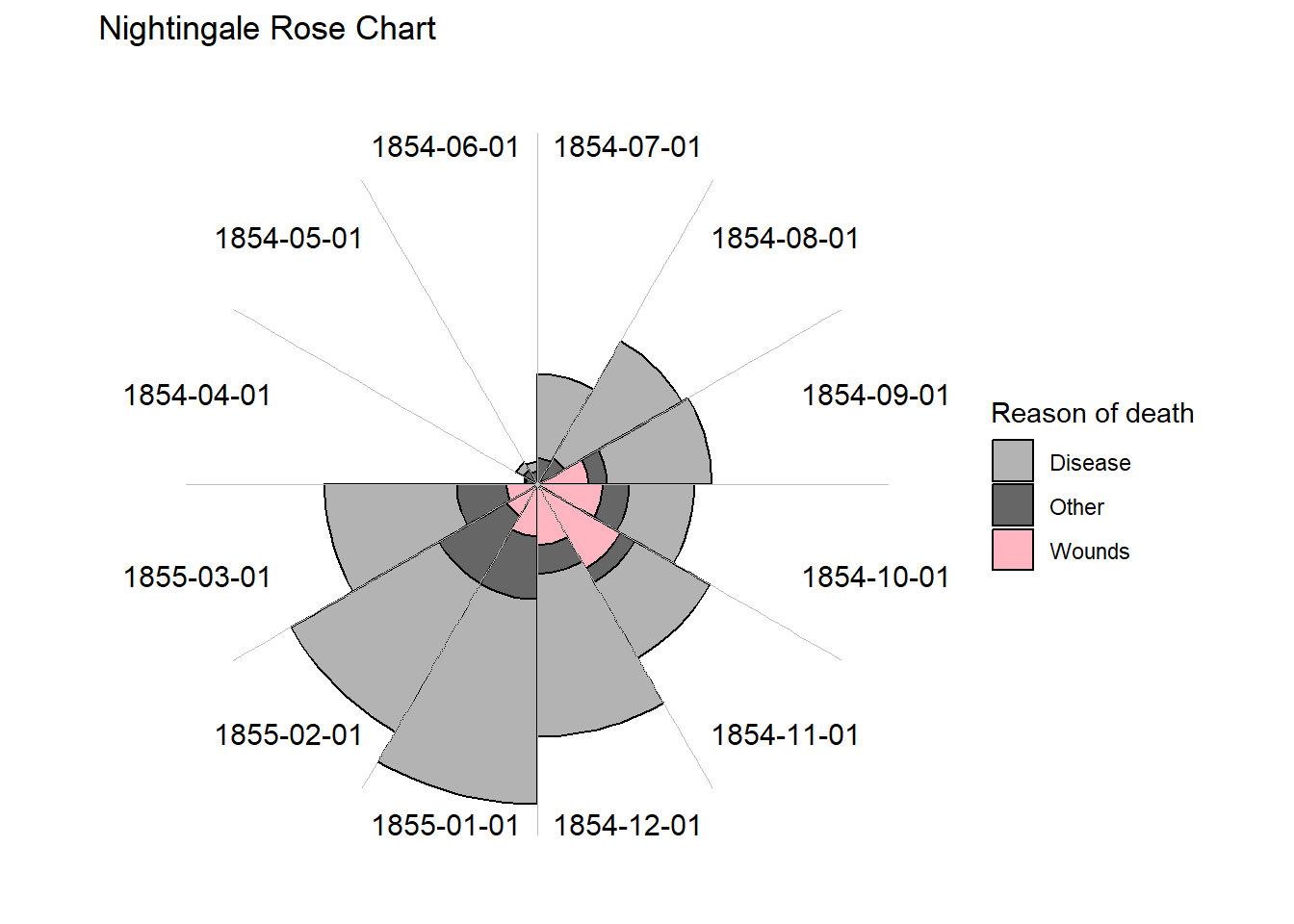
ggplot(
  data = filter(
    Nightingale2,
    Date > "1855-03-02"
  ),
  aes(x = as.factor(Date))
) +
  geom_col(
    aes(y = value3, fill = variable),
    color = "black", width = 1
  ) +
  geom_text(
    data = filter(
      Nightingale2,
      Date > "1855-03-02"
    ) |>
      group_by(Date) |>
      summarize(value3 = max(sqrt(value2))) |>
      mutate(value3 = max(value3)),
    aes(y = value3 * (1.1), label = Date),
    size = 4
  ) +
  coord_polar(start = -pi / 2, direction = 1) +
  scale_y_continuous(breaks = NULL) +
  scale_fill_manual(values = c(
    "gray70", "gray40",
    "lightpink"
  )) +
  theme(axis.text.x = element_blank()) +
  scale_x_discrete(label = NULL) +
  labs(
    title = "Nightingale Rose Chart",
    x = NULL,
    y = NULL,
    fill = "Reason of death"
  ) +
  geom_vline(
    xintercept = seq(.5, 13, by = 1),
    size = .1,
    color = "grey"
  ) +
  theme_void()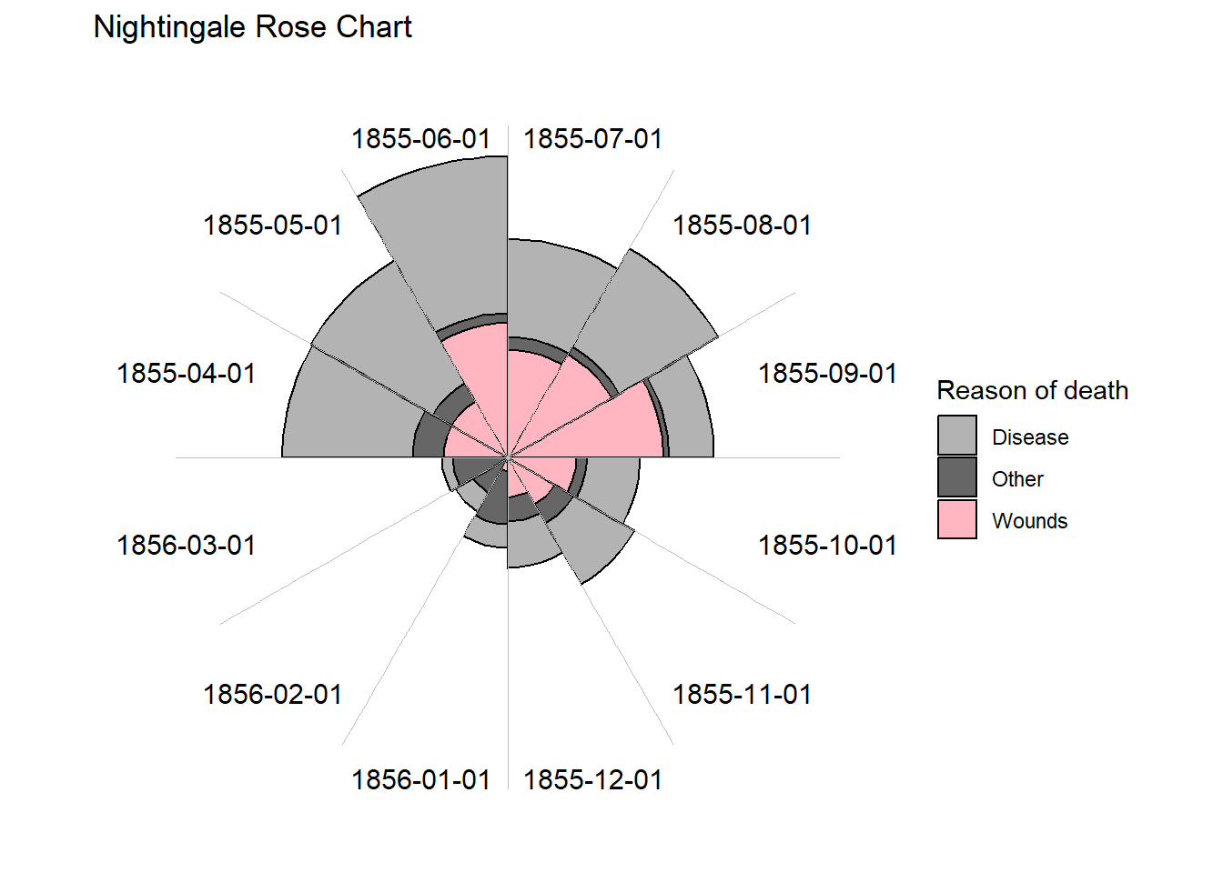
ggplot(
  data = filter(
    Nightingale2,
    Date <= "1855-03-02"
  ),
  aes(x = as.factor(Date))
) +
  geom_col(
    aes(y = value, fill = variable),
    color = "black", width = 1
  ) +
  geom_text(
    data = filter(
      Nightingale2,
      Date <= "1855-03-02"
    ) |>
      group_by(Date) |>
      summarize(value = max(value2)) |>
      mutate(value = max(value)),
    aes(y = value * (1.1), label = Date),
    size = 4
  ) +
  coord_polar(start = -pi / 2, direction = 1) +
  scale_y_continuous(breaks = NULL) +
  scale_fill_manual(values = c(
    "gray70", "gray40",
    "lightpink"
  )) +
  theme(axis.text.x = element_blank()) +
  scale_x_discrete(label = NULL) +
  labs(
    title = "Nightingale Rose Chart",
    subtitle = "without scale correction",
    x = NULL,
    y = NULL,
    fill = "Reason of death"
  ) +
  geom_vline(
    xintercept = seq(.5, 13, by = 1),
    size = .1,
    color = "grey"
  ) +
  theme_void()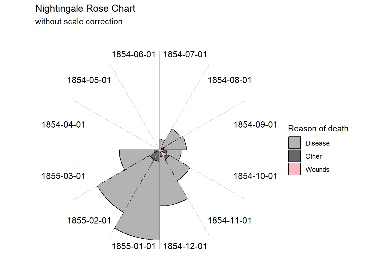
ggplot(
  data = filter(
    Nightingale2,
    Date > "1855-03-02"
  ),
  aes(x = as.factor(Date))
) +
  geom_col(
    aes(y = value, fill = variable),
    color = "black", width = 1
  ) +
  geom_text(
    data = filter(
      Nightingale2,
      Date > "1855-03-02"
    ) |>
      group_by(Date) |>
      summarize(value = max(value2)) |>
      mutate(value = max(value)),
    aes(y = value * (1.1), label = Date),
    size = 4
  ) +
  coord_polar(start = -pi / 2, direction = 1) +
  scale_y_continuous(breaks = NULL) +
  scale_fill_manual(values = c(
    "gray70", "gray40",
    "lightpink"
  )) +
  theme(axis.text.x = element_blank()) +
  scale_x_discrete(label = NULL) +
  labs(
    title = "Nightingale Rose Chart",
    subtitle = "without scale correction",
    x = NULL,
    y = NULL,
    fill = "Reason of death"
  ) +
  geom_vline(
    xintercept = seq(.5, 13, by = 1),
    size = .1,
    color = "grey"
  ) +
  theme_void()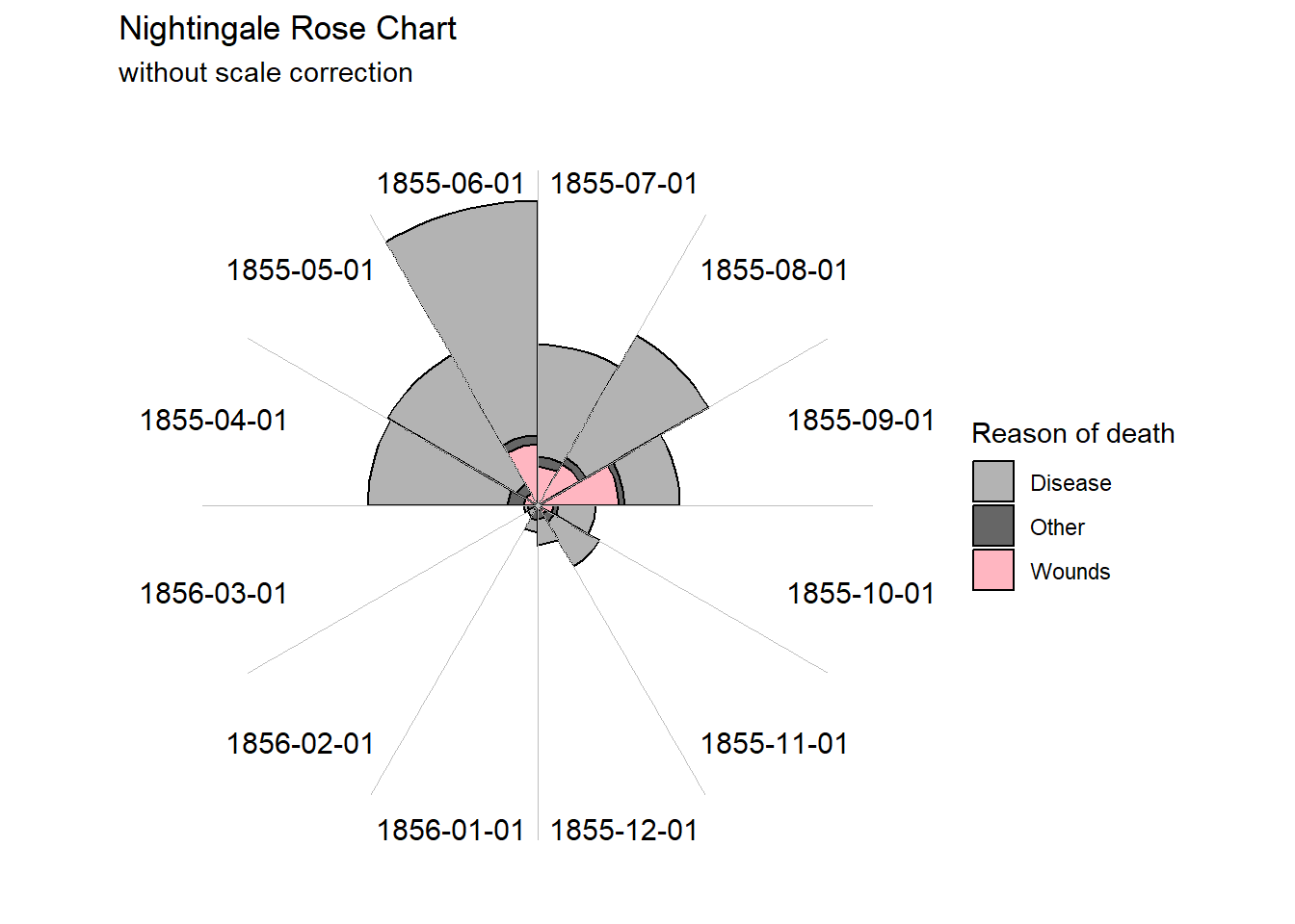
ggplot(
  data = filter(Nightingale2, Date <= "1855-03-02"),
  aes(x = as.factor(Date))
) +
  geom_col(
    aes(y = value, fill = variable),
    color = "black", width = 1
  ) +
  scale_fill_manual(values = c(
    "gray70", "gray40",
    "lightpink"
  )) +
  labs(
    title = "Nightingale Bar Chart",
    x = "Date",
    y = "Number of deaths",
    fill = "Reason of death"
  ) +
  geom_vline(
    xintercept = seq(.5, 13, by = 1),
    size = .1,
    color = "grey"
  ) +
  theme_minimal() +
  theme(
    axis.text.x = element_text(
      angle = 45,
      hjust = 1
    ),
    panel.grid.major.x = element_blank()
  )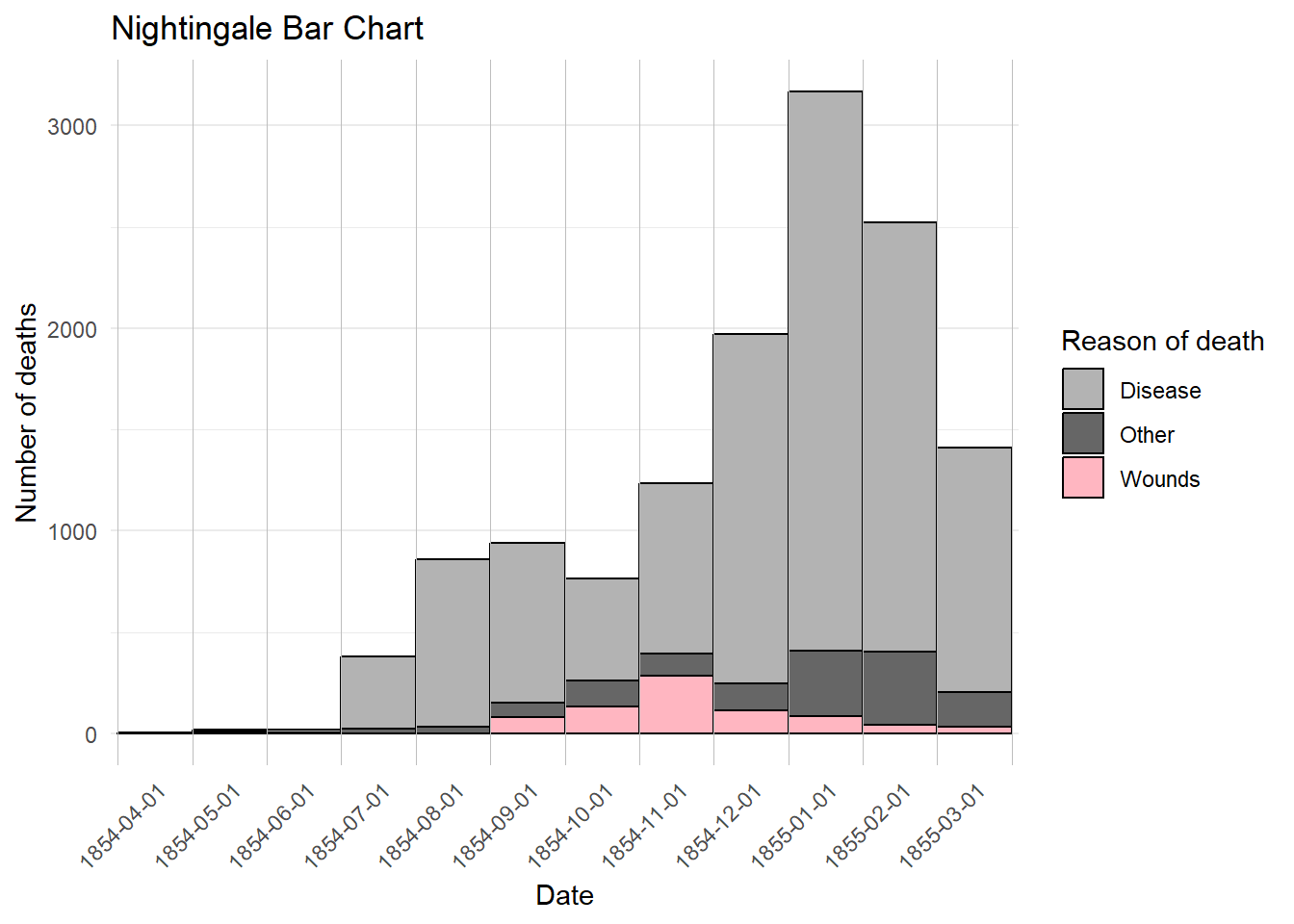
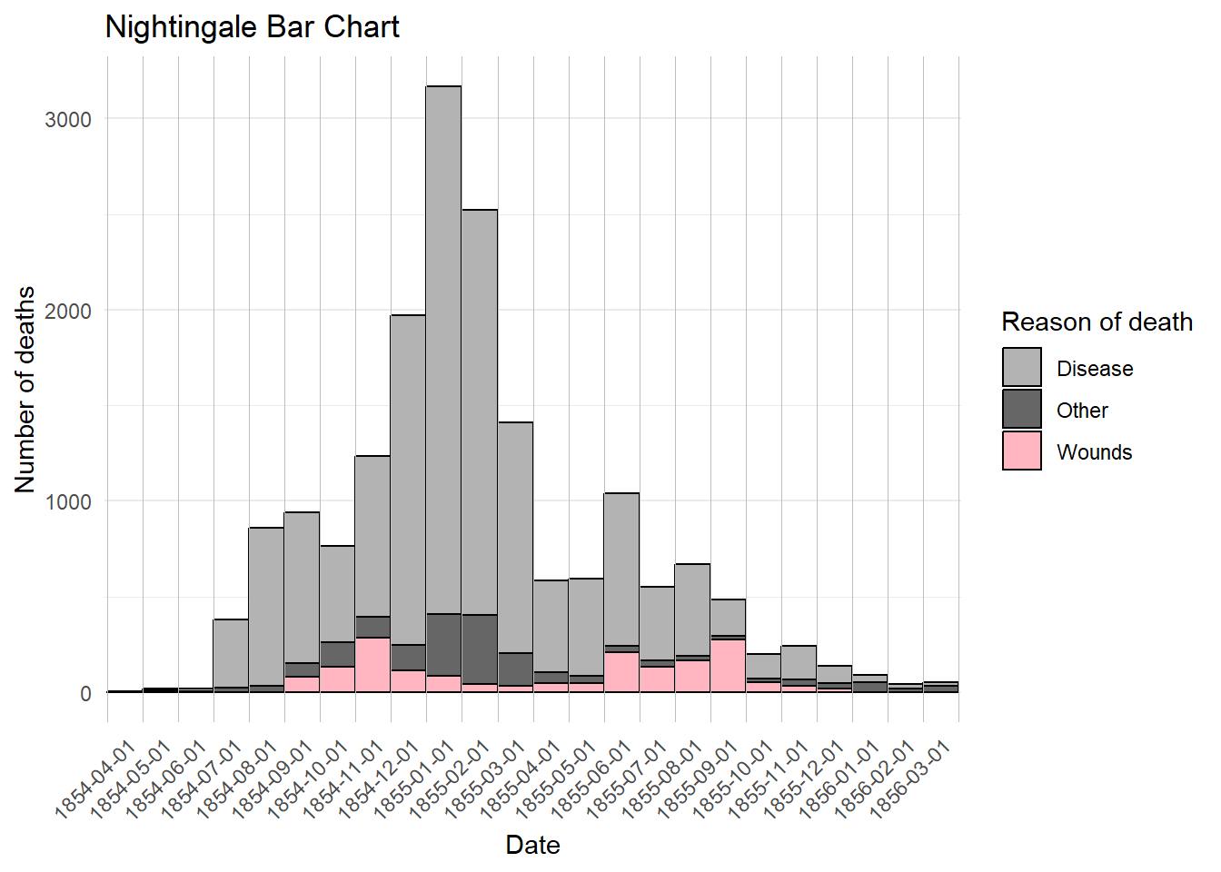
ggplot(Nightingale2, aes(x = as.factor(Date))) +
  geom_col(
    aes(y = value, fill = variable),
    color = "black", width = 1
  ) +
  scale_fill_manual(values = c(
    "gray70", "gray40",
    "lightpink"
  )) +
  labs(
    title = "Nightingale Bar Chart",
    x = "Date",
    y = "Number of deaths",
    fill = "Reason of death"
  ) +
  geom_vline(
    xintercept = seq(.5, 25, by = 1),
    size = .1,
    color = "grey"
  ) +
  theme_minimal() +
  theme(
    axis.text.x = element_text(
      angle = 45,
      hjust = 1
    ),
    panel.grid.major.x = element_blank()
  )
ggplot(
  data =
    Nightingale2 |> group_by(variable) |>
      summarise(value = sum(value)),
  aes(x = variable, y = value, fill = variable)
) +
  geom_col() +
  guides(fill = "none") +
  scale_fill_manual(values = c(
    "gray70", "gray40",
    "lightpink"
  )) +
  labs(
    title = "Nightingale Bar Chart",
    x = "Reason of death",
    y = "Number of deaths"
  ) +
  theme_minimal() +
  theme(panel.grid.major.x = element_blank())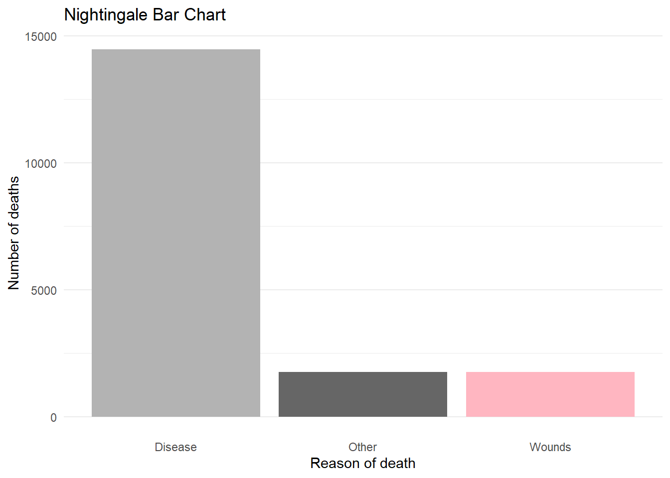
ggplot(data = Nightingale2 |> group_by(variable) |>
  summarize(value = sum(value)) |>
  pie_stats(0, 0, 0, 1, value, FALSE, c(.3, .75, .75))) +
  ggforce::geom_arc_bar(
    aes(
      x0 = 0, y0 = 0, r0 = 0, r = 1,
      amount = value, fill = variable
    ),
    stat = "pie"
  ) +
  geom_text(aes(x = x_lab, y = y_lab, label = variable),
    size = 5
  ) +
  scale_fill_manual(values = c(
    "gray70", "gray40",
    "lightpink"
  )) +
  guides(fill = "none") +
  labs(
    title = "Nightingale Pie Chart"
  ) +
  coord_equal() +
  theme_void()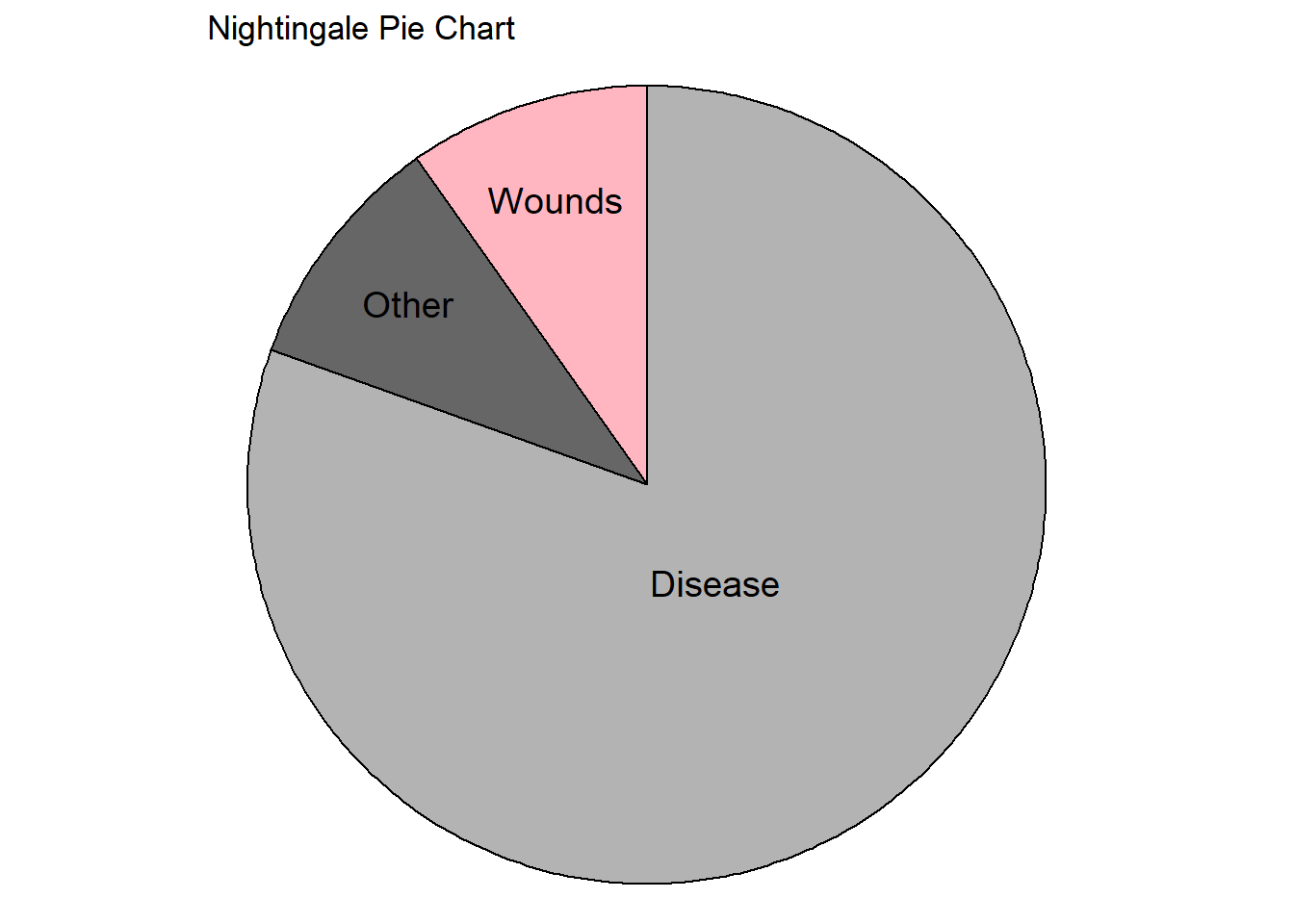
Snow

library(HistData)ggplot(data = Snow.deaths2, aes(x = x, y = y)) +
geom_path(data = Snow.streets, aes(group = street)) +
geom_point(aes(color = "Cholera death")) +
geom_point(data = Snow.pumps, aes(color = "Pump"), size = 3) +
scale_color_manual(values = c(
"Cholera death" = "black",
"Pump" = "red"
)) +
guides(color = guide_legend(
title = NULL,
override.aes = list(size = c(1, 3))
)) +
coord_equal() +
theme_void() +
ggtitle("John Snow cholera map")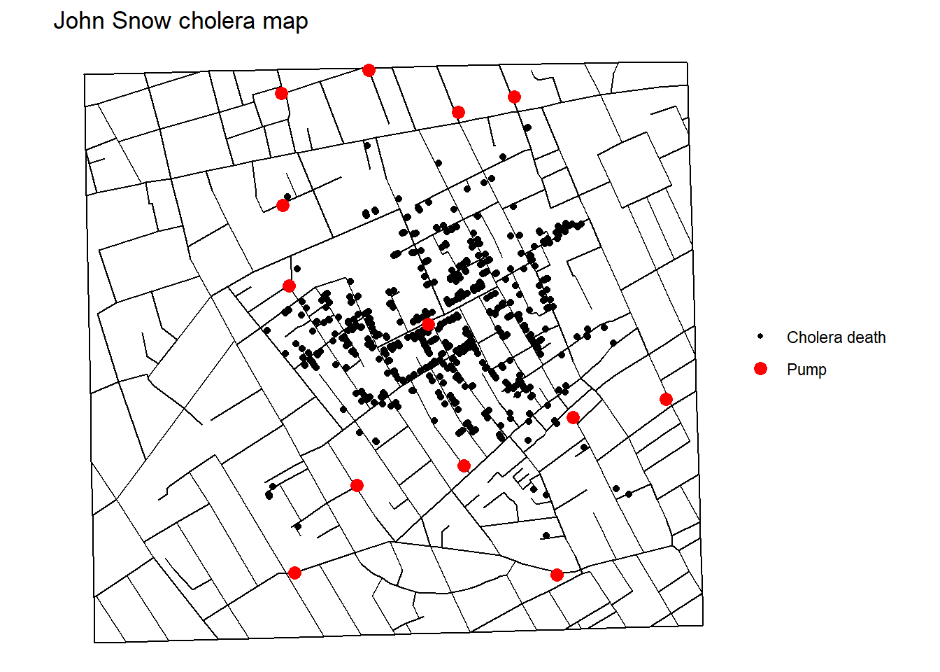
ggplot(data = Snow.deaths2, aes(x = x, y = y)) +
  geom_path(data = Snow.streets, aes(group = street)) +
  stat_density_2d(
    aes(fill = ..level..),
    geom = "polygon",
    alpha = .5, color = NA
  ) +
  geom_point(aes(color = "Cholera death")) +
  geom_point(data = Snow.pumps, aes(color = "Pump"), size = 3) +
  scale_color_manual(values = c(
    "Cholera death" = "black",
    "Pump" = "red"
  )) +
  viridis::scale_fill_viridis() +
  guides(
    color = guide_legend(
      title = NULL,
      override.aes = list(size = c(1, 3))
    ),
    fill = guide_colorbar(title = "Dead density")
  ) +
  coord_equal() +
  theme_void() +
  ggtitle("John Snow cholera map", subtitle = " with density")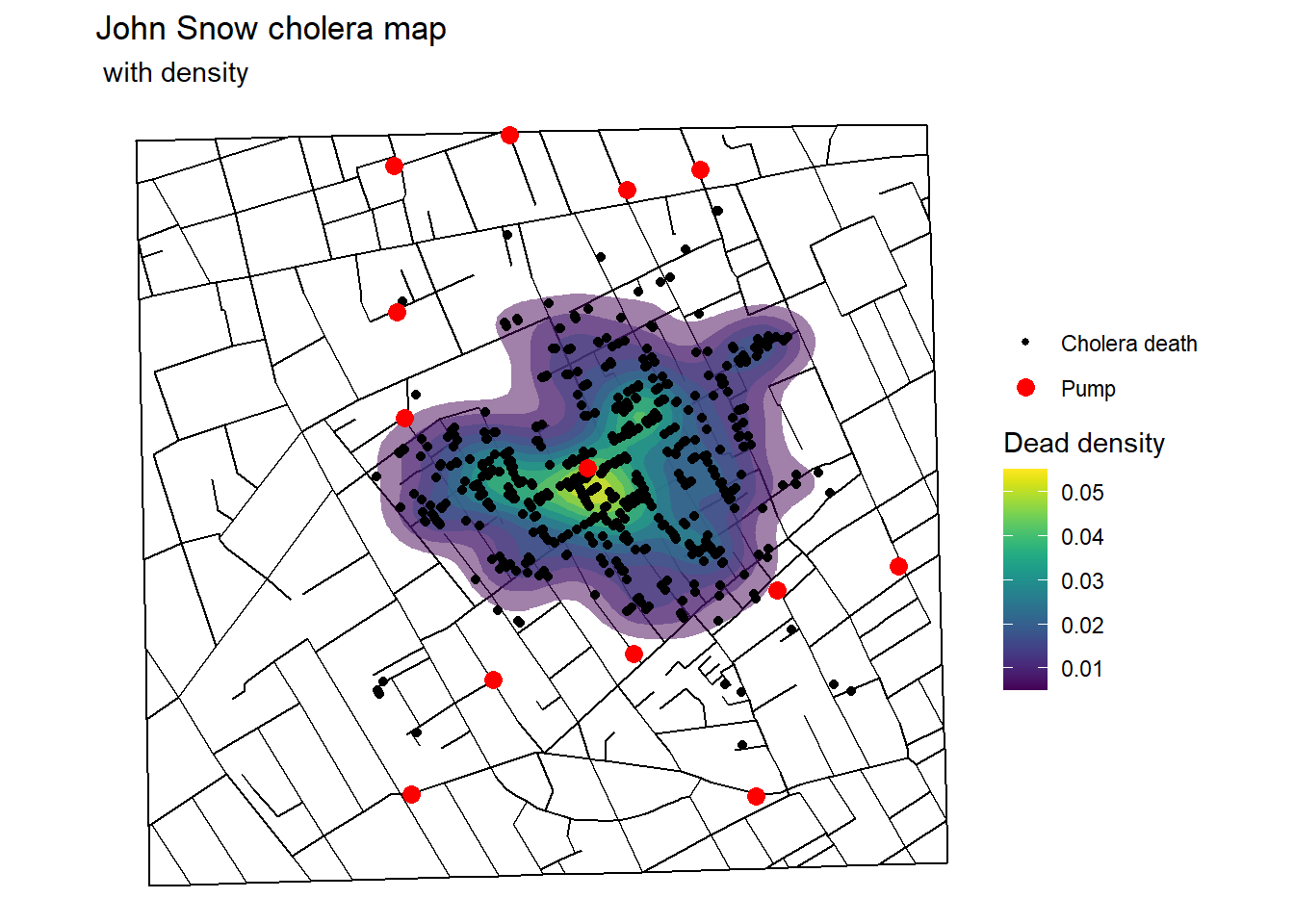
SnowDeath <- Snow.dates |>
  mutate(week = lubridate::ymd("1854-09-08") +
    lubridate::dweeks(floor((date - lubridate::ymd("1854-09-08"))
    / lubridate::dweeks(1))))
ggplot(data = SnowDeath, aes(x = week, y = deaths)) +
geom_col() +
geom_segment(
x = as.numeric(lubridate::ymd("1854-09-08")) - 3.5,
xend = as.numeric(lubridate::ymd("1854-09-08")) - 3.5,
y = -Inf, yend = Inf, color = "red",
size = 2
) +
scale_x_date(
breaks = unique(SnowDeath$week) - 3,
labels = unique(SnowDeath$week)
) +
labs(
x = "Date",
y = "Number of deaths",
title = "John Snow cholera bar plot",
subtitle = "by week"
) +
theme_minimal()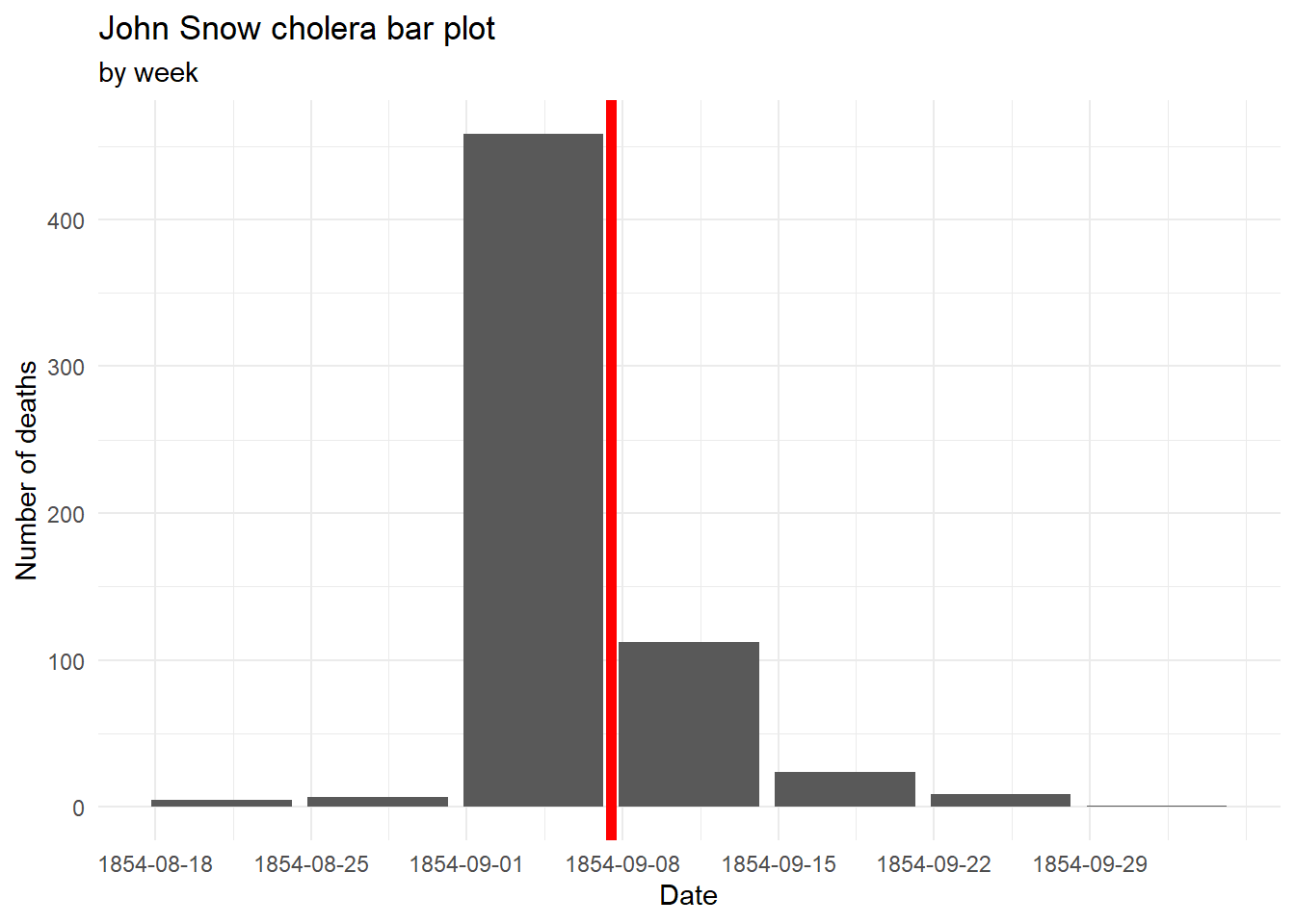
ggplot(data = SnowDeath, aes(x = date, y = deaths)) +
  geom_col() +
  geom_segment(
    x = as.numeric(lubridate::ymd("1854-09-08")) - .5,
    xend = as.numeric(lubridate::ymd("1854-09-08")) - .5,
    y = -Inf, yend = Inf, color = "red",
    size = 2
  ) +
  scale_x_date(breaks = unique(SnowDeath$week) - .5) +
  labs(
    x = "Date",
    y = "Number of deaths",
    title = "John Snow cholera bar plot",
    subtitle = "by day"
  ) +
  theme_minimal()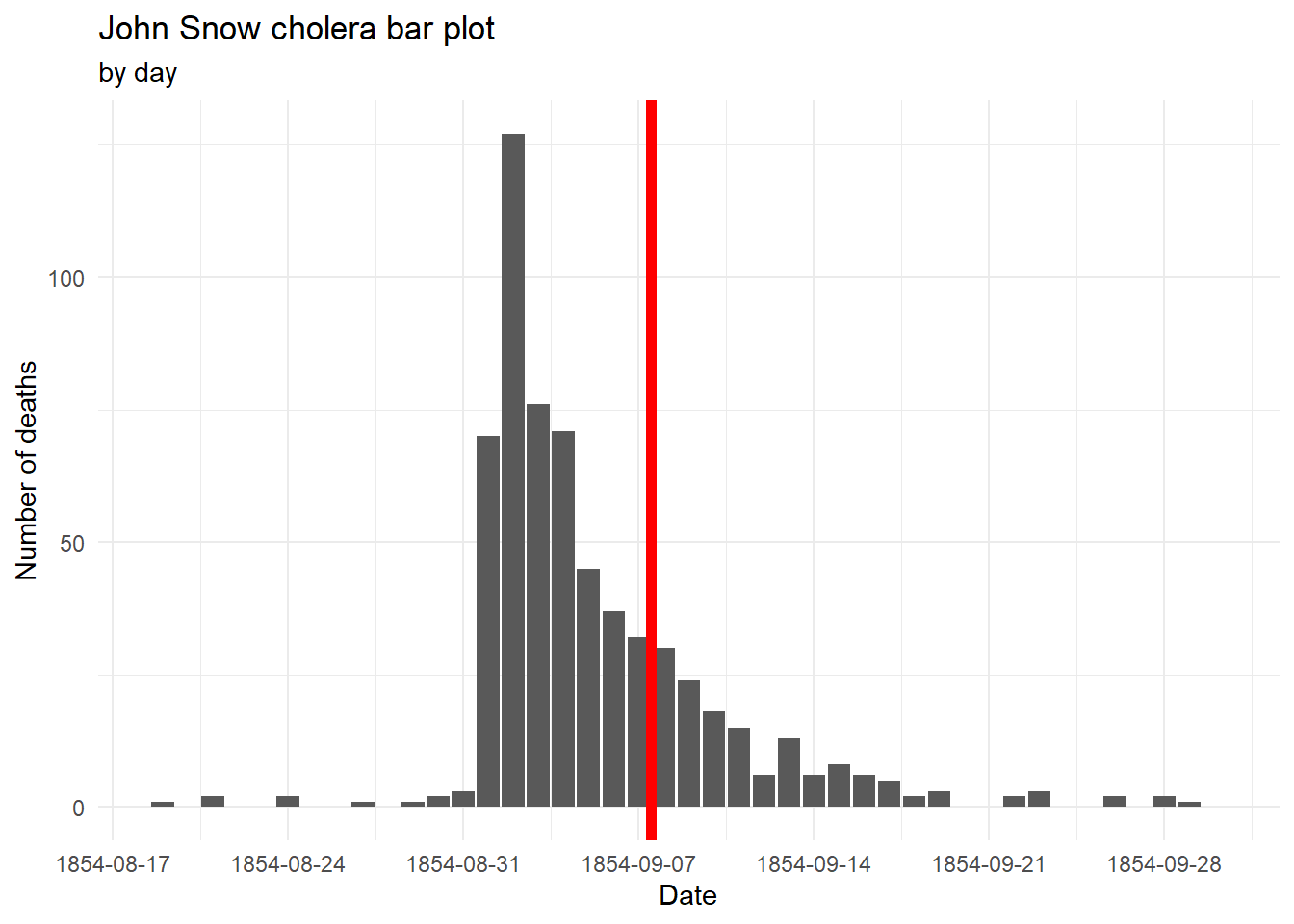
Du Bois
Credit to Matthew A. (statswithmatt)

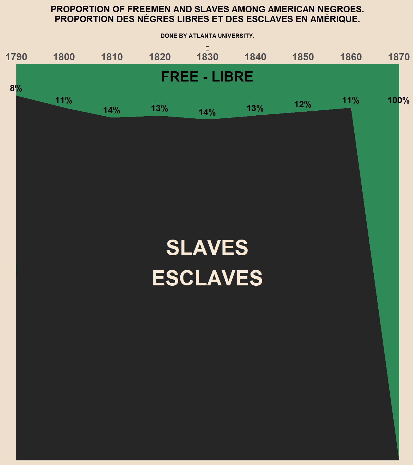
freemen <- data.frame(
  year = seq(1790, 1870, by = 10),
  pct_free = c(0.08, 0.11, 0.135, 0.13, 0.14, 0.13, 0.12, 0.11, 1)
) |>
  mutate(
    pct_slave = 1 - pct_free,
    # replace the last value (0%) with the previous one so that it's aligned
    # in the same place as the actual image
    labels = replace(pct_slave, n(), pct_slave[n() - 1])
  )
font_name <- "Inconsolata"
theme_du_bois <- function() {
theme_gray(base_family = font_name) %+replace%
theme(
plot.background = element_rect(
fill = "antiquewhite2",
color = "antiquewhite2"
),
panel.background = element_rect(
fill = "antiquewhite2",
color = "antiquewhite2"
),
plot.title = element_text(
hjust = 0.5,
face = "bold"
),
plot.subtitle = element_text(hjust = 0.5)
)
}ppmsca_33913 <- ggplot(
data = freemen,
mapping = aes(
x = year,
y = pct_slave
)
) +
geom_area(aes(y = 1),
fill = "seagreen"
) +
geom_area(fill = "gray15") +
labs(
title = "PROPORTION OF FREEMEN AND SLAVES AMONG AMERICAN NEGROES.\nPROPORTION DES NÈGRES LIBRES ET DES ESCLAVES EN AMÉRIQUE.\n",
subtitle = "DONE BY ATLANTA UNIVERSITY.\n\n⎄"
) +
scale_x_continuous(
breaks = seq(1790, 1870, by = 10),
position = "top"
) +
coord_cartesian(
expand = FALSE,
clip = "off",
xlim = c(1788, 1872)
) +
theme_du_bois()
# annotations for plot
ppmsca_33913 + geom_text(
aes(
y = labels,
label = scales::percent(pct_free, accuracy = 1),
family = font_name,
fontface = "bold"
),
nudge_y = 0.02
) +
annotate(
"text",
label = c("SLAVES\nESCLAVES", "FREE - LIBRE"),
color = c("antiquewhite", "black"),
size = c(9, 6),
x = 1830,
y = c(0.5, 0.97),
family = font_name,
fontface = "bold"
) +
### theme adjustments
theme(
text = element_text(face = "bold"),
panel.background = element_blank(),
plot.subtitle = element_text(size = 7),
panel.grid.major.x = element_line(color = "gray25"),
panel.grid.minor = element_blank(),
panel.grid.major.y = element_blank(),
axis.text.x = element_text(face = "bold", size = 12),
axis.text.y = element_blank(),
axis.ticks = element_blank(),
axis.title = element_blank()
)

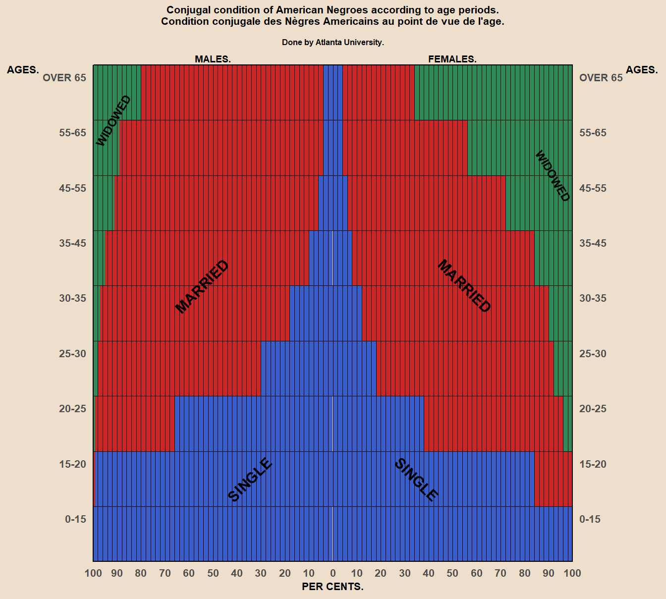
gender <- c("female", "male")
status <- c("single", "widowed", "married")
age_bins <- c(
  "0-15", "15-20", "20-25", "25-30", "30-35",
  "35-45", "45-55", "55-65", "OVER 65"
)

marital <- expand.grid(age = age_bins, gender = gender, status = status) |>
  mutate(
    pct = c(
      100, 84, 38, 18, 12, 8, 6, 4, 4,
      100, 99, 66, 30, 18, 10, 6, 4, 4,
      0, 0, 4, 8, 10, 16, 28, 44, 66,
      0, 0, 1, 2, 3, 5, 9, 11, 20,
      0, 16, 58, 74, 78, 76, 66, 52, 30,
      0, 1, 33, 68, 79, 85, 85, 85, 76
    ),
    status = factor(
      status,
      levels = c("widowed", "married", "single")
    ),
    age_numeric = as.numeric(age)
  )
ggplot(
data = marital,
mapping = aes(
x = age_numeric,
# should just be able to negate pct to get pyramid plot. for gender, men
# are on the left, so they get the negative
y = if_else(gender == "male", -pct, pct),
fill = status
)
) +
geom_bar(
stat = "identity",
width = 1
) +
scale_x_continuous(
breaks = (1:9) + 0.5,
labels = age_bins,
expand = c(0, 0),
sec.axis = dup_axis() # dual age axis
) +
scale_y_continuous(
breaks = seq(-100, 100, by = 10),
labels = abs,
expand = c(0, 0),
# lines on original plot are by 2s
minor_breaks = seq(-100, 100, by = 2)
) +
scale_fill_manual(
values = c("seagreen4", "firebrick3", "royalblue3"),
labels = c("WIDOWED", "MARRIED", "SINGLE")
) +
labs(
title = "Conjugal condition of American Negroes according to age periods.\nCondition conjugale des Nègres Americains au point de vue de l'age.\n",
subtitle = "Done by Atlanta University.\n\n",
x = "AGES.",
y = "PER CENTS."
) +
coord_flip(clip = "off") +
theme_du_bois() +
annotate(
"text",
label = rep(c("SINGLE", "MARRIED", "WIDOWED"), each = 2),
# angle text for marital status
y = c(-35, 35, -55, 55, -92, 92),
angle = c(45, -45, 45, -45, 60, -60),
x = c(2, 2, 5.5, 5.5, 8.5, 7.5),
size = c(4, 4, 4, 4, 3, 3),
family = font_name,
fontface = "bold"
) +
annotate(
"text",
label = c("MALES.", "FEMALES."),
y = c(-50, 50),
x = Inf,
vjust = -0.4,
size = 2.5,
family = font_name,
fontface = "bold"
) +
### theme adjustments
theme(
text = element_text(face = "bold"),
panel.background = element_blank(),
plot.title = element_text(
size = 8,
vjust = 2
),
plot.subtitle = element_text(
size = 6,
vjust = 2
),
axis.title = element_text(size = 8),
axis.ticks = element_blank(),
panel.grid.major = element_line(
color = "black",
size = 0.1
),
panel.grid.minor.x = element_line(
color = "black",
size = 0.05
),
panel.grid.minor.y = element_blank(),
legend.background = element_blank(),
legend.position = "none",
legend.key = element_blank(),
# put grid lines on top so not covered by plot
panel.ontop = TRUE,
panel.border = element_rect(
fill = NA,
color = "black"
),
axis.text.x = element_text(size = 8),
# both axes titles for age hortizontal instead of vertical, and put them at
# the top, just above the values
axis.title.y = element_text(
angle = 0,
vjust = 1
),
axis.title.y.right = element_text(
angle = 0,
vjust = 1
),
# age group labels need to be slightly below grid line
axis.text.y = element_text(
vjust = 2,
size = 8
)
)
Challenger

data(Challeng, package = "alr4")
Challeng <- Challeng |>
  rownames_to_column() #|>
  # Fix data issue
  #mutate(Fail = if_else(rowname == "51-C",
  #  3L, Fail
  #))
ggplot(
data = filter(Challeng, fail > 0),
aes(x = temp, y = fail)
) +
geom_point(size = 5) +
labs(
x = "Temperature",
y = "Nb of issues",
title = "Challenger prelauch investigation",
subtitle = "only with flights with incident"
) +
ggrepel::geom_text_repel(aes(label = rowname),
point.padding = .5,
nudge_y = .2,
segment.size = 0,
seed = 42,
direction = "x"
) +
scale_y_continuous(breaks = 0:3) +
coord_cartesian(ylim = c(0, 3)) +
theme_light() +
theme(panel.grid.minor.y = element_blank())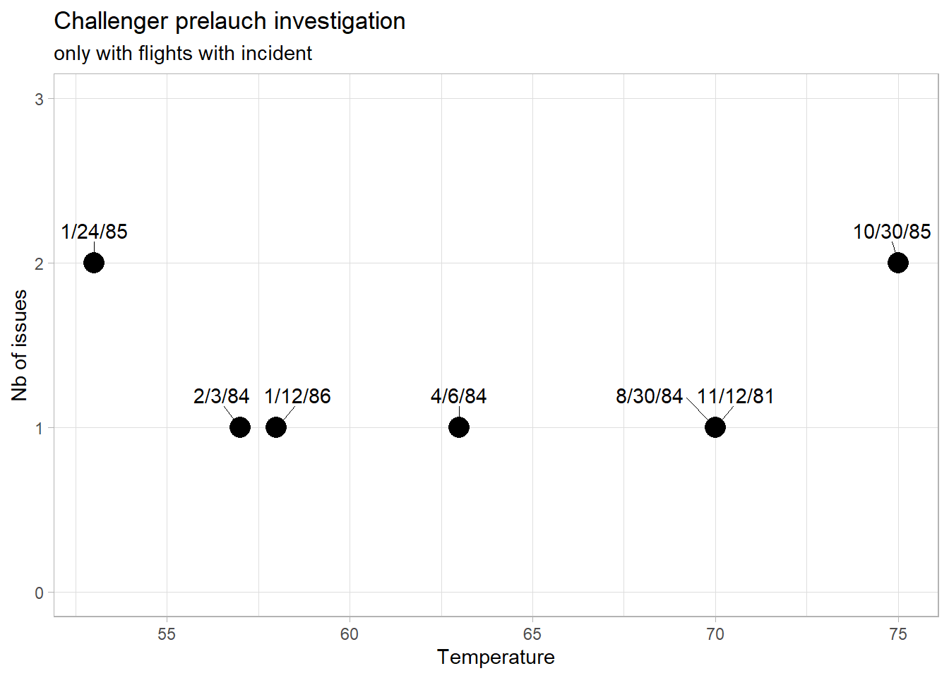
ggplot(
  data = filter(Challeng, fail > 0),
  aes(x = temp, y = fail)
) +
  geom_point(size = 5) +
  geom_smooth(
    method = "lm",
    formula = y ~ poly(sqrt(x), 2)
  ) +
  labs(
    x = "Temperature",
    y = "Nb of issues",
    title = "Challenger prelauch investigation",
    subtitle = "only with flights with incident"
  ) +
  scale_y_continuous(breaks = 0:3, limits = c(-0.5, 4)) +
  theme_light() +
  coord_cartesian(ylim = c(0, 3)) +
  theme(panel.grid.minor.y = element_blank())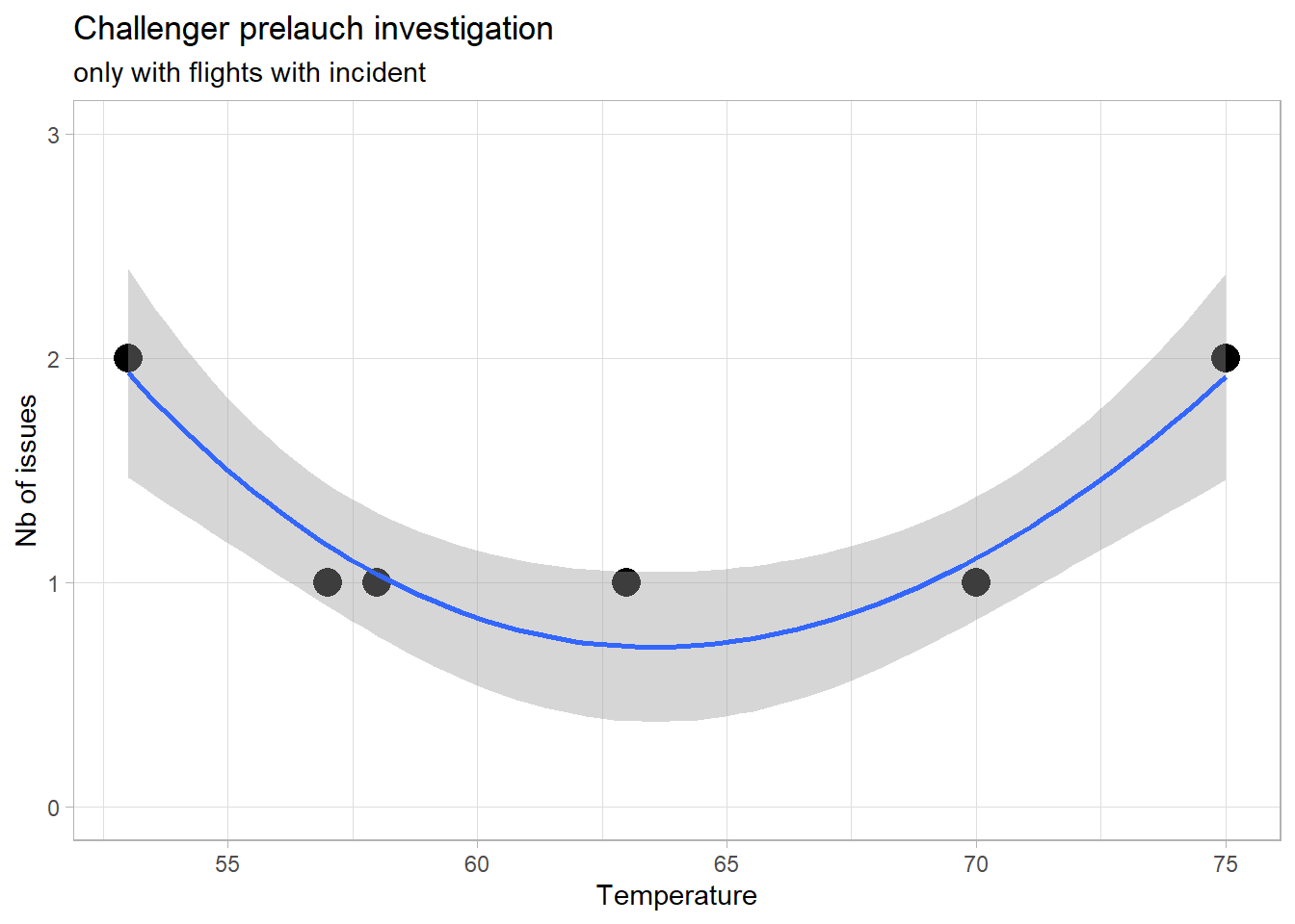
ggplot(data = Challeng, aes(x = temp, y = fail)) +
  geom_point(size = 5) +
  labs(
    x = "Temperature",
    y = "Nb of issues",
    title = "Challenger prelauch investigation",
    subtitle = "with all flights included"
  ) +
  scale_y_continuous(breaks = 0:3) +
  coord_cartesian(ylim = c(0, 3)) +
  theme_light() +
  theme(panel.grid.minor.y = element_blank())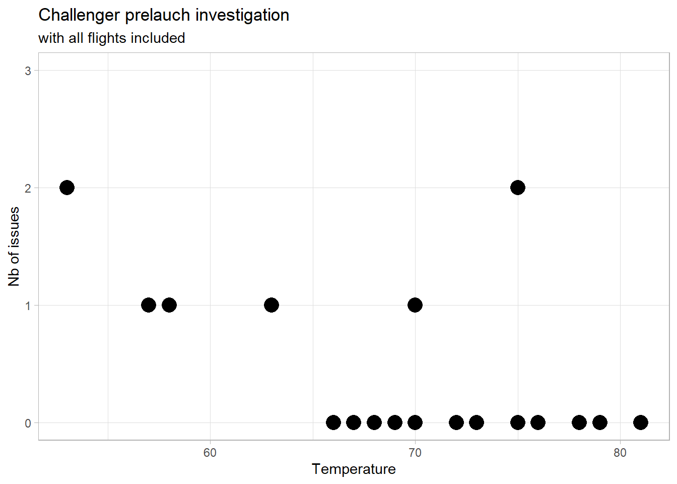
ggplot(data = Challeng, aes(x = temp, y = fail)) +
  geom_point(size = 5) +
  geom_smooth(
    method = "lm",
    formula = y ~ poly(sqrt(x), 2)
  ) +
  labs(
    x = "Temperature",
    y = "Nb of issues",
    title = "Challenger prelauch investigation",
    subtitle = "with all flights included"
  ) +
  scale_y_continuous(breaks = 0:3) +
  coord_cartesian(ylim = c(0, 3)) +
  theme_light() +
  theme(panel.grid.minor.y = element_blank())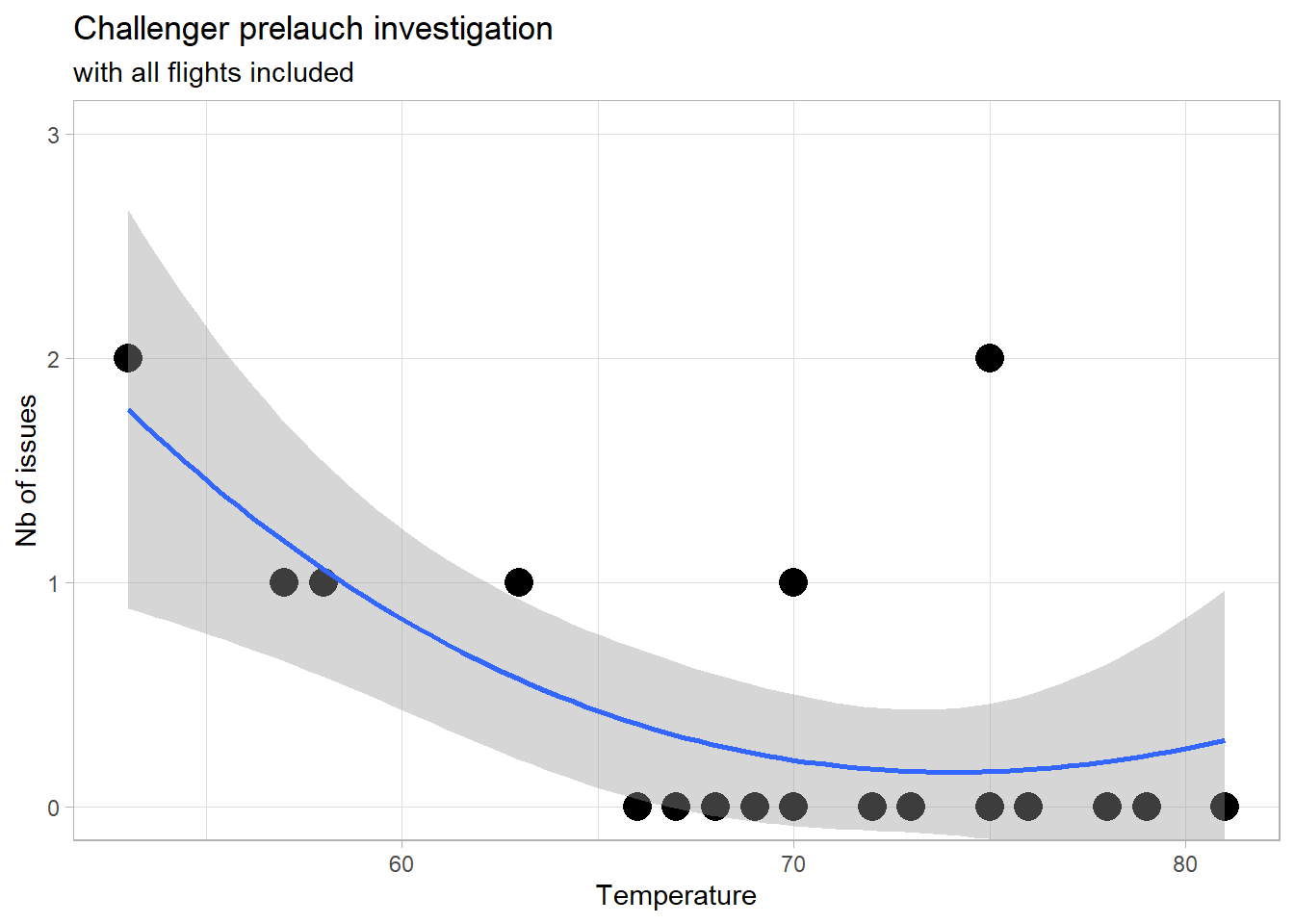

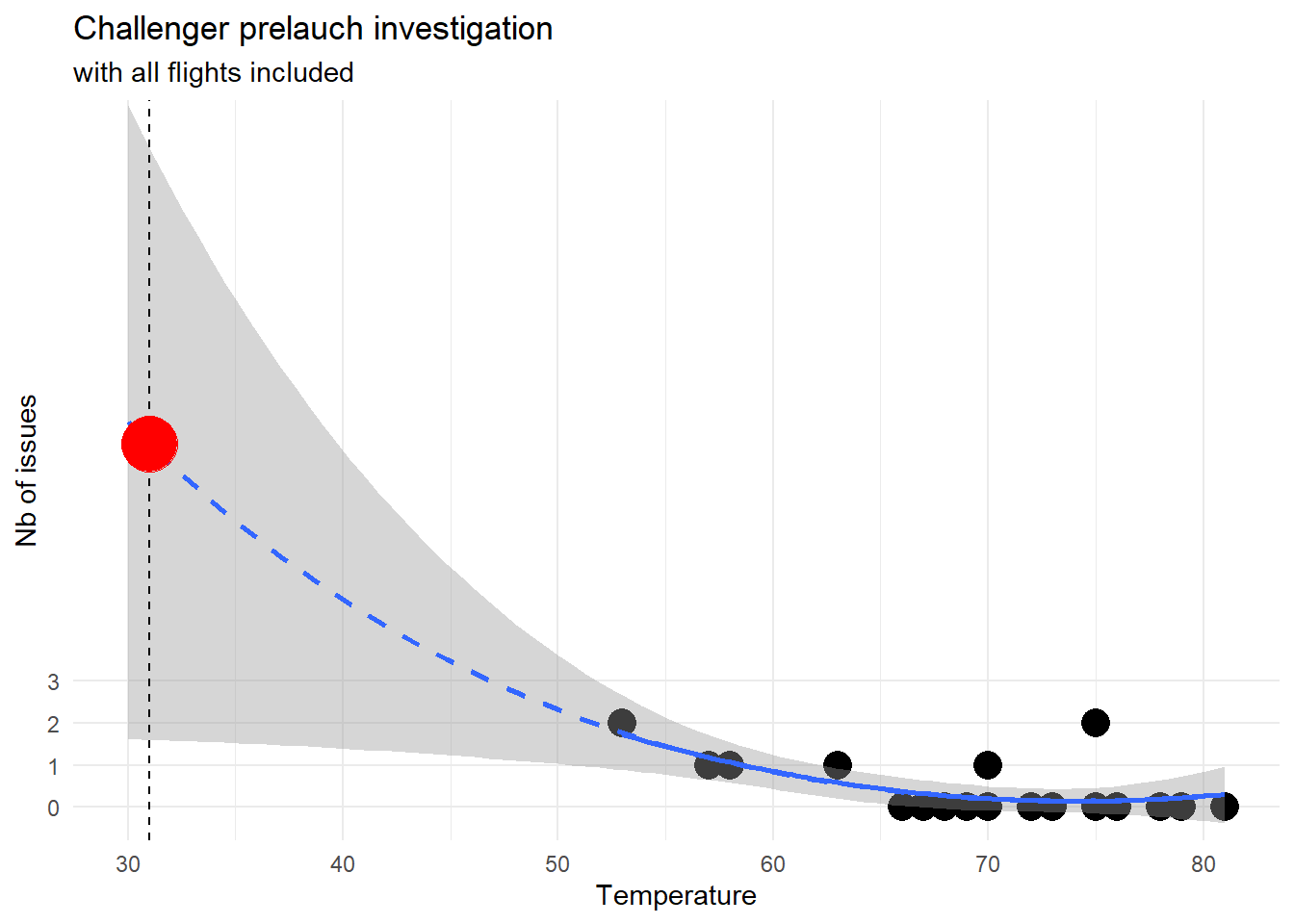
ggplot(data = Challeng, aes(x = temp, y = fail)) +
  geom_point(size = 5) +
  geom_smooth(
    method = "lm",
    formula = y ~ poly(sqrt(x), 2),
    fullrange = TRUE,
    linetype = "dashed"
  ) +
  geom_smooth(
    method = "lm",
    formula = y ~ poly(x, 2),
    se = FALSE
  ) +
  geom_vline(aes(xintercept = 31),
    linetype = "dashed"
  ) +
  geom_point(
    data = tibble(
      temp = 31,
      fail = predict(
        lm(fail ~ poly(sqrt(temp), 2), data = Challeng),
        tibble(temp = 31)
      )
    ),
    size = 10,
    color = "red"
  ) +  scale_x_continuous(limit = c(30, NA)) +
  labs(
    x = "Temperature",
    y = "Nb of issues",
    title = "Challenger prelauch investigation",
    subtitle = "with all flights included"
  ) +
  scale_y_continuous(breaks = 0:3) +
  coord_cartesian(ylim = c(0, 16)) +
  theme_minimal() +
  theme(panel.grid.minor.y = element_blank())